Overview
Context
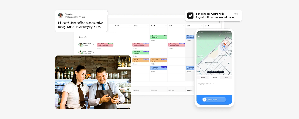
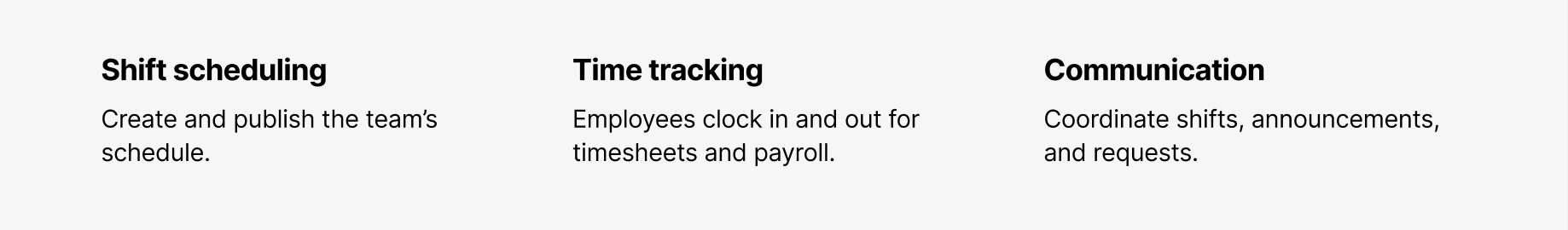
Camelo is a scheduling and workforce management app for businesses that operate on shifts, like cafes, retail stores, and clinics. It covers the full cycle of managing an hourly team: shift scheduling, time and attendance tracking, and team communication.
Problem
Everything starts with a published schedule. Once scheduled, employees can clock in to track their work time, and many team communications revolve around upcoming shifts. Because it unlocks the rest of the product experience, publishing the first schedule became our core activation moment.
When I joined this project, only 47% of new users reached this moment. The original onboarding only covered scheduling. Time tracking and team communication, two other core areas of the app, had no guidance at all.
Goals & Needs
Business goals
- More new users reach the core activation moment
- Add guidance for other important features
User needs
- Explore the app at their own pace
- Get guidance at the right time
How do we make onboarding flexible enough for any user, while still guiding them to the moments that matter?
Highlights
I drove this onboarding redesign from initial audit through to shipping. The goal was to rebuild onboarding: fix what didn't work, expand what was missing, and get more users to the core activation moment.
The redesigned flow shipped in early 2026. Activation rate climbed from 47% to 59%, a 12-point improvement.
Research & Discovery
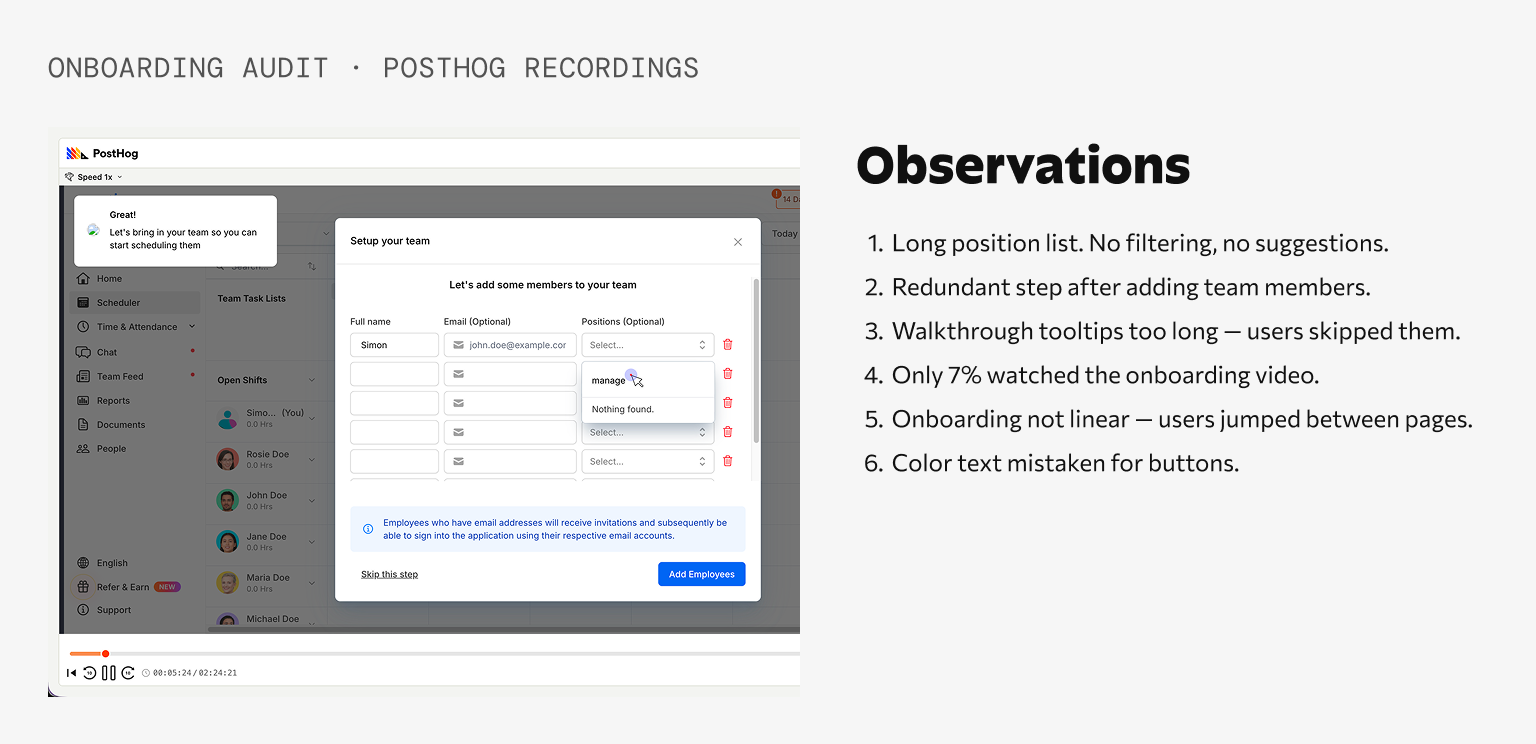
Reseach & Audit
Across analytics, recordings, and customer feedback, a few patterns came through clearly: users skipped past guidance, dropped off sharply before activation, and got stuck on certain moments.
Analytics & Feedback
The funnel showed a clear drop-off before the activation moment: Create workspace (100%) → Business info (82%) → Team members (61%) → Publish first schedule (47%)
Customer Success reported the same friction repeatedly. Users struggled to invite employees and weren’t sure how to publish their first schedule. A follow-up survey supported this: 21% of recent customers described onboarding as confusing.
Session Recordings
Watching session recordings helped explain the numbers. Users jumped between pages, mistook blue text for links, and skipped onboarding elements like tooltips, the Home checklist, and the onboarding video. Only 7% watched the onboarding video.
Flow Audit
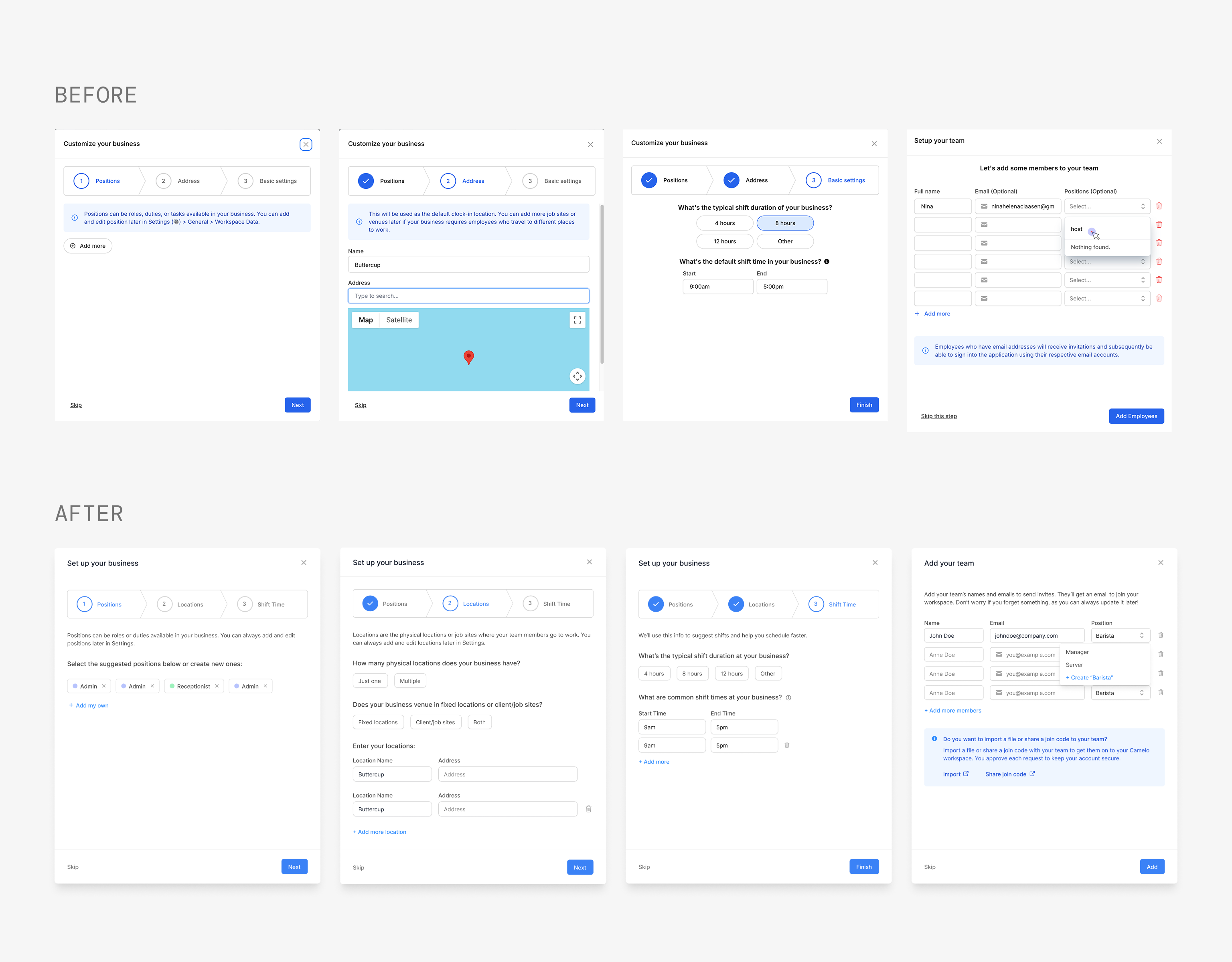
The existing onboarding reflected an earlier version of the product.
It guided users only through scheduling, even though Camelo had expanded into time tracking and team communication. Some steps were redundant, while others created unnecessary friction, such as asking users to add employees twice or forcing them to scroll through long position lists.
Competitive Analysis
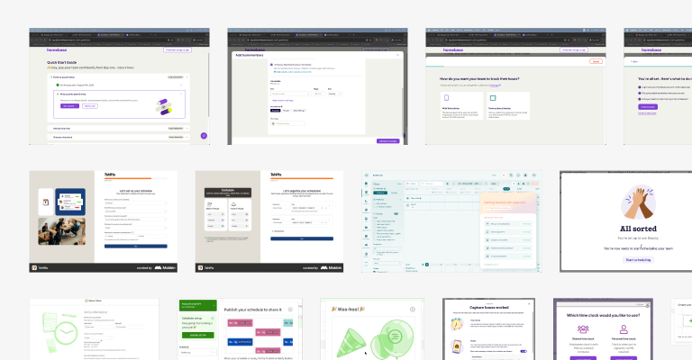
I reviewed onboarding experiences from competitors and products known for strong onboarding.
Three patterns appeared consistently:
- Flexible, non-linear onboarding
- Clear focus on activation milestones
- Small incentives that encouraged completion
Key Insights
Looking across all four research activities, three themes stood out:
1. Users wanted guidance without losing control.
People rarely followed the path we expected. They explored the product in their own order and ignored onboarding that interrupted them. Instead of leading users through a fixed sequence, onboarding should support their natural workflow and appear only when it was relevant.
2. Friction built up through many small moments.
Outdated copy, redundant steps, missing shortcuts, and confusing interactions each added a little more effort. None of them seemed critical on their own, but together they prevented users from reaching activation.
3. The product had outgrown its onboarding.
While Camelo had evolved into a workforce management platform, onboarding still treated it as a scheduling tool. New users received little guidance for time tracking or team communication, making it harder to discover the product’s broader value.
Process
Design Principles
Every exploration was guided by three principles:
01
Flexibility over linearity
Give users a flexible path to explore the app.
02
Guidance in context
Help should appear where and when users need it.
03
Friction reduction
Remove friction points to keep users engaged and reach activation moments.
Exploration & Validation
Before finalizing the onboarding experience, I tested interactive prototypes with 5 new users and 5 teammates through unmoderated walkthroughs and internal reviews.
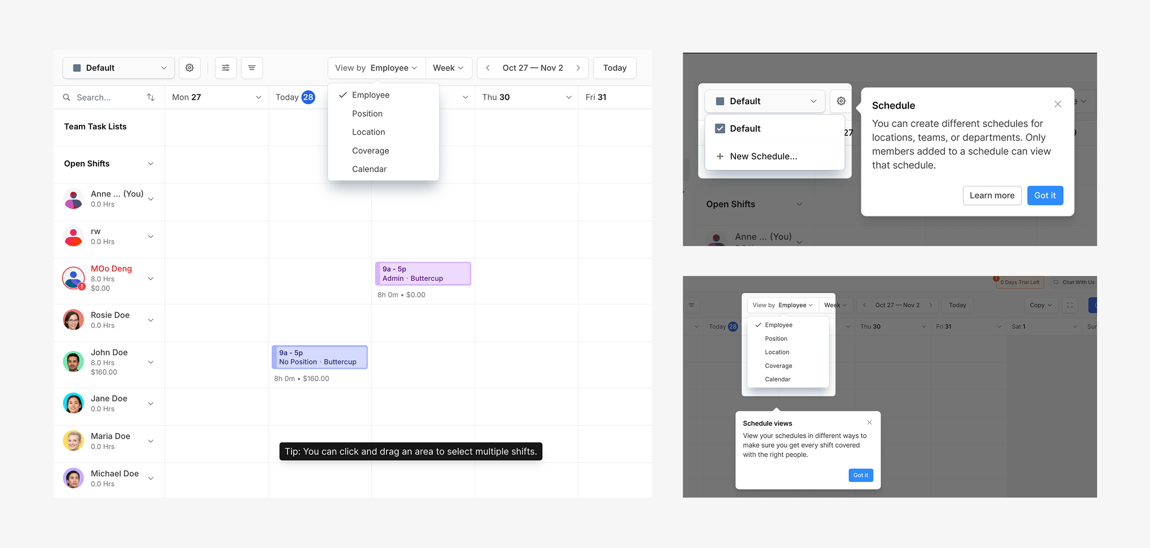
Redesigned Home checklist
A redesigned Home checklist was still largely ignored, so I replaced it with a floating checklist.
Feature-specific onboarding panels
Promising, but deferred because each page required custom content and implementation.
Comprehensive schedule setup modal
A more comprehensive schedule setup modal introduced too much complexity too early, so advanced settings were moved into Scheduler customization.
The testing sessions helped refine the direction. The concepts that consistently tested well became the foundation of the final onboarding experience.
Final Design
Final Design
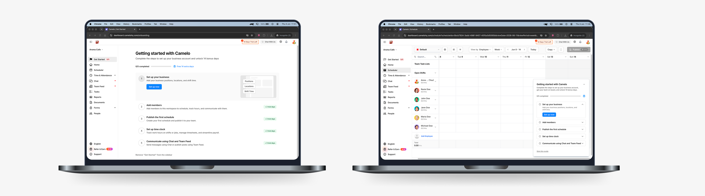
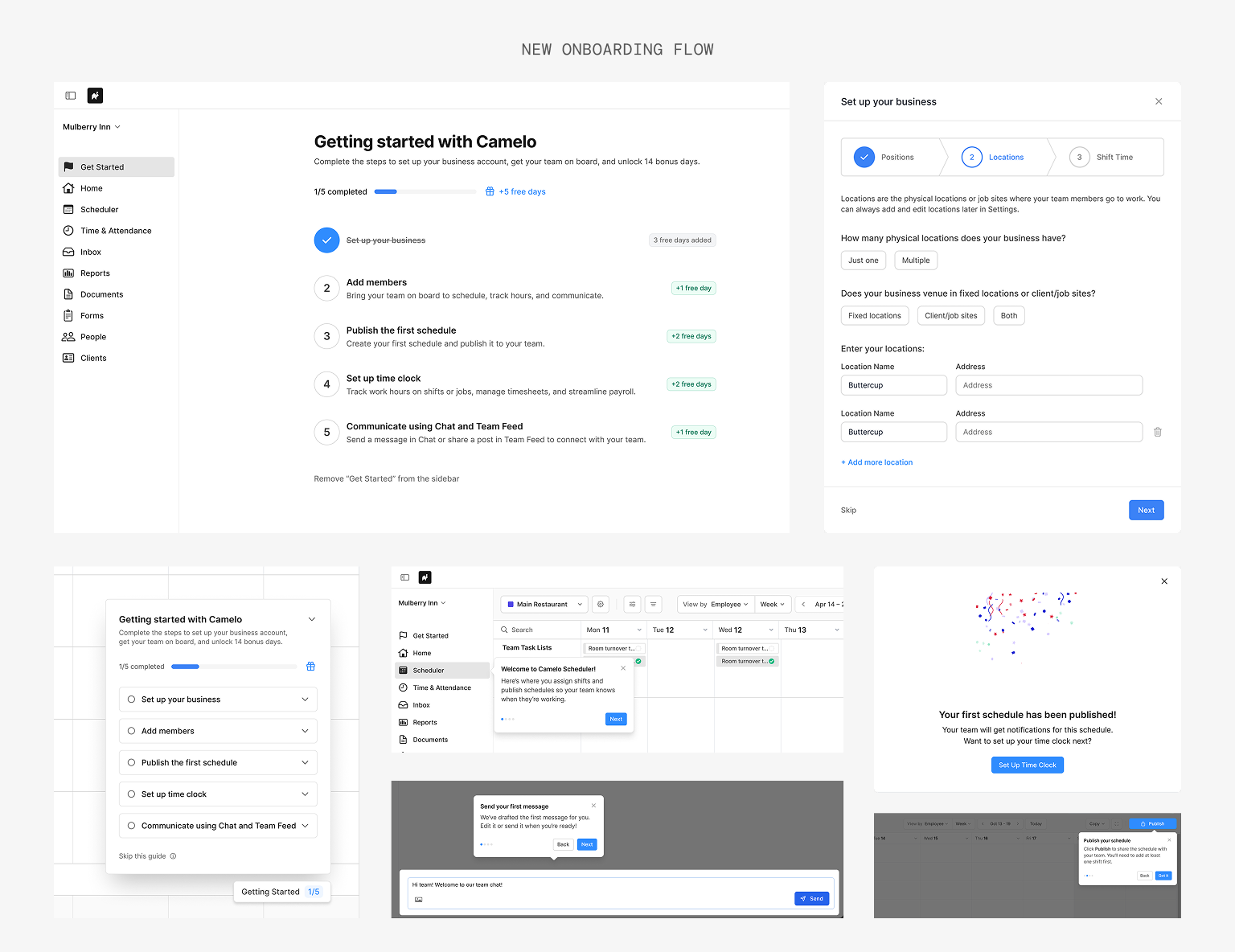
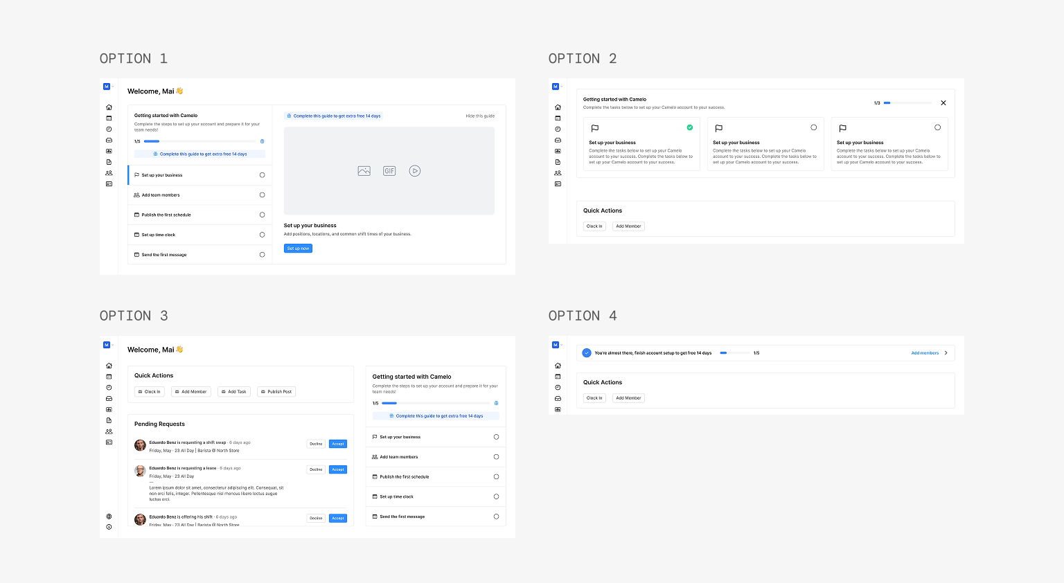
Dedicated Get Started page
Rather than sending users straight into scheduling, onboarding now begins with a dedicated Get Started page. It gives users a clear starting point while letting them complete setup at their own pace.
The page brings together five milestones across scheduling, time tracking, and team communication. Users can complete them in any order, while clear progress and rewards keep them moving toward activation.
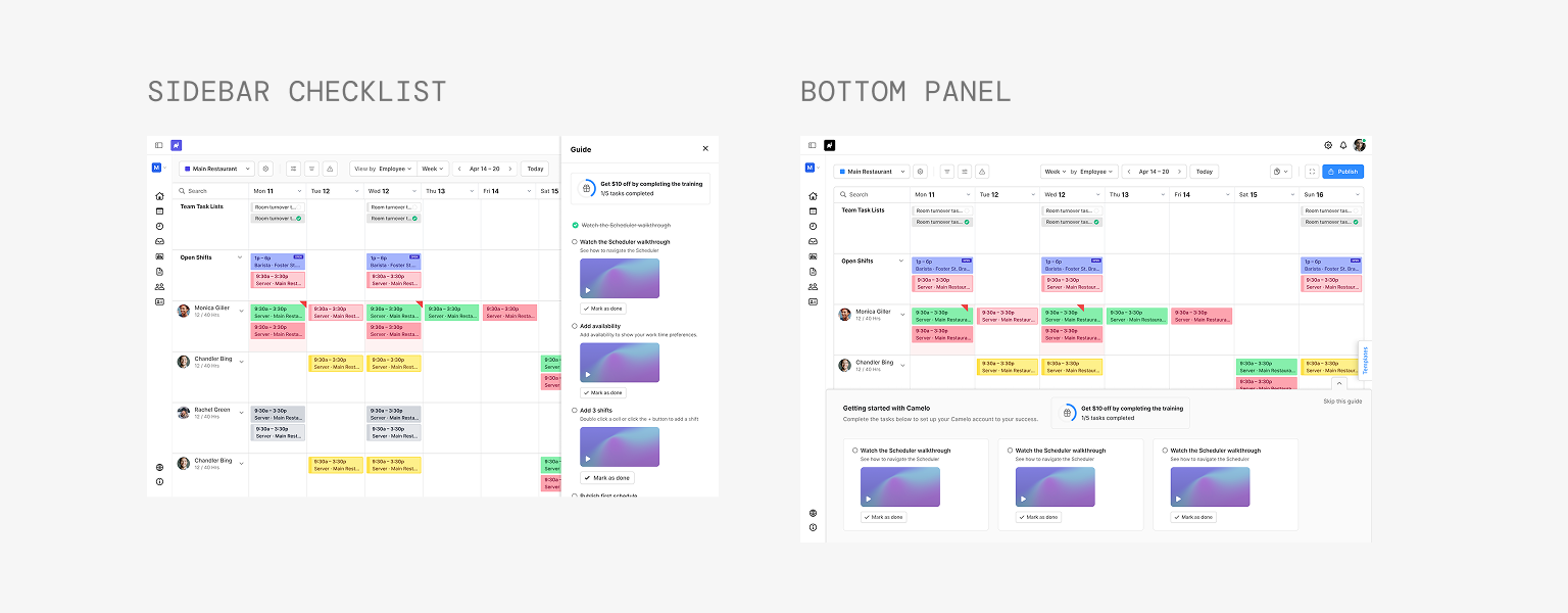
Floating Checklist
Users didn’t stay on one page during onboarding, so guidance needed to move with them.
The floating checklist follows users across the product, so guidance appears where they’re already working. Users can collapse or skip the checklist when they don't need it.
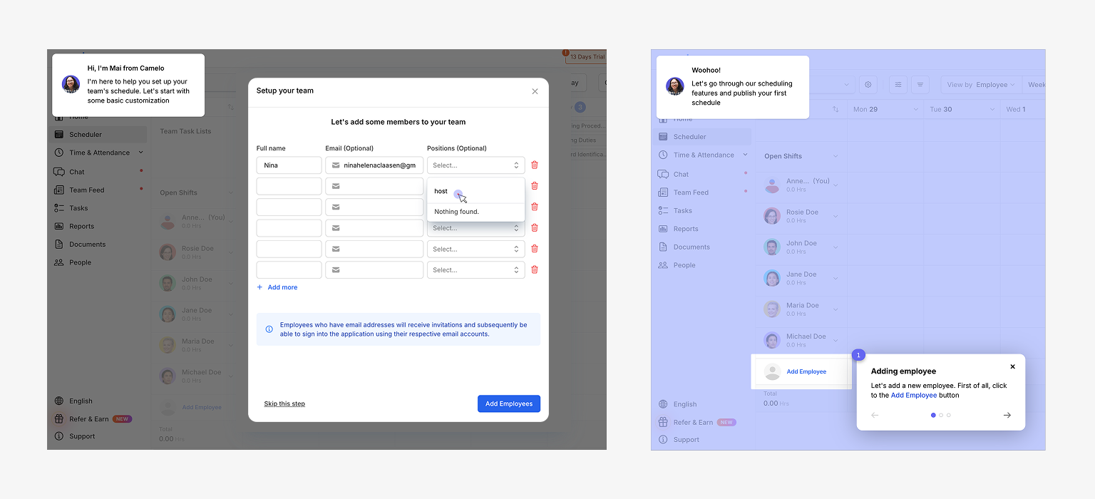
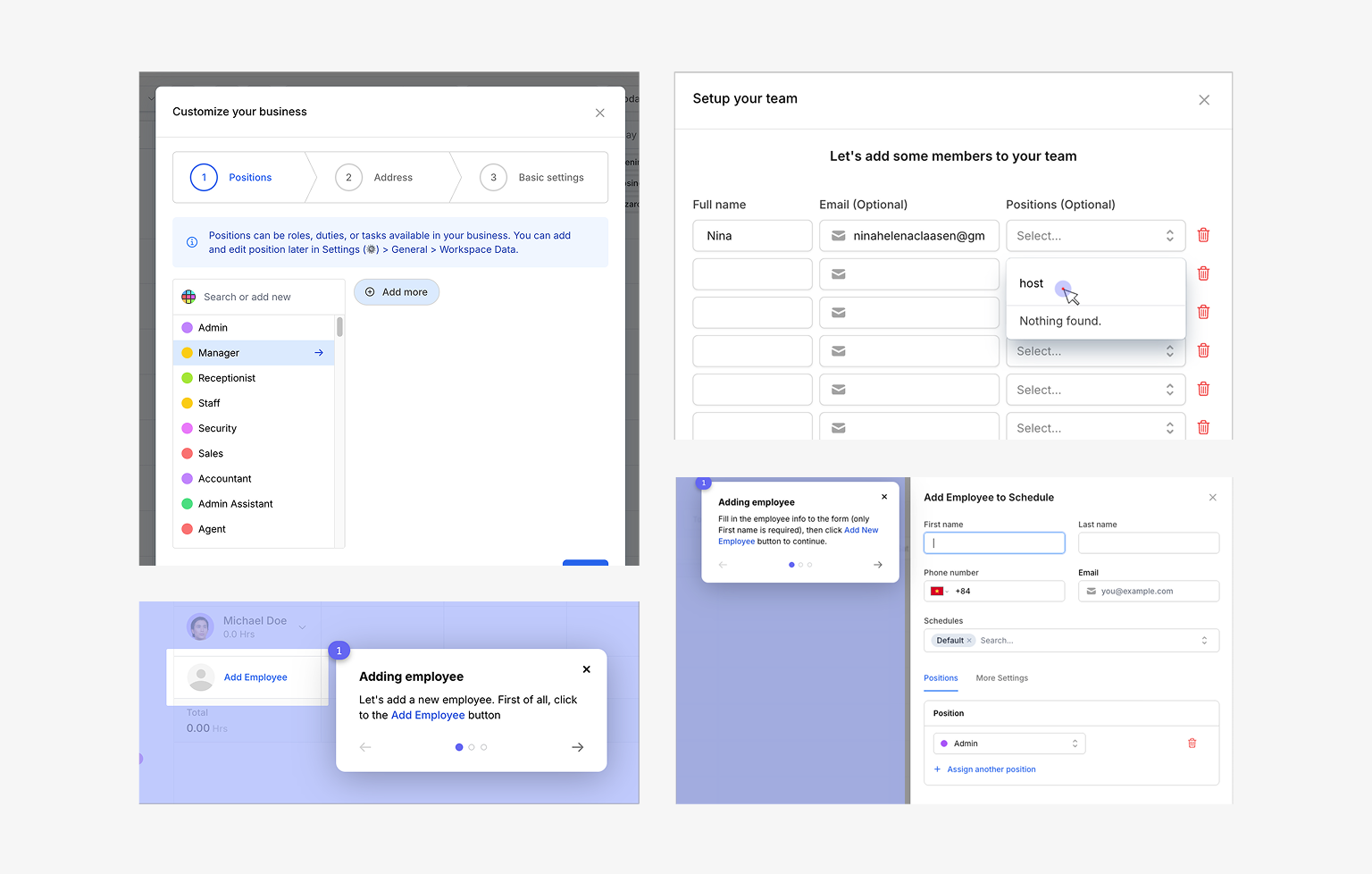
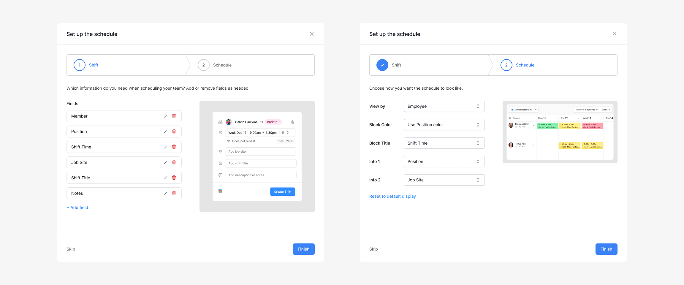
Enhanced Setup Modals
I updated the setup modals to better reflect how the product had evolved and and remove the friction points uncovered during the audit.
Improvements included:
- Pre-select positions based on industry
- Expand Locations to support fixed and client job sites
- Let users add a new position on the spot while filling in team member details
Coaching Marks
Long guided tours are often ignored, so I kept only a few lightweight coaching marks that appeared when users first encountered key actions.
Contextual Tooltips
Some concepts only make sense once users start using the product. Instead of introducing them during setup, contextual tooltips appear after relevant actions. For example, explaining drag-and-drop after users create their first few draft shifts.
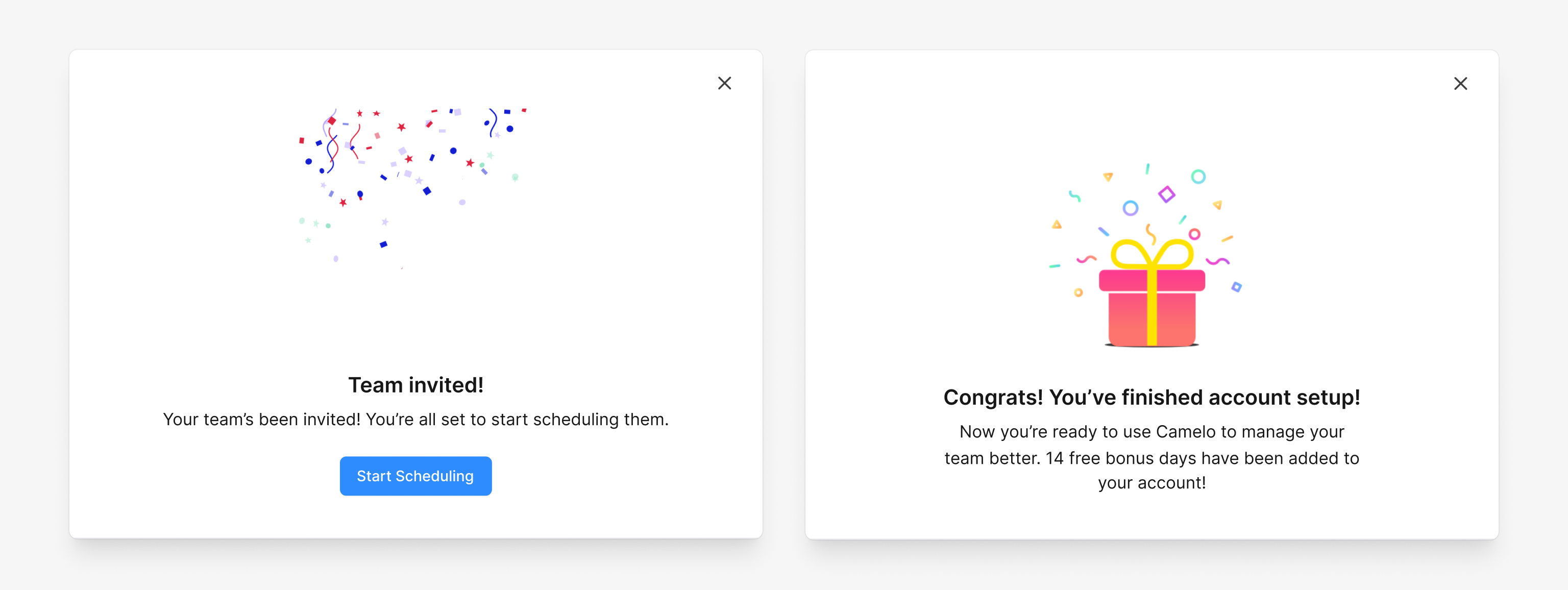
Rewards
To encourage continued progress, completing each milestone rewards users with bonus trial days and points them to the next step. The reward reinforces momentum.
Impact
Results
The redesigned onboarding increased the core activation rate from 47% to 59%, helping significantly more new users reach their first schedule.
+12pts
improvement in core activation rate
59%
of new users published their first schedule
Qualitative outcomes:
- Session recordings showed less backtracking and fewer signs of frustration.
- Customer Success reported fewer onboarding-related complaints after launch.
Time clock setup and first message were new onboarding milestones introduced to encourage broader product adoption. Because they were new, they’ll be evaluated over time rather than compared against a historical baseline.
Reflection
What I Learned
Onboarding is not about explaining every feature.
Onboarding isn’t about explaining every feature. It’s about helping users reach value quickly while staying out of their way.
Users like to explore on their own.
Forcing a linear path creates friction. The best onboarding gives users a reliable structure they can return to while letting them move at their own pace.
Onboarding is never really "done".
The product evolves, user expectations shift, and positioning changes. Good onboarding is a continuous refinement, not a one-time redesign.
What I'd Explore Next
Step-level tracking
Go deeper on per-step analytics to pinpoint exactly where users get stuck, not just where they drop off.
Contextual nudges
Experiment with in-app nudges that surface incomplete steps based on what users are already doing.