Overview
Context & Problem
Camelo is a shift scheduling and employee management app. Chat was well-used on mobile: teams relied on it to coordinate shifts, ask questions, and stay in sync. But the feature didn't exist on web.
For managers, this created a constant context-switch. They spent most of their time on desktop planning schedules, but had to reach for their phone just to reply to a message, often mid-task. Several had asked for a web version directly.
Goals & Needs
Business goals
- Reduce device switching
- Increase engagement on desktop
- Keep feature parity
User needs
- Manage conversations more efficiently on larger screens
- Communicate without leaving their desktop workflow
How do we bring Chat to web without losing what made it work on mobile, and without overbuilding the first version?
Highlights
I designed Chat for web: the same core experience as mobile, adapted for a larger screen, scoped to ship within a month.
One month after launch, 73% of mobile Chat users adopted Chat on web and 68% of active web users started using Chat.
Research & Discovery
Research & Insights
Before designing, I looked at analytics, session recordings, competitor patterns, and user feedback to understand how teams communicated across devices.
Users were already living on both platforms
Analytics showed 73% of active mobile Chat users also logged into web weekly. Managers were the heaviest cross-device users, often moving between scheduling and messaging throughout the day.
Session recordings showed where mobile fell short. It handled quick updates and shift confirmations well, but broke down for longer conversations, searching older messages, or managing multiple chats while doing other work.
Desktop and mobile carry different expectations
The web version couldn’t simply mirror mobile. Besides reading messages on a bigger screen, people were also scheduling shifts, checking employee details, and switching between conversations.
Desktop users expected faster scanning, a persistent conversation list, easier access to message history, and room to multitask. At the same time, familiar mobile patterns like message grouping, reactions, attachments, and read states still needed to carry over.
These findings shaped the design challenge: create a desktop workflow that supported scanning and multitasking without making Chat feel like a separate product.
| Mobile | Desktop |
|---|---|
| quick replies | longer conversations |
| one conversation | many conversations |
| temporary | persistent |
| focused | multitasking |
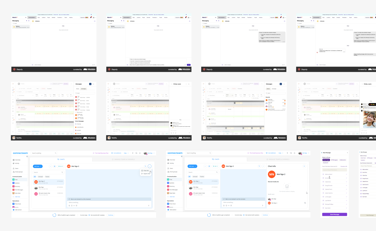
Competitive Analysis
I looked at competitors and messaging apps to compare layout and interaction patterns. Layouts varied, but most kept chat and feed-style features as separate navigation items.
This supported two directions for the web version: use familiar desktop chat conventions, and separate real-time messages from structured posts.
Process
Explorations & iterations
The research narrowed the work into three design questions: how the interface should be organized, how messaging should be structured, and what belonged in the first release.
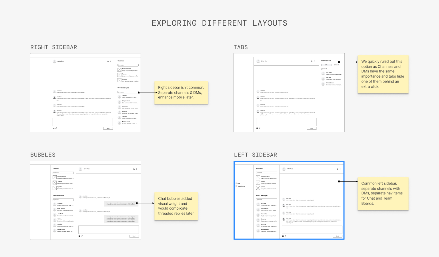
Exploring different layouts
Desktop users needed to switch between conversations quickly without losing context. I explored four layout directions before choosing a persistent conversation list beside the active thread.
The main concern was density: could the app’s sidebar and a chat panel sit side by side without feeling crowded? Testing showed users preferred the visibility. They wanted the chat list to stay in view so they could move between conversations faster.
The final layout kept the main thread spacious while leaving room for a future right panel for conversation details.
Separating Chat and Team Boards
Another question was whether Chat and Team Boards should continue sharing the same Inbox on web. On mobile, this worked as tabs. On desktop, it made less sense.
Team Boards supported longer posts, comments, and threads, while Chat supported real-time messaging. Grouping them together blurred the difference and made both harder to find.
We split them into separate navigation items so each communication type had a clearer home.
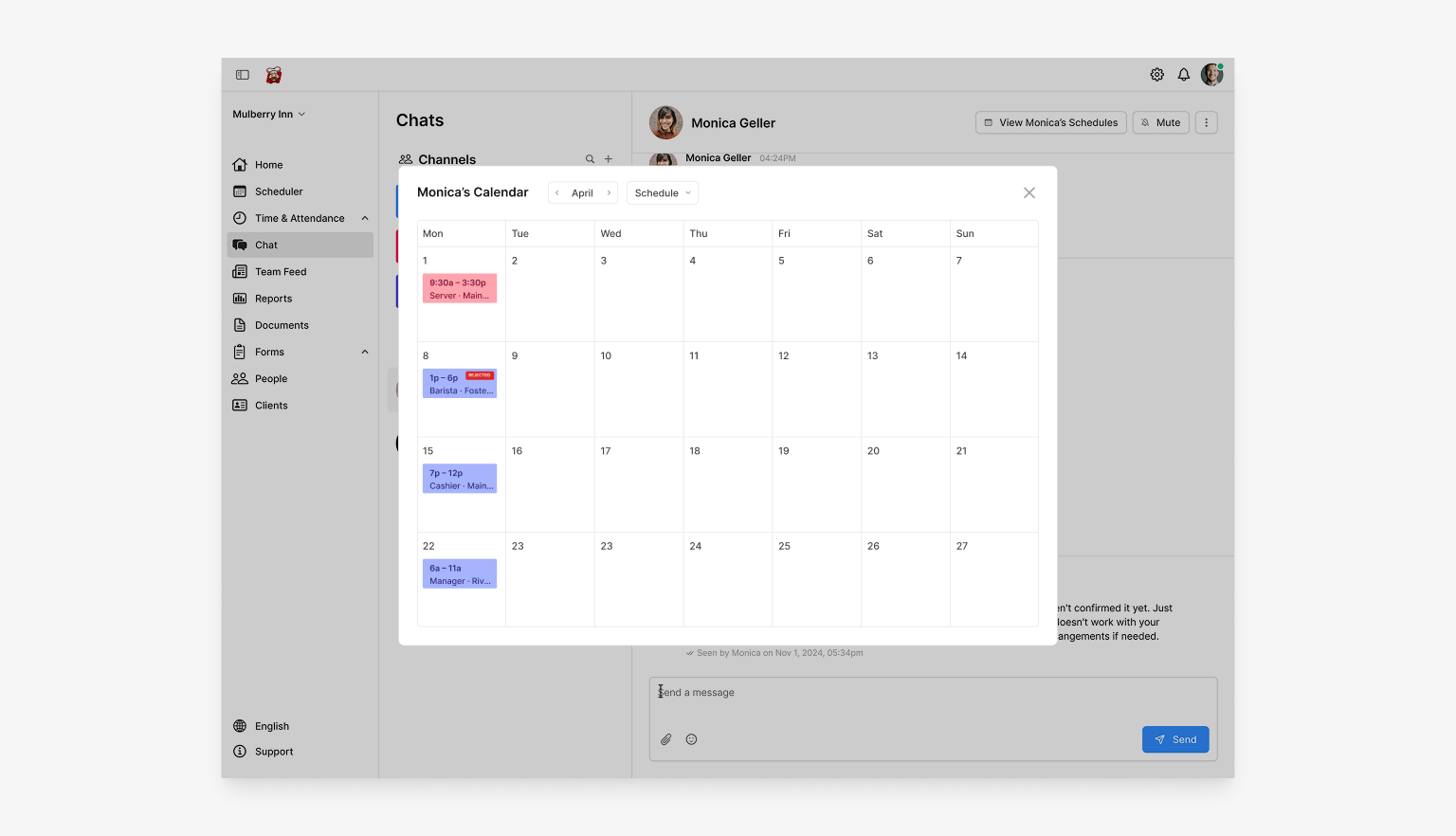
Supporting better multitasking
Messaging was rarely the only task happening on desktop. Managers often checked schedules or employee details while replying, so I explored ways to keep those workflows connected.
Modal and slide-in concepts tested well because they let users reference related information without leaving Chat.
Staying within scope, with scalability in mind
With the core desktop experience taking shape, the remaining question was what should be prioritized.
We kept v1 close to mobile parity and held back extras like message edits, thread replies, and expanded emoji options. That kept the experience consistent across platforms and reduced maintenance pressure.
The layout still left room to scale, including a future right panel for conversation details and space for threaded replies.
Final Design
Highlights of the final design
Those decisions came together in a desktop experience that stayed familiar to existing users while taking advantage of the larger screen.
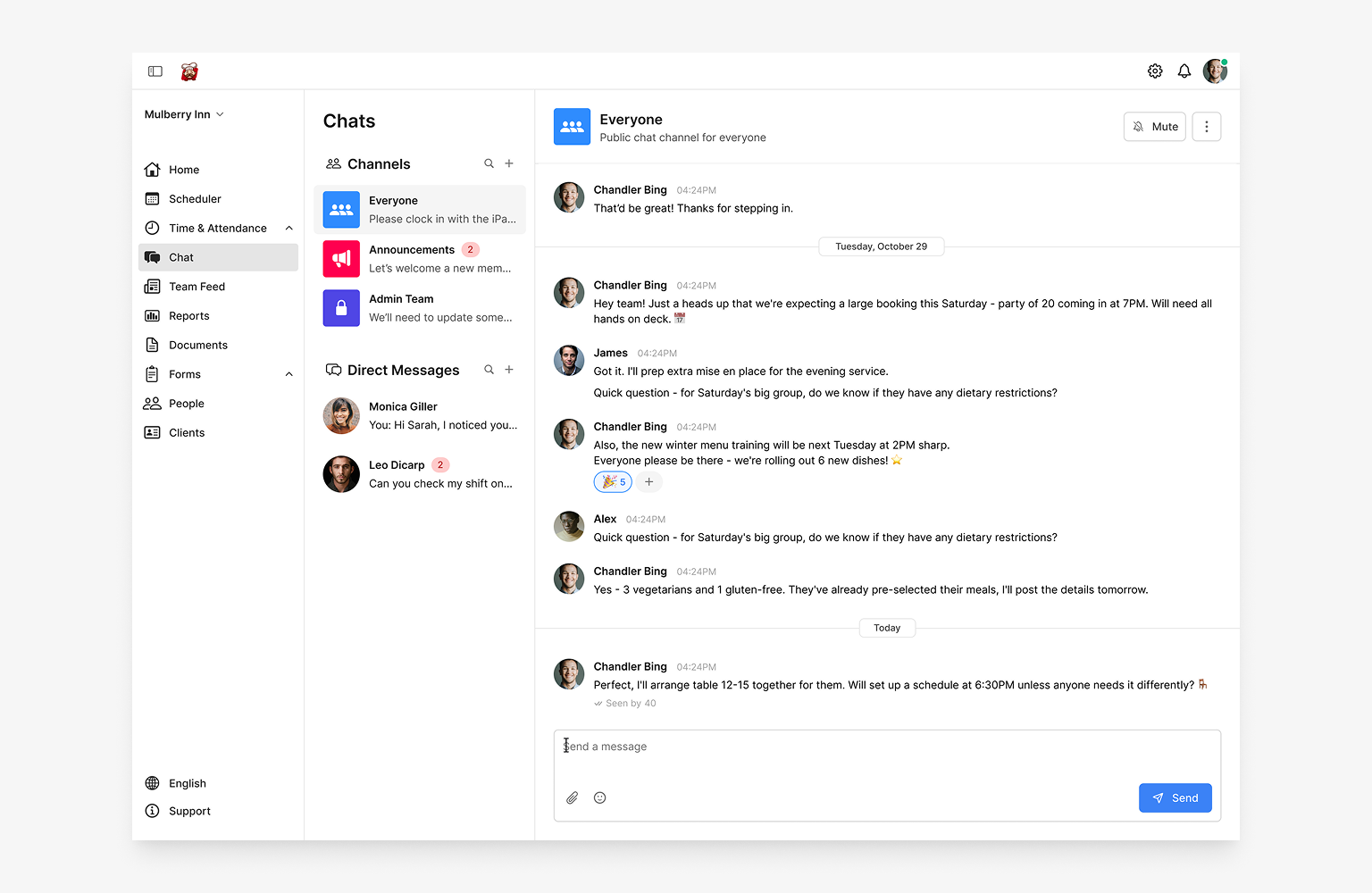
A layout built for scanning and multitasking
The final layout keeps a persistent conversation list on the left and the active thread on the right. This matches how managers actually work on desktop: keeping context visible while moving between conversations and other tasks.
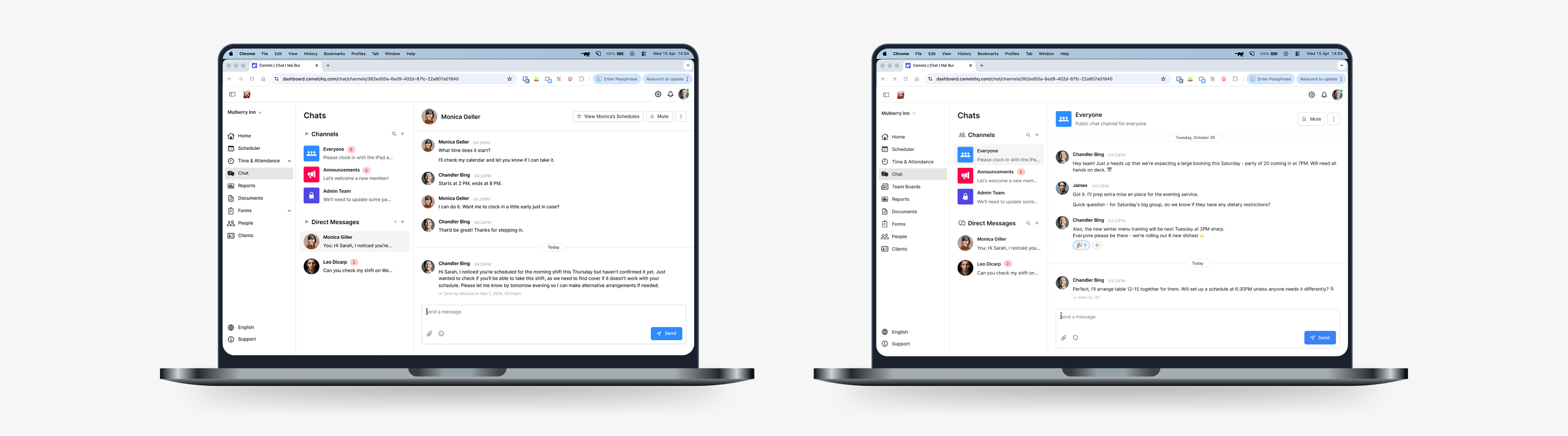
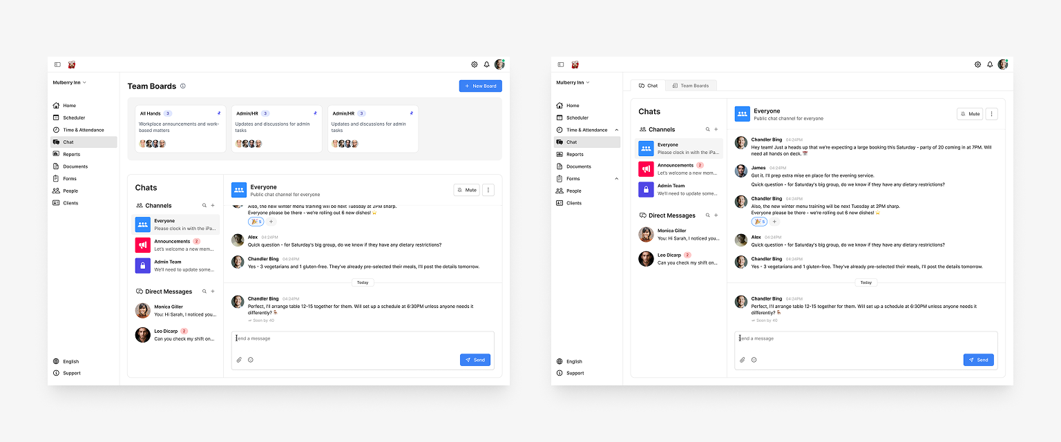
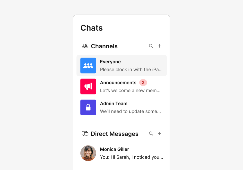
Separate channels & direct messages
On mobile, all conversations live in a single list with no distinction between channels and direct messages. On web, I split them into separate sections in the left panel so it's easier to scan and tell the two apart at a glance.
Browse and add channels
Users can browse available channels and join the ones relevant to them. Channels can be set to private or public depending on their purposes.
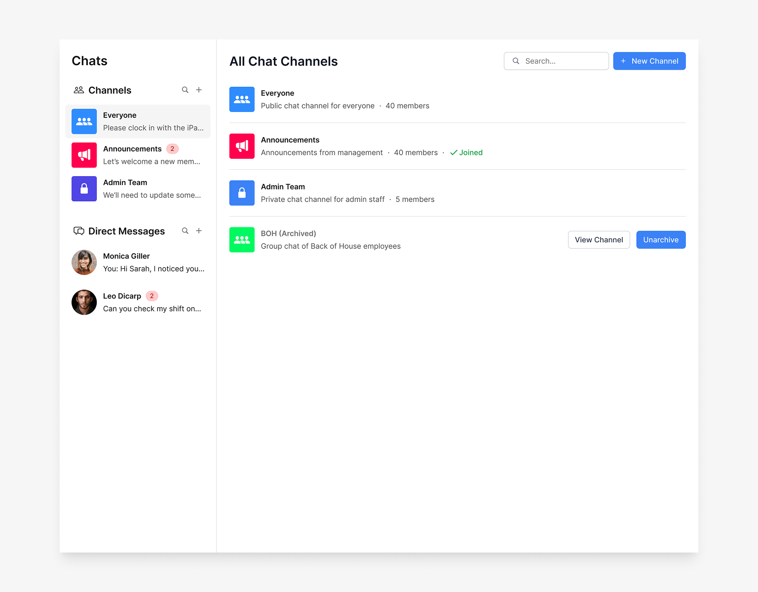
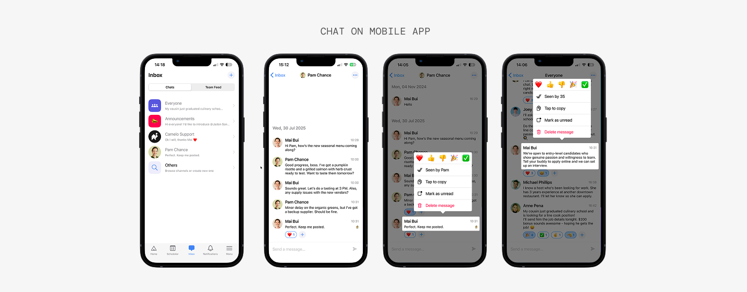
Reactions
Hover a message to react. Emoji options match the ones available on mobile so reactions stay consistent across platforms.
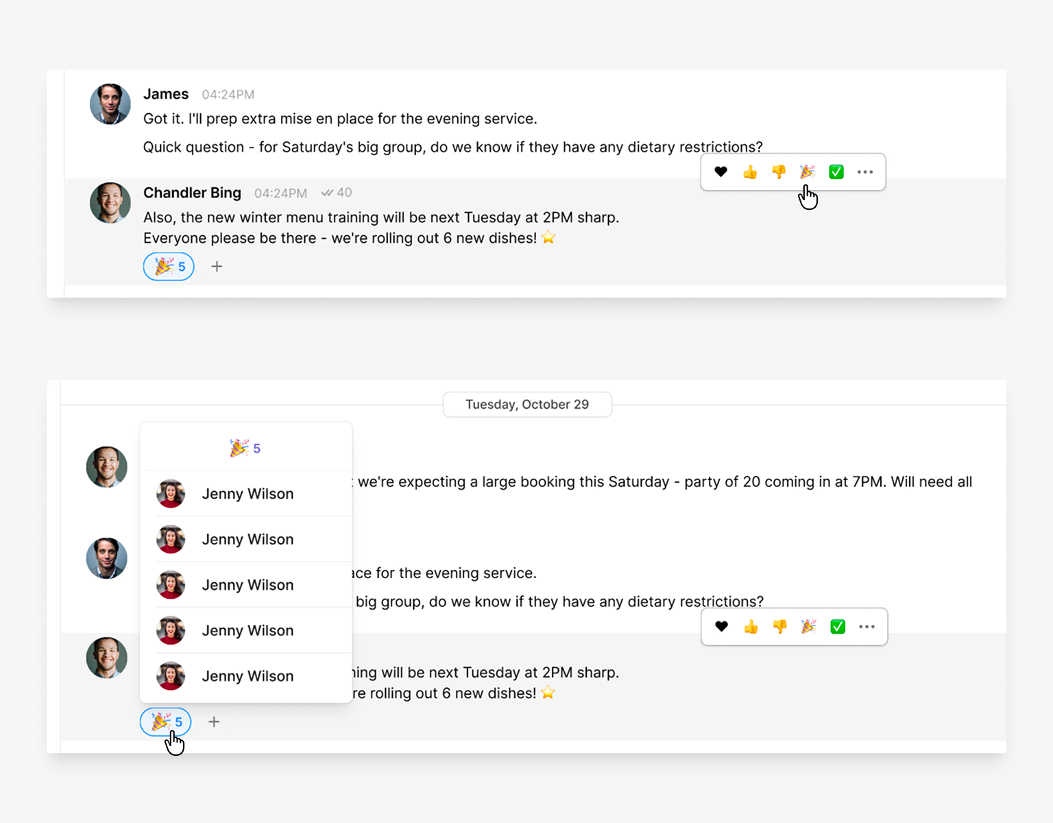
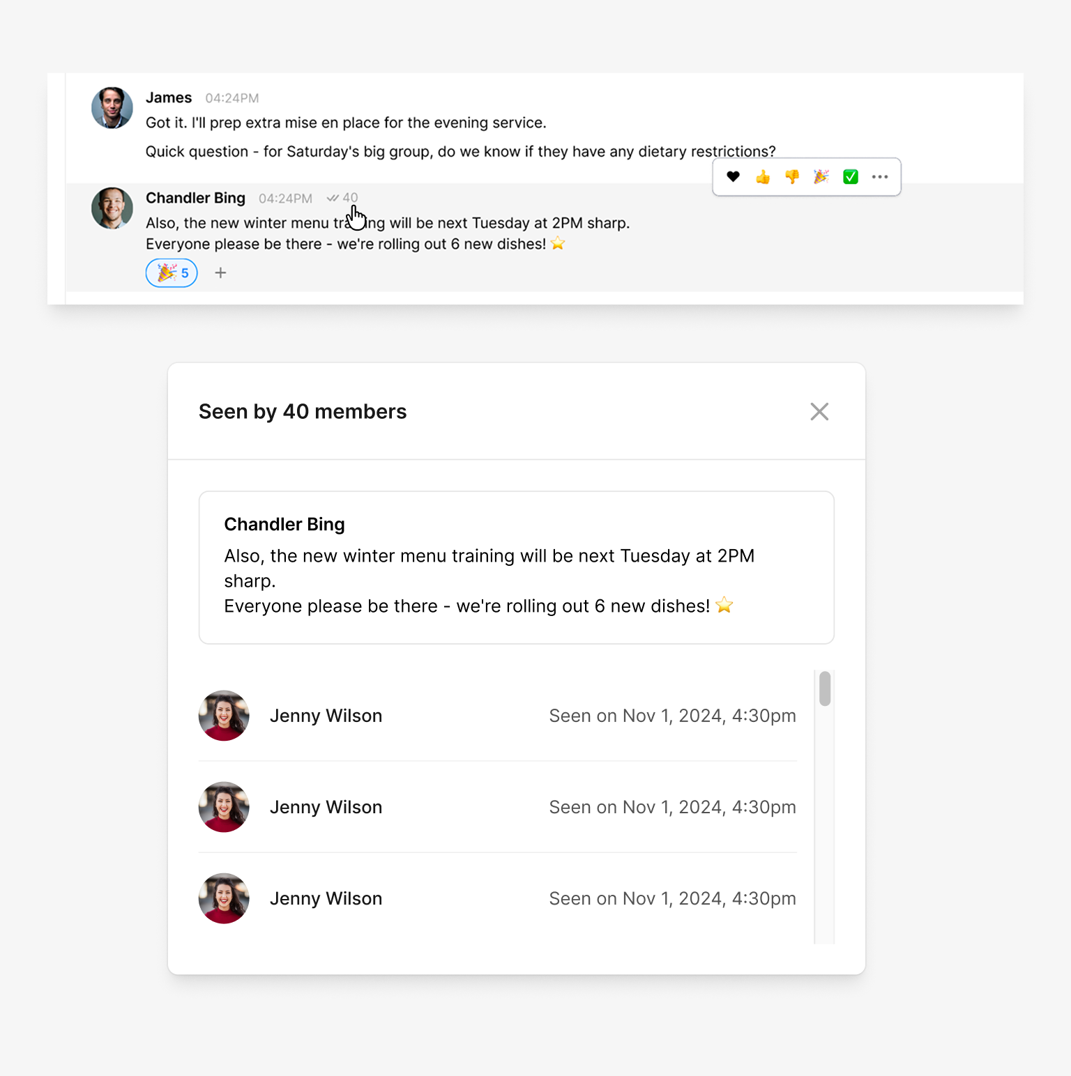
Read receipts
Read receipts appear on hover or through the message menu, keeping the information accessible without cluttering the conversation view.
Impact
Results
Within one month, Chat on web reached both key audiences: existing mobile Chat users and active web users. 73% of mobile Chat users also use Chat on web. 68% of active web users adopted Chat on web. Managers could now stay in their desktop workflow instead of switching devices to reply.
73%
of mobile Chat users adopted Chat on web
68%
of active web users started using Chat
Reflection
What I Learned
Information density matters more on web.
Mobile chat is often single-column and minimal. On web, users scan more. They expect a visible conversation list, side panels for context, and easier navigation across multiple conversations.
Scoping tightly is a design decision, not a compromise.
Shipping parity first without extras kept the feature consistent across platforms. Every nice-to-have we held back was one less inconsistency to maintain, and deferring them kept the door open to implementing them properly later.