Overview
Context
Camelo's Time Off page showed requests as a list. It worked well for approving individual requests, but gave managers no sense of the bigger picture. Who else was off that week? How long did a request span? Would the team be short-staffed?
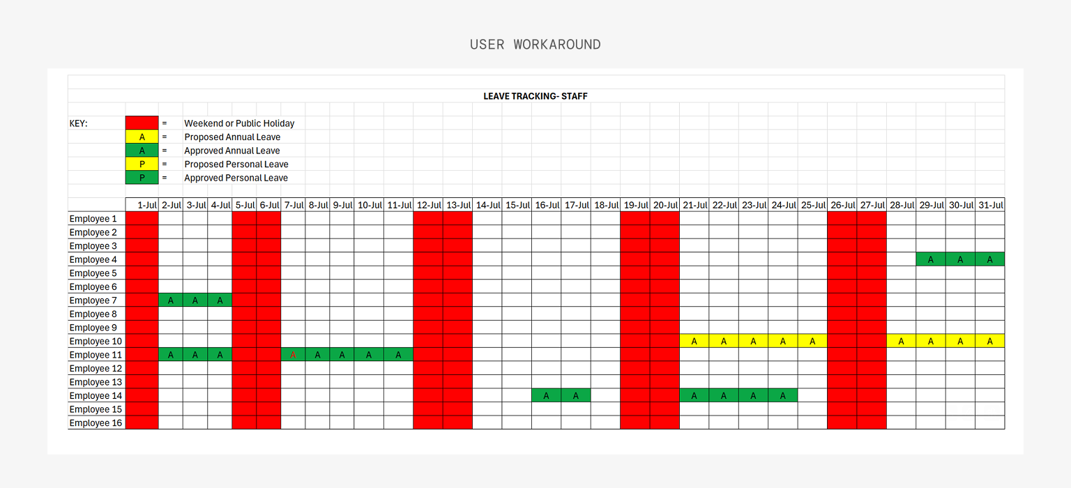
To answer those questions, some managers built spreadsheets in Google Sheets or Excel and color-coded statuses by hand. Others kept switching between the Time Off page and the Schedule page to piece the information together themselves.
Goals & Needs
Business goals
- Reduce reliance on external tools and keep time-off planning inside Camelo
- Extend Time Off beyond request management
User needs
Give managers a clear view of who's away and when, so they can plan coverage without leaving Camelo.
How do we give managers a full picture of time off without pulling them away from the approval flow?
Highlights
I designed a calendar view alongside the existing list, giving managers a full picture of time off across their team at a glance.
One month after launch, 64% of Time Off users had switched to the calendar view. Users who had built their own spreadsheet workarounds reported they no longer needed them.
Research & Discovery
Research & Audit
I looked at how managers process time off and how other apps on the market handled this calendar feature.
Looking at how managers process time off
To understand how managers were actually handling time off, we ran user interviews, sent a short survey, and reviewed session recordings.
User interviews surfaced a clear pattern. One manager showed us a spreadsheet calendar they had built by hand, with color codes for different statuses and types of leave. It was their way of seeing who would be away on a given day and spotting overlaps before approving new requests.
Session recordings confirmed it: managers were repeatedly switching between the Time Off page and the Schedule page to piece together who was available.
The list view was built for processing single requests, not seeing the full picture
The current Time Off page worked well when a manager wanted to act on a single request. They could see the details, approve or decline, and move on.
But it couldn't answer the questions that came up while planning:
- Who else is off that week/month?
- How long is this request, and does it overlap with anyone?
- Is anyone taking more time off than usual in this period?
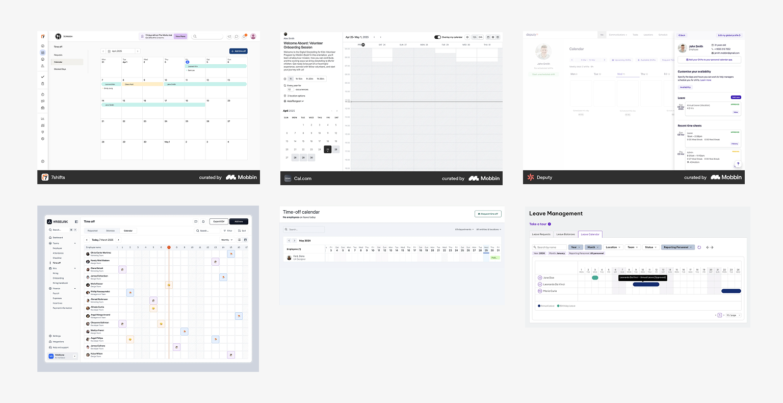
Market analysis
I looked at how scheduling and HR tools approached calendar views and how they handled density, color, and interaction patterns.
Most products solved density differently. Some relied heavily on color, others compressed requests into tiny indicators. Reviewing these patterns helped identify tradeoffs between readability and information density before exploring our own approach.
The research showed managers were struggling to understand time-off requests in context. The missing piece was a visualization that supported planning.
Process
Explorations & Design Decisions
Every decision came back to two guiding principles:
01
Scanning first, configuration second
A calendar's job is to help managers see patterns at a glance, not just manage individual records.
02
Manage density carefully
A calendar can fill up fast. Surface the essentials, hide the rest behind interaction.
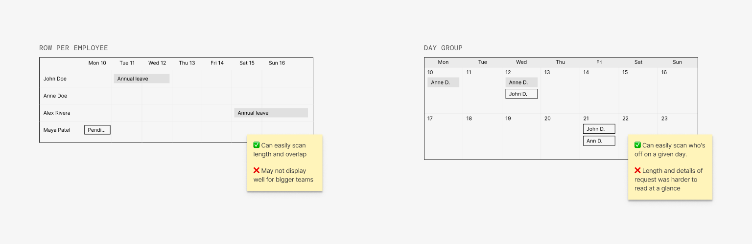
Choosing how to represent time off in a cell
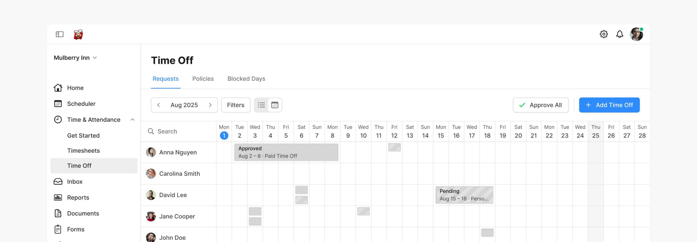
A calendar cell sometimes needed to show multiple requests or partial-day leave, so I explored several ways to represent them. The final direction used a labeled block per request, with status shown through fill style rather than color. It stayed readable even on busy weeks.
Choosing colors for status
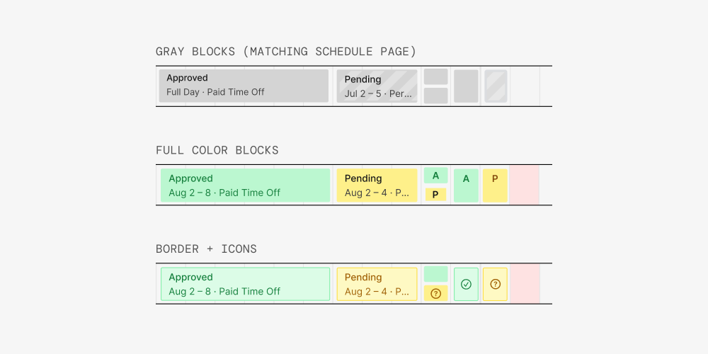
The calendar needed to distinguish pending requests, approved requests, and public holidays.
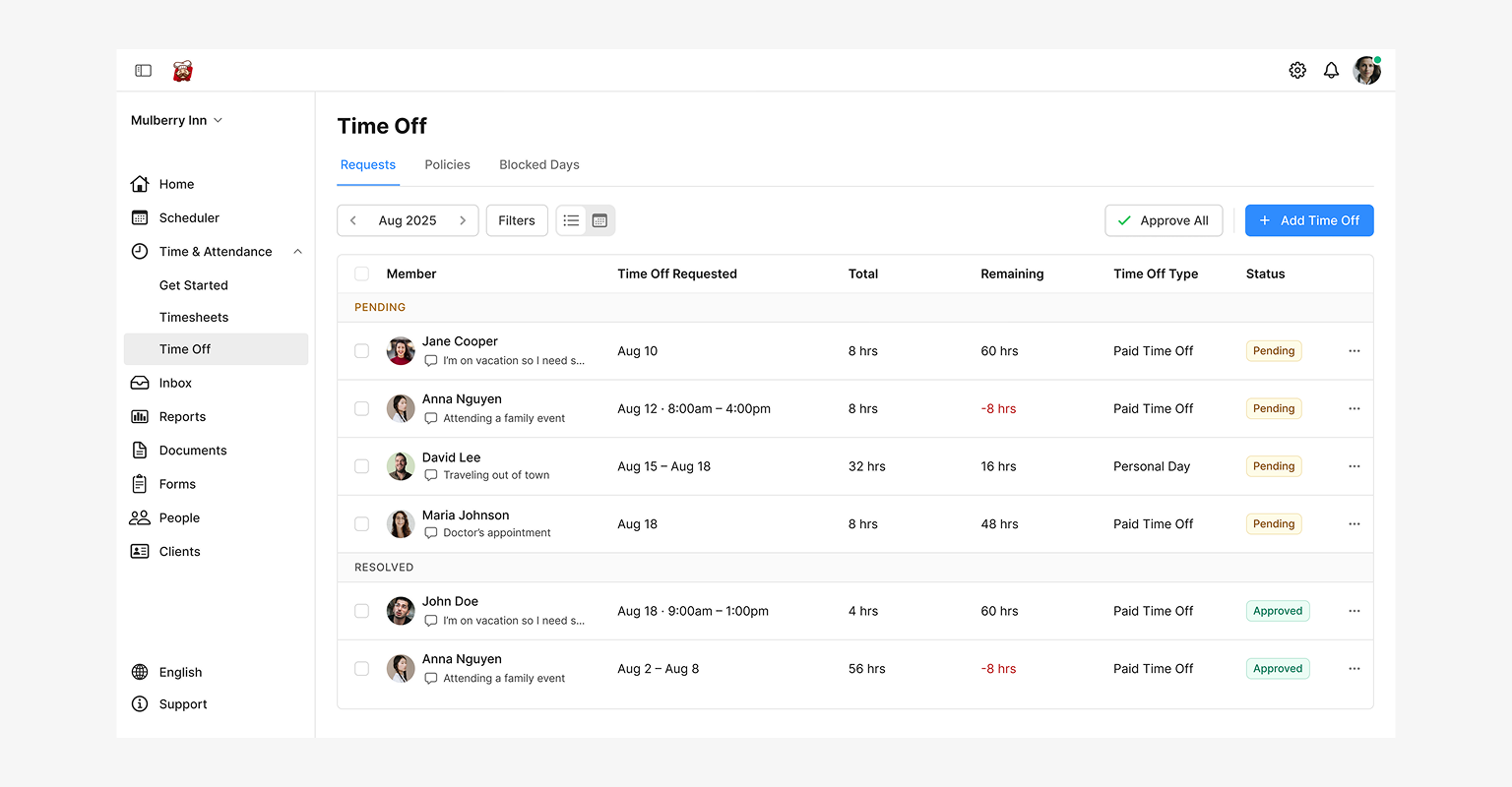
Rather than introducing new colors, I reused the visual patterns already established in the Scheduler: striped blocks for pending, solid gray for approved, and gray backgrounds for holidays. This kept the experience familiar and consistent.
Handling partial days and multiple days
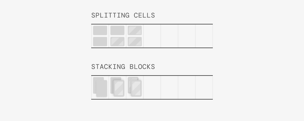
A calendar cell needed to support full-day requests, partial-day requests, and occasional overlaps. Looking at real usage data, more than two requests on a day was extremely rare, so I capped the display at two blocks per cell.
I explored stacked blocks and split cells, but both reduced readability, especially once different statuses were introduced. Limiting the display kept the calendar easy to scan without optimizing for edge cases.
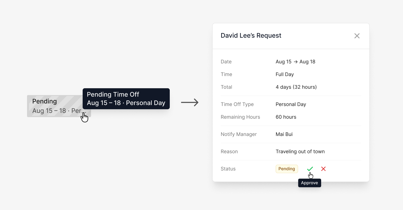
Keeping approval in context
Introducing a calendar risked splitting the workflow into two separate experiences. Instead of creating a new approval flow, I reused the existing request modal and surfaced it through hover tooltips, letting managers review and act on requests without leaving the calendar.
Final Design
Final Design
A calendar view that sits alongside the existing list, designed for fast scanning and quick decisions.
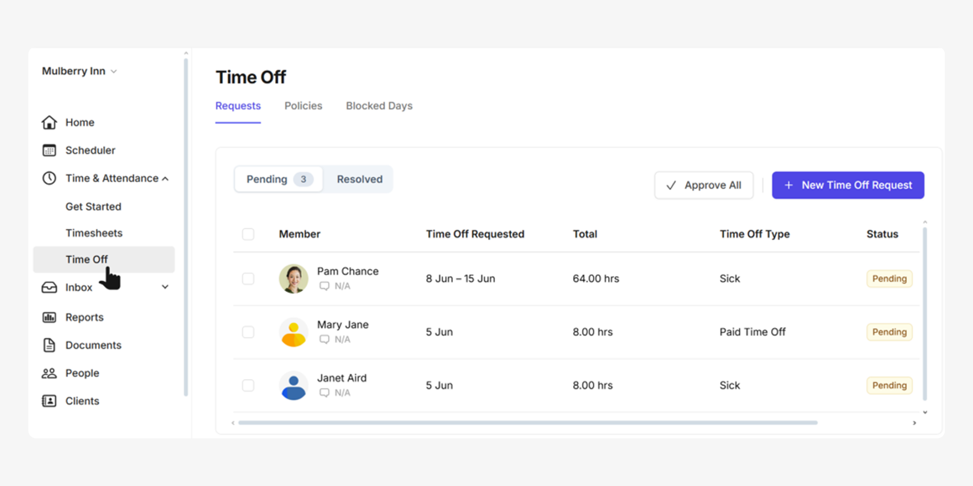
List and Calendar: Two views for two different jobs
Managers can move between the existing List View and the new Calendar View depending on what they need to do. Lists for processing one request at a time. Calendar for seeing the bigger picture.
Reusing familiar status patterns
Pending, approved, and public holidays are shown with the same visual language used in the Scheduler. Striped blocks for pending. Solid gray for approved. Gray background for holidays.
Partial and multiple time off in a day
Each cell supports full-day, partial-day, and up to two requests on the same day. Beyond that, the calendar stays readable.
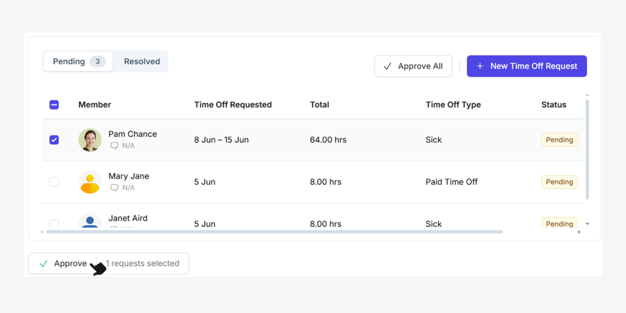
Approving without leaving the calendar
Clicking a time-off block opens the request details with approve and decline actions inline. The same modal used in the list view, so managers don't have to learn a new interaction.
Click any block to see the request and act on it without leaving the calendar.
Refining the existing list view
Although the calendar was the main addition, I also updated the list view to improve readability, hierarchy, and consistency. Managers still spent time here approving requests, so both views needed to feel like parts of the same experience.
Impact
Results
Instead of reviewing requests one by one, managers could now see availability across the team at a glance, spot patterns, and anticipate staffing gaps. The work that used to require a separate tool now happened directly in Camelo.
64% of Time Off users adopted the calendar within the first month. Managers who previously maintained spreadsheet calendars reported they stopped updating them after adopting the calendar. And feedback showed it became the go-to tool for planning while the list remained useful for approvals and administration.
64%
Time Off users adopted the calendar within the first month
Reflection
What I Learned
Calendar is mainly a scanning tool.
Designing a calendar is less about managing records and more about helping users spot patterns, availability, and risk. That shifted my focus from displaying every detail to presenting just enough information for fast, confident scanning.
Status clarity is not simple.
Pending vs. approved, partial vs. full, one vs. multiple — each of these states needs to be instantly readable. Small ambiguity creates a lot of confusion in workplace tools.