Camelo is a workforce management tool made for shift-based teams and hourly workers. Its core feature is employee scheduling.
When I joined the project, the signup flow had a 48% completion rate, with many users dropping off at the first step. This prevented users from experiencing the core value of the product — creating and publishing schedules.
I redesigned the signup experience into a clearer, more progressive flow that reduced early friction and helped users move forward with confidence.
As a result, completion rate increased from 48% to 55%, and activation rate increased from 31% to 40%.
Note: As the product is still evolving, impact metrics represent early estimates based on available analytics.

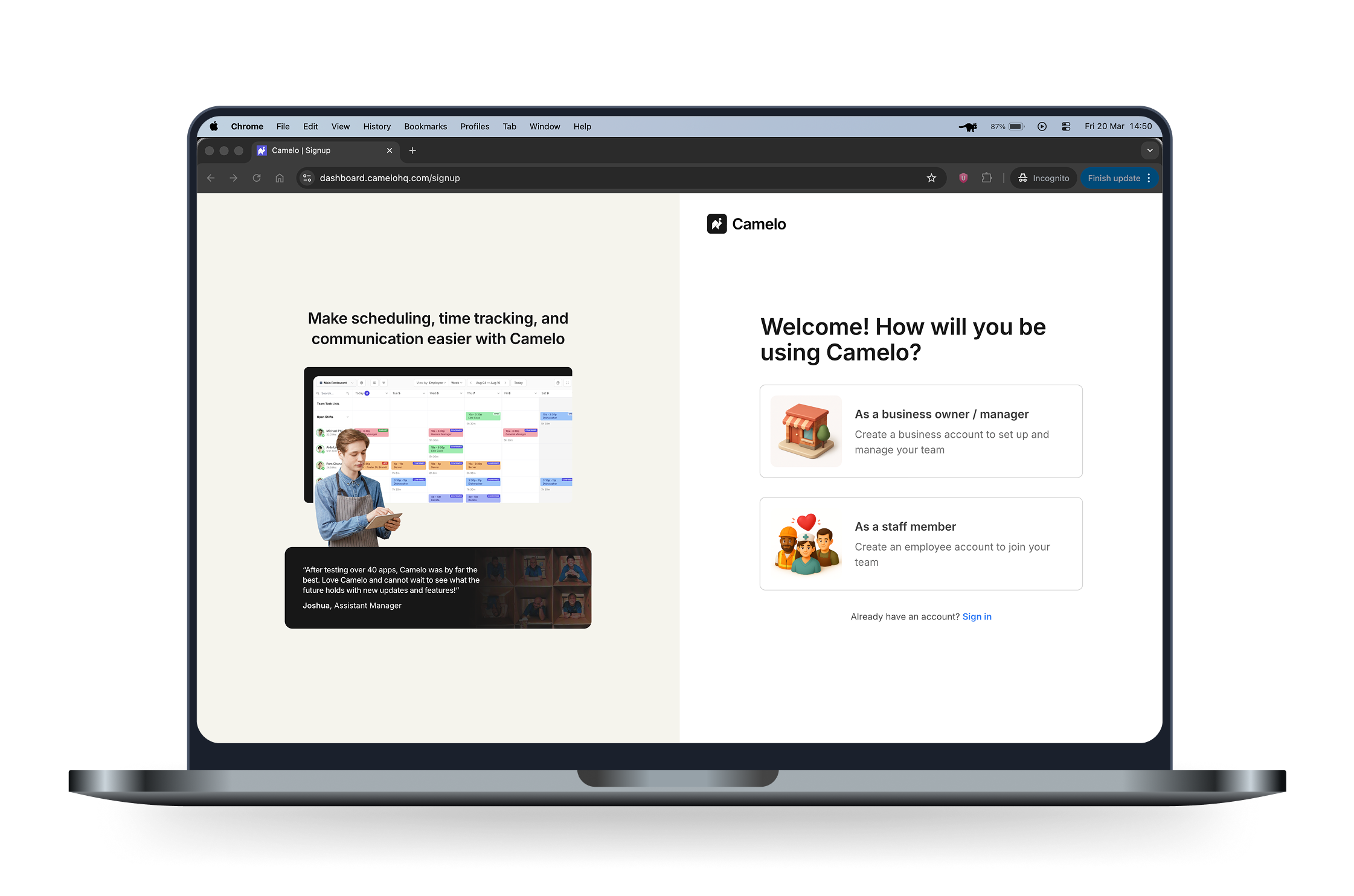
Finding out the problems of the old signup flow
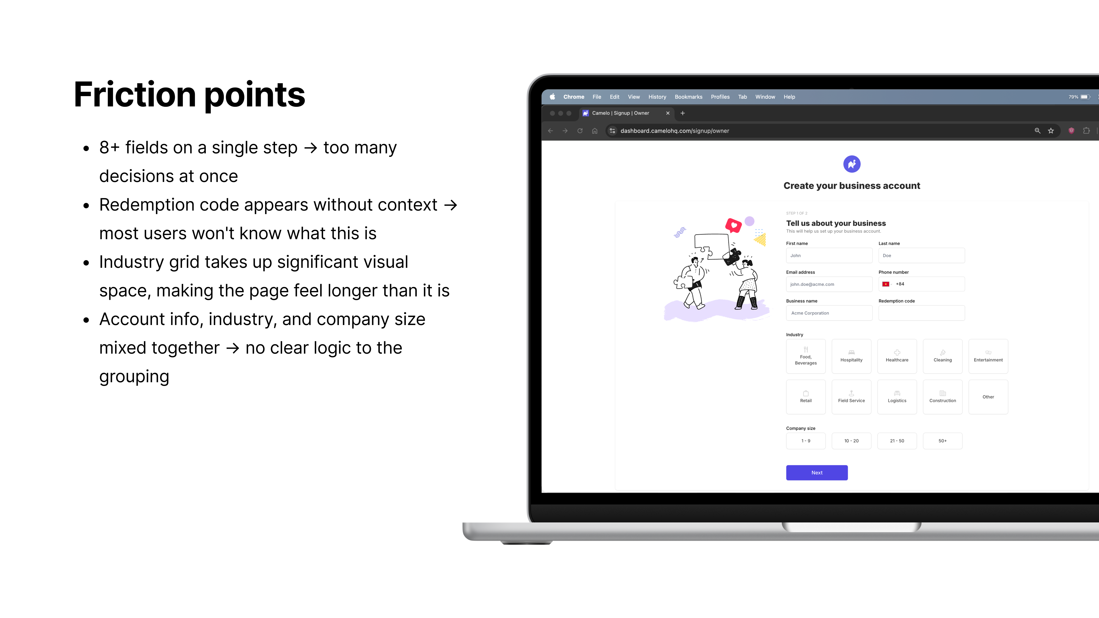
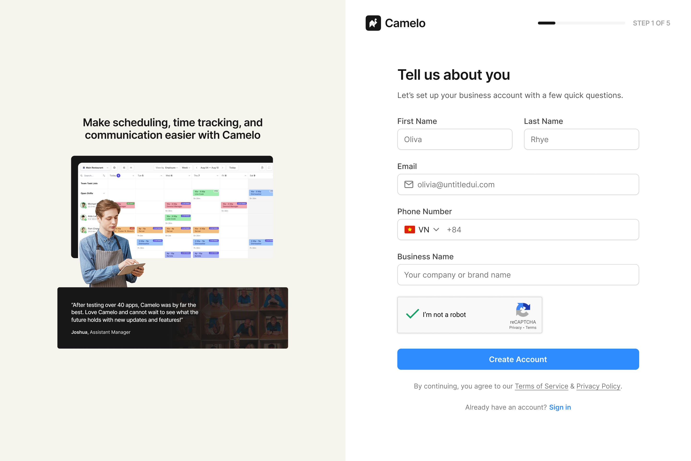
Although the signup flow had only three screens, each screen contained many fields. Users were asked to make too many decisions at once.
Step 1 in the old sign up flow
Questions were ungrouped and lacked context. Each step felt more demanding than it needed to be.
Step 2 in the old sign up flow
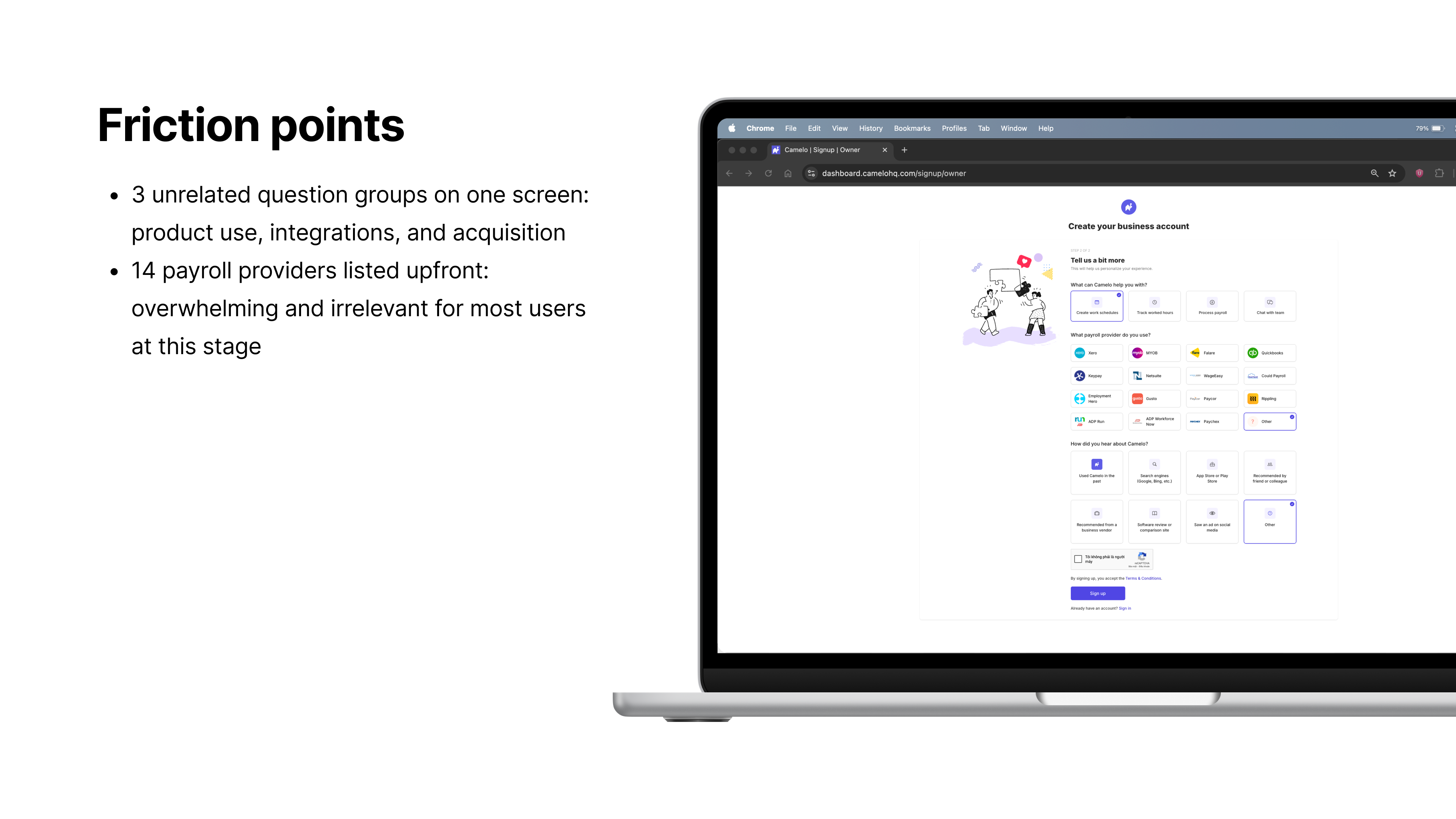
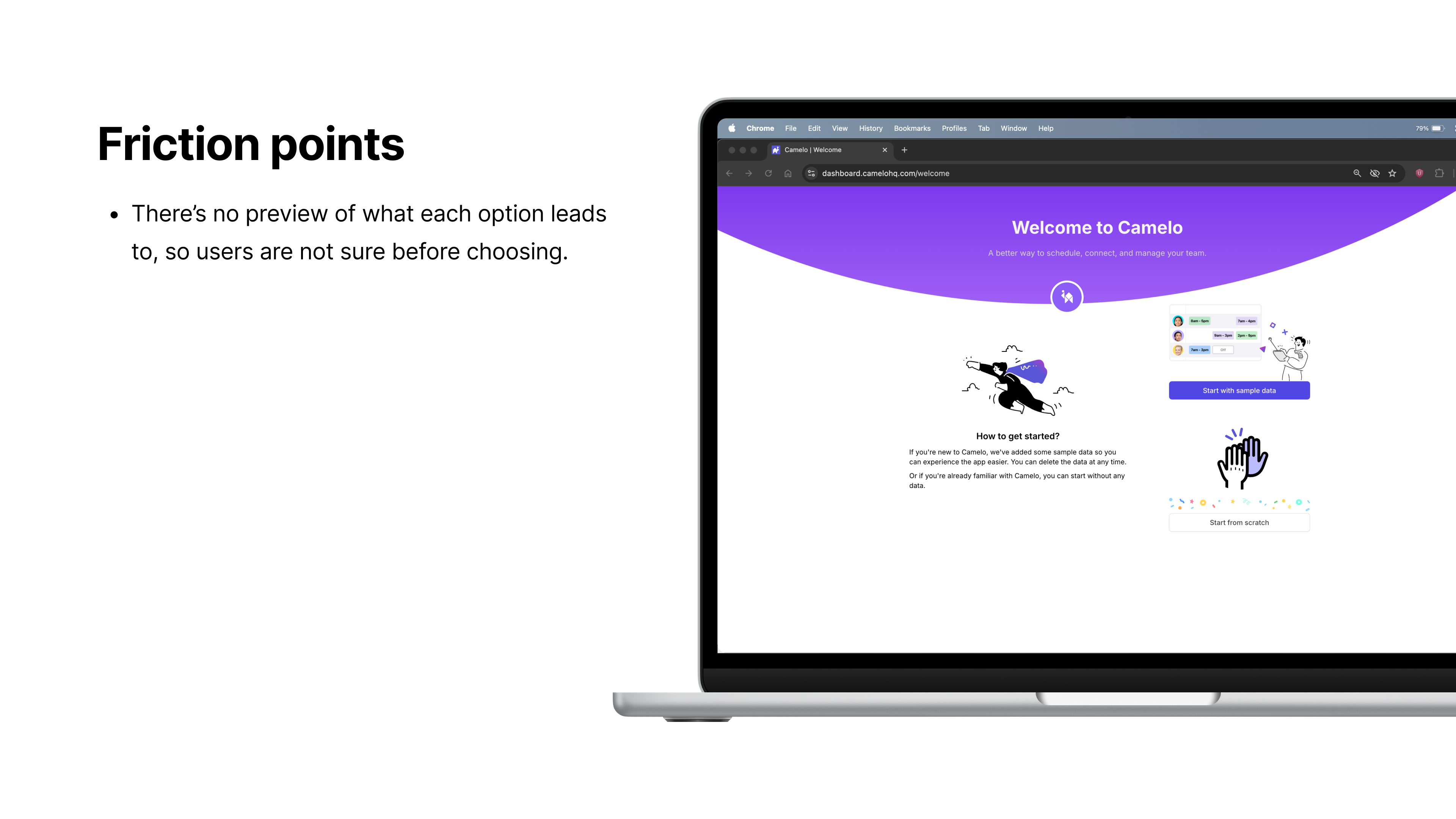
The final screen offered two options with no preview of what each would lead to. Users had to guess before committing.
Step 3 in the old sign up flow
Approach
PostHog showed a significant gap between signup page views and completed “workspace signed up” events, but without step-level tracking there was no way to pinpoint exactly where users were dropping off. Given a short timeline and a lean team, I focused on diagnosing the flow through a manual audit rather than waiting for more granular data.
I audited each field to understand whether it was necessary at signup. Some inputs were useful later in the product but not critical for getting started. Some I initially considered removing, but the team needed them for marketing purposes — understanding how users discovered Camelo and which features they cared about. Rather than cutting them, I kept them in a separate step so they wouldn’t add to the cognitive load of setup.
I also reviewed how similar tools structure their flows. Most asked for a comparable amount of information but grouped it more logically. This confirmed that the issue wasn’t the volume of questions, but how they were organized.
Key UX opportunities
Break the flow into smaller, progressive steps
Users were dropping off at the first step — a single screen with too many decisions. Splitting the flow into focused steps would reduce that early pressure.
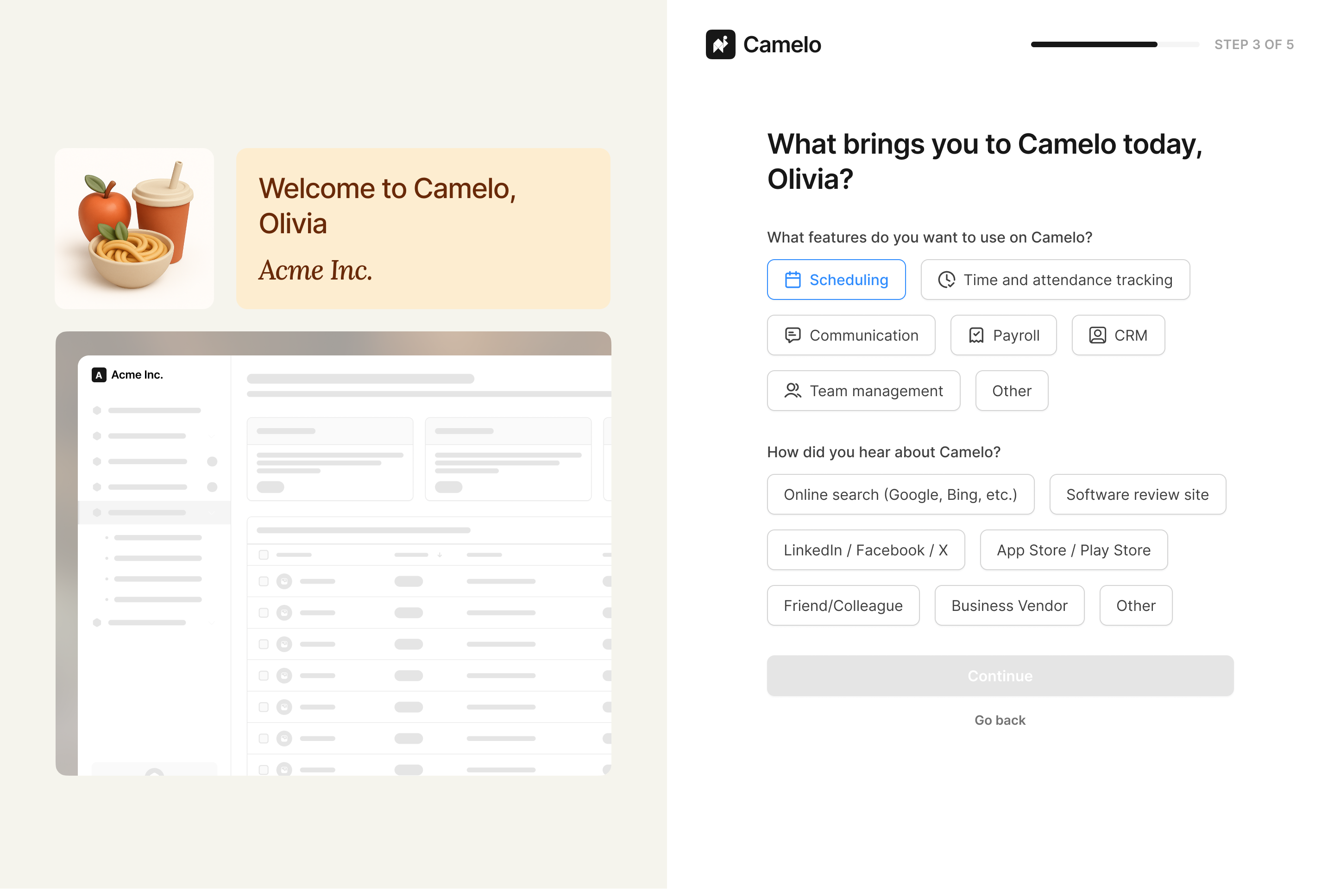
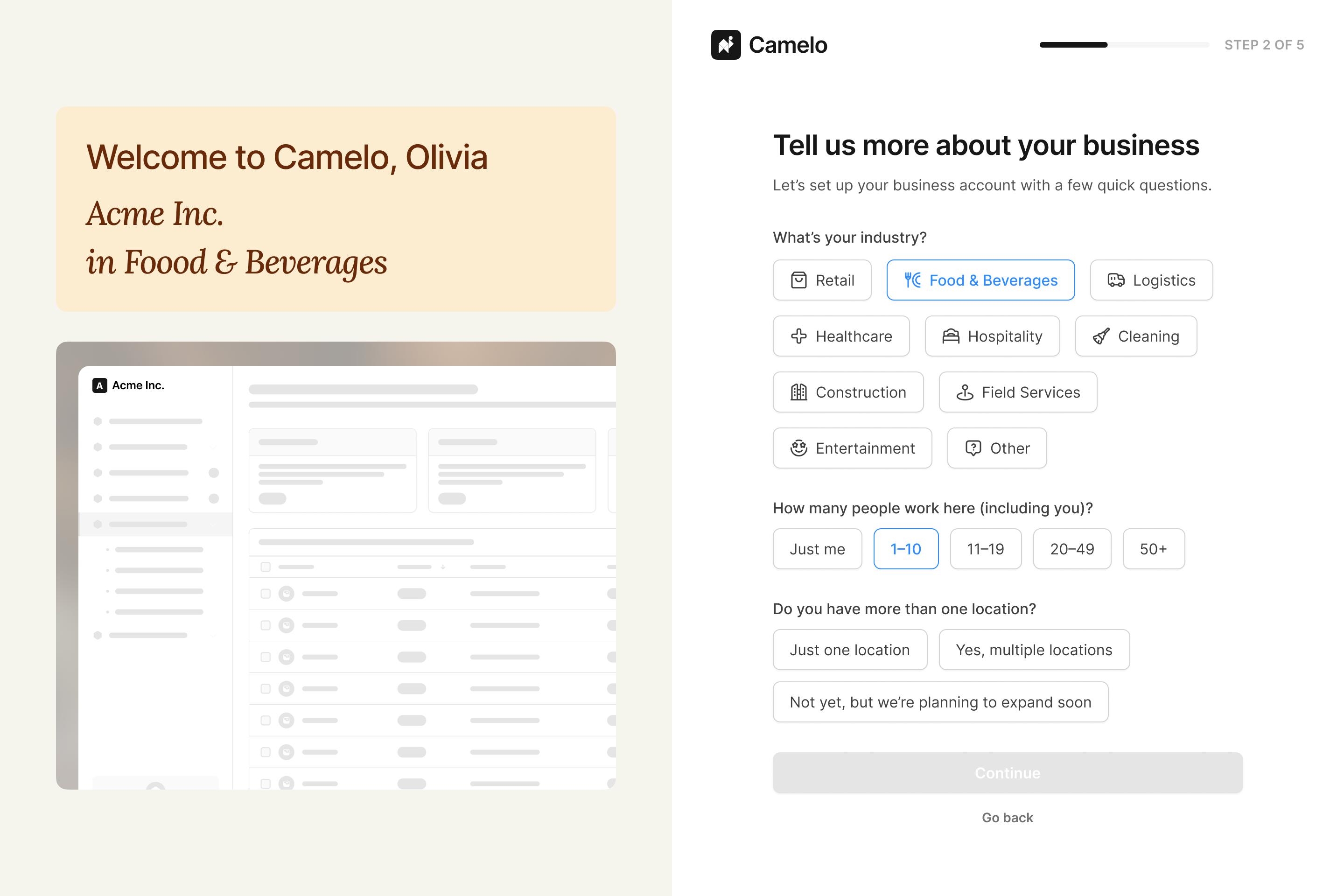
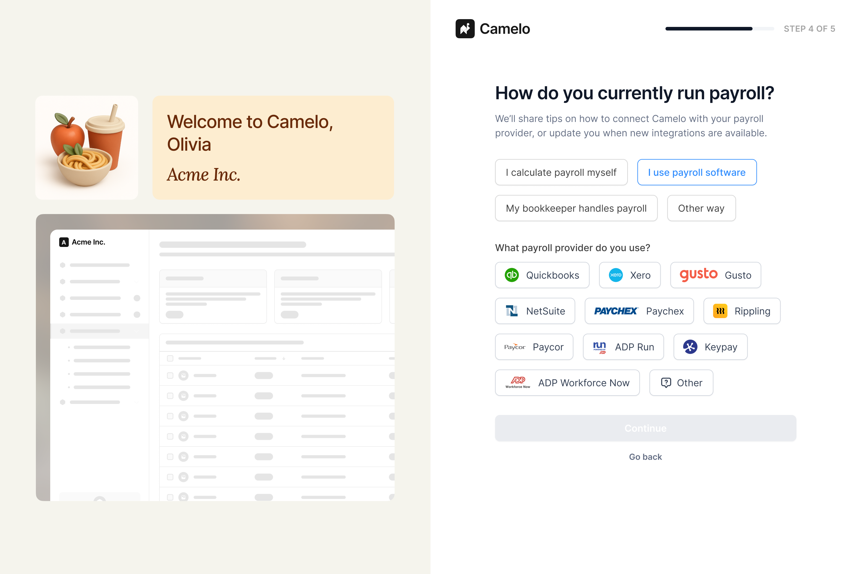
Regroup information and prioritize higher-value data
Fields about account setup, company context, and scheduling needs were mixed on the same screen with no clear reason why. Regrouping them would make each question feel more purposeful.
Align the flow with the new visual system & branding
The signup screens didn't reflect the updated design system, which created an inconsistent first impression. Aligning them would build trust from the start.
Break the flow into smaller, progressive steps
I restructured the flow into smaller steps, each focused on a single purpose. Users could focus on one decision at a time and understand why each field was needed. A clearer progress indicator helped reduce uncertainty and gave users a sense of momentum.
Account creation was moved to the first step so that even if a user dropped off mid-flow, their basic information was already captured for re-engagement.
Although this increased the steps from three to five, each step required less effort. One dedicated step handled product and marketing questions separately from setup, so they felt lower-stakes and less disruptive.
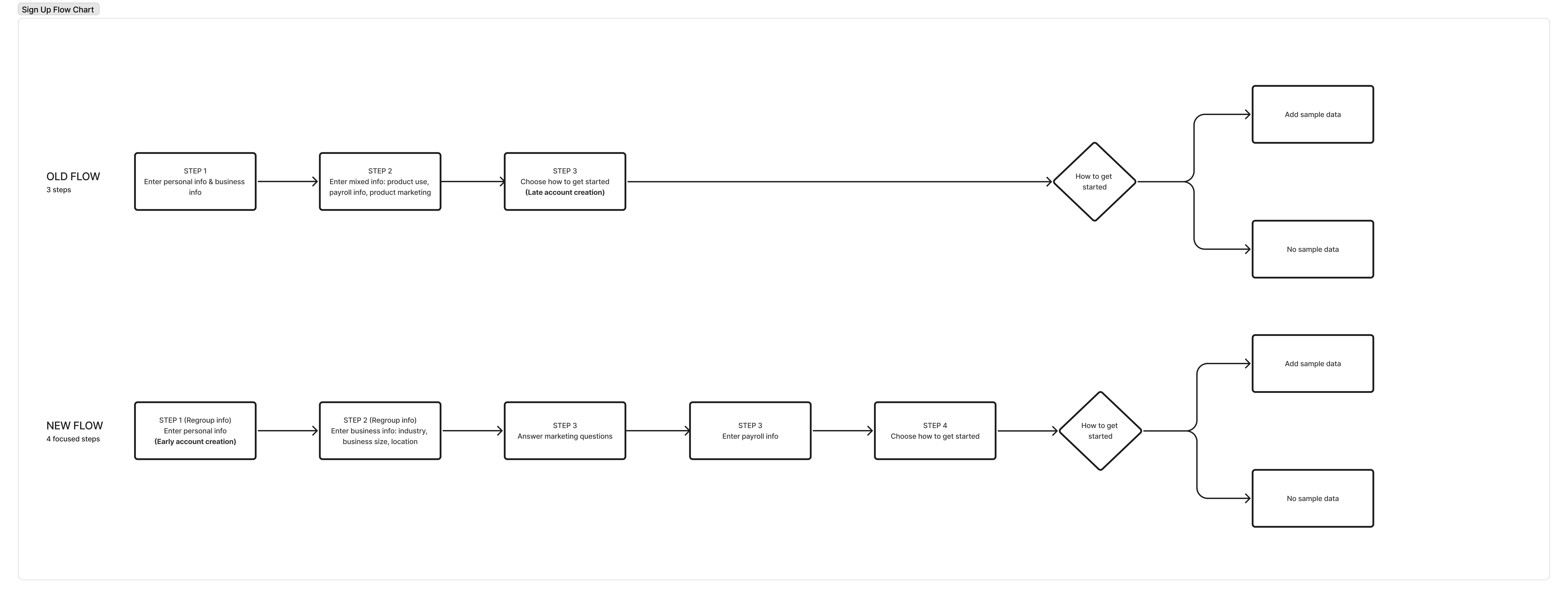
Old flow vs. new flow — 3 steps reorganized into 5 focused steps
The same principle applied to the post-signup welcome screen. Instead of presenting two options with no context, the redesign added a preview of what each choice would look like — so users could decide without having to guess.
Regroup information and prioritize higher-value data
In the original flow, fields related to account setup, company context, and scheduling needs were mixed together without clear structure.
I reorganized the inputs into logical groups based on user goals and product needs. Each step focused on a specific type of information, making the purpose of each question clearer.
| Field | Before | After | Decision |
|---|---|---|---|
| Name, email, phone, business name | Step 1 | Step 1 | Core account creation — captured first |
| Redemption code | Step 1 | Removed | No longer used |
| Industry, company size | Step 1 | Step 2 | Moved to business context step |
| Business location | — | Step 2 | New field — supports onboarding setup later |
| Payroll provider | Step 2 | Step 3 | Separated into its own integration step |
| How did you hear about Camelo? | Step 2 | Step 4 | Separated into marketing step |
| What can Camelo help you with? | Step 2 | Step 4 | Separated into marketing step |
Some data points helped personalize the experience, refine personas, and identify upsell opportunities. Others supported newer features like payroll integrations, which required company details collected early to pre-fill settings and surface relevant guidance later.
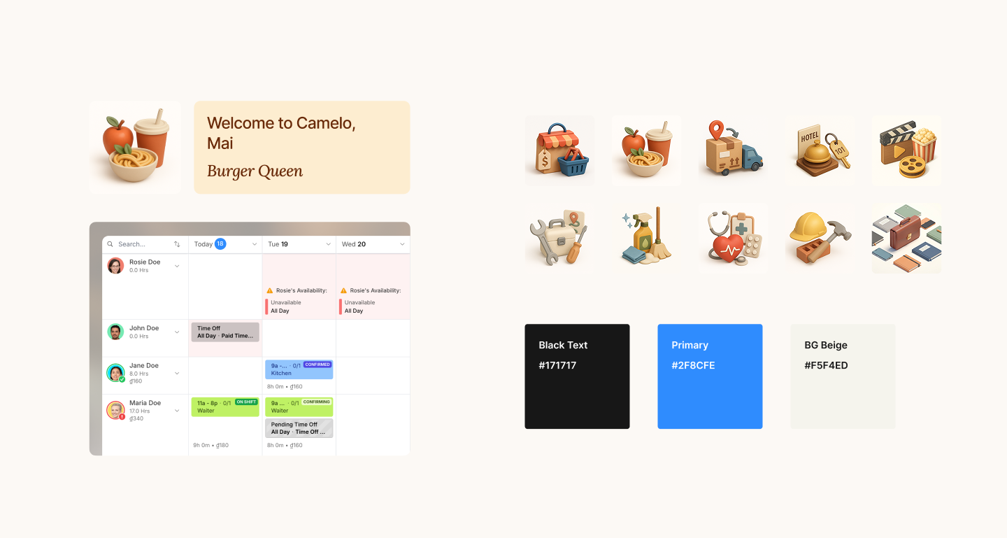
Align with the new visual system
The original screens were inconsistent with the updated design system. For a signup flow, that inconsistency matters — it’s the first thing new users see, and a mismatched experience can quietly undermine trust before they’ve even started. I updated typography, spacing, and components to improve readability and guide attention toward primary actions.
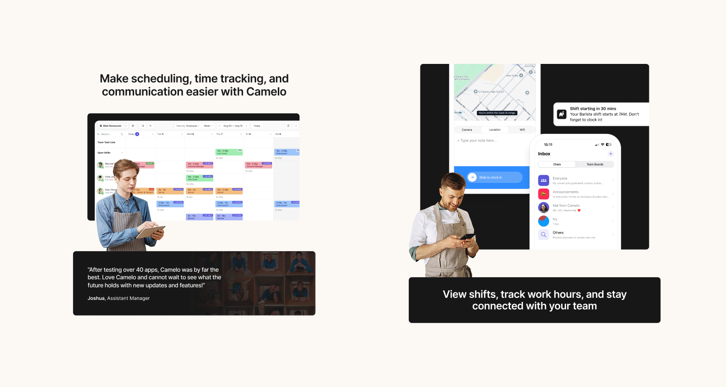
Together with another designer and a UX writer, we added contextual illustrations and trust-building elements such as quotes from similar users to make the experience feel more approachable. Aligning onboarding with the broader product interface created a more cohesive first impression.
Quotes and copy that align to each type of user: management and employee
Illustrations that change according to user choice and fit the new visual design system
The redesigned signup flow
The redesigned flow guides users through focused tasks with clear progress at each step. I worked closely with engineers to reuse existing layout patterns and keep implementation lightweight.
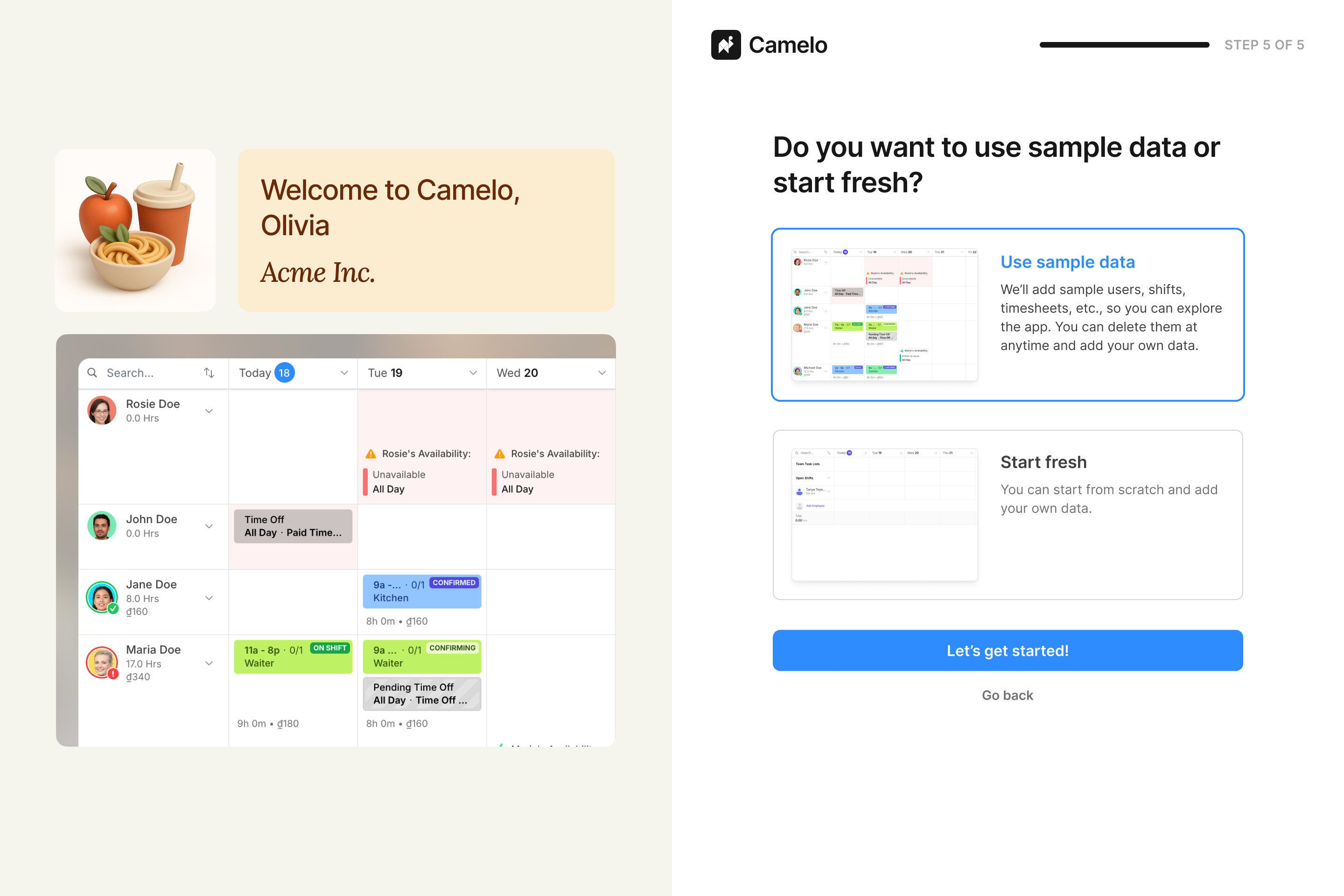
A quick look at new sign up screens
New sign up flow prototype
Improved completion rate and activation rate
Using funnel analysis in PostHog, I compared signup performance over a 4-week period before and after the redesign:
- Completion rate increased from 48% to 55%.
- Activation rate — users who published their first schedule — increased from 31% to 40%.
Without step-level tracking it’s hard to attribute the improvement to a single change, but my hypotheses are:
- Smaller, focused steps lowered the effort required at each point, making users more likely to continue.
- Clearer context for each question made the flow feel purposeful rather than demanding.
- Early account creation captured data on users who dropped off, giving the team a way to re-engage and bring them back to the product.
Note: Metrics represent early estimates based on available analytics while the product continues to evolve.
Reflections
Key learnings
- Smaller steps reduce abandonment not just by shortening each task, but by making the endpoint feel reachable at every point in the flow.
- Design decisions don’t always optimize for UX alone. Keeping a field that seemed like friction turned out to serve a real business need — learning to find solutions that satisfy both sides is part of the work.
- Starting a redesign without step-level tracking meant the approach relied on qualitative judgment. Instrumenting the flow before making changes would have made the diagnosis sharper and the results more attributable.
What I’d improve next
Given the short timeline and team constraints, a few things were out of scope for this round. If I had more time, I would:
- Introduce step-level tracking to better identify drop-off points.
- Test different messaging strategies in early steps.
- Experiment with earlier value communication to see if it’ll strengthen motivation.
- Explore ways to personalize onboarding based on industry, company type, or team size.