My review
What’s good
-
This course covers the basics of Figma quite well. I’ve learned Figma from random YouTube videos before, so it’s not difficult to follow this course. I managed to learn some useful hotkeys and tips tho. I think it’s very detailed for absolute beginners.
-
38 hours is a decent time for a Udemy course.
What could be improved
- For some concepts like nested instances, free YouTube tutorials from Figma team is much more engaging and clear.
- Lacks homework. Would be nice to be assigned some projects rather than only following what the instructor does on the screen. Learning by doing is always better.
- The instructor’s voice and him repeatedly saying “basically” makes me sleepy. I had to speed up the videos to get through them.
Figma Variants
Variants can be used to create different sets of buttons:
- Themes: primary, error, success
- States: static, hover, active
- Show right/left icon
- Size: SM, M, L, XL
You can add interactions for variants in Prototype mode.
- Eg: For hovered button: While hovering → Change to; For clicked button: On click → Change to
When you add interactions for components, the instances will get the interactions too.
One useful plugin for organizing variants: Simple Sort
Figma Styles & Automation
Local styles: text, color, effect, gride. Only applies to the file. For styles that apply to all files, you need to add to Libraries.
Text styles
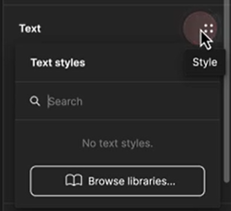
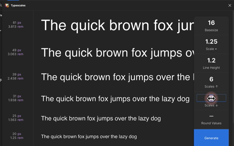
Helpful plugin for scaling types for creating typography hierarchy: Typescales
You can create folders for styles. This can be useful to store styles for Product, Websites, Posters, etc. Click and drag to organize styles and folders.
To add styles quickly, select the texts and use the plugin Styler → Generate Styles. To quickly bulk-update styles, use the plugin Batch Styler.
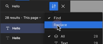
To bulk replace a text that appears in many places, click setting button within Search box:
Color styles
Plugin Color Shades Kit & Color scale generator: generate shades from a color, useful for creating color pallettes.
Plugin Color Style Guide & Typography Style Guide: useful for creating style guide.
Plugin Design Lint can detect elements with properties matching the styles you’ve added.
Effect styles
Plugin Beautiful Shadows & Shadow Maker: helps create nice shadows.
Grid styles
Design for responsiveness: autolayout the frame, add min & max width. Eg for mobile min can be iPhone SE frame & max can be iP Pro Max frame. Breakpoints can be defined depending on your specific project.
Accessibility colors
Choose color combinations that make it easy for users to look. Run plugin Stark - Contrast & Accessibility Tools to measure accessibility. Contrast ratio should be above4.5:1
Design principles & theories
Unity & similarity
Unity: All design elements carry the same weight & look harmonized & belong together. Similarity: Similar design elements perceived to be as one harmonious group. Eg: Buttons with meaningful icons, relevant & consistent icons, sảme border radius
Dominance & working memory
Dominance: Emphasize one design element to grab attention. Eg: Buy button Working memory: Average person can only memorize up to 5 things in short-term memory. Eg: important elements should only be 3-5 Make primary action buttons filled & secondary action buttons outline or text.
Negative space & complexity
Negative space: remove unnecessary design elements & empty area to increase contrast. Complexity: design elements are perceived with less effort when complexity is reduced.
Contrast & emphasis
Contrast: distinguishes elements, increases readability & legibility. Emphasis: elements with solid colors have more emphasis than those with outlines. Reversed emphasis: everything is solid, but one is outline.
Proximity & common region
Proximity: the closer the elements, the more related they become.
Common region: design elements are perceived to be related when surrounded by boundaries.
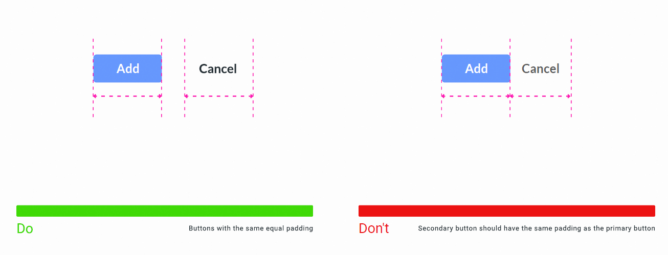
Alignment & uncompleted task
Alignment: creates visual flow, directs user’s eye to the info, helps scan info faster. Uncompleted design elements are more likely to be remembered. If 2 elements are aligned but the 3rd one is not, users are more likely to remember that 3rd one.
Psychological barrier & proportion
Design elements are remembered with less effort when numbers are rounded. Add scale to make certain elements stand out.
Repetition & common behavior
Repeated design elements create visual hierarchy. Avoid breaking universal design elements that behave in similar way. Eg: most users read from left to right.
Rhythm & line connection
Rhythm is the group of elements that create visual flow and motion.
Design elements connected with lines are perceived as a group.
Typography
Type anatomy:

font-size can be absolute or relative.
rem: root element
em: parent element
Kerning—letter-spacing: space between each letter
Large headings need tighter kerning. Smaller text needs more kerning so it’s easier to read.
Tracking—word-spacing: space between each word
Leading—line-height: space between sentences
Line width—width & height: the longer, the harder to read. Better to keep 30-50 characters per line.
percentage %
viewport width vw
viewport height vh
Orphan & widow: short line at the beginning and end of paragraph. It’s hard to avoid widows when you create responsive designs.
Type alignment—text-align: left, right, center, justify
HTML
In VSCode & html file, type ! will show the structure of a html file.
<!DOCTYPE html>
<html lang="en">
<head>
    <meta charset="UTF-8">
    <meta name="viewport" content="width=device-width, initial-scale=1.0">
    <title>Document</title>
</head>
<body>

</body>
</html>
To preview the html file, right click → Show preview. Or use the Live Server extension, right click → Open with Live Server.
HTML anatomy
Hyper Text Markup Language building blocks of websites skeleton of the website
<opening tag>content</closing tag>
HTML Comments
Use comments to organize code & describe logic to other developers.
<!-- Your comment -->
HTML Boilerplate
All links & styles are wrapped inside head tag. All content & HTML tags are wrapped inside body tag.
<!DOCTYPE html>
<html lang="en">
<head>

</head>
<body>

</body>
</html>
Nesting
Headings & paragraphs
Heading tags: h1 → h6
Paragraph tag: p
Lists
unordered list & ordered list & list items: ul, ol, li
Attributes
<a href="">anchor text</a>
Images
<img src="filepath.ext" alt="alt text">
HTML videos
HTML video attributes are src, autoplay, loop, muted, playsinline, controls.
`
HTML iFrame
HTML iframe attributes are src, autoplay, allowfullscreen.
Checkbox & radio button
<input>
<input type="checkbox">
<input type="radio">
<input name="yourAge" type="radio">
Input field
HTML input attributes are type, for, id.
<label for="firstName">Name</label>
<input type="text" id="firstName">
<label for="security">Password</label>
<input type="password" id="security">
The reason we give it a for attribute is when you click on the label, if the for attribute and the id attribute matches, it would direct you to the exact input field.
Dropdown
<select> and <option> tags
name and value attributes
value is for backend development
<select name="degree">
    <option value="Bachelor Degree">Bachelors</option>
    <option value="Masters Degree">Masters</option>
</select>
Buttons
<button>
<button>Click</button>
<button id="dropdown">Projects<svg class="svg-arrow" style="width:24px;height:24px" viewBox="0 0 24 24"><path d="..."/></svg></button>
Linking CSS & JavaScript files
<link rel="stylesheet" href="">
<script src=""></script>
Semantics
To write more readable code, we use semantic tags in the source code.
<header></header>
<footer></footer>
<nav></nav>
<main></main>
<article></article>
<section></section>
<aside></aside>
<div></div>
Meta tags
Placed in head tag and not rendered in browser.
 <!DOCTYPE html>
<html lang="en">
<head>
    <meta charset="UTF-8">
    <meta name="viewport" content="width=device-width, initial-scale=1.0">
        <!-- make web responsive -->
    <meta name="description" content="lorem ipsum">
    <meta name="keywords" content="ux, web design">
    <title>HTML Lessons</title>
</head>
<body>
    <h1>HTML Lessons</h1>
    <video></video>
</body>
</html>
External style
It’s the styles.css file (just an example name). Best practice is to style your html elements in external stylesheets.
External style hold the least specificity power. (Because you can override them in html, but it’s not the best practice).
Style tag
style tag is inside head, and holds all the applied styles.
<head>
    <style>
        li {
            background-color: #333333;
        }
    </style>
</head>
Inline style
Inline style attributes hold the strongest specificity power. It overrieds the styles in your css file. Best practice is to avoid inline style amap. You can use !important to override inline style.
<h1 style="color: red;">Hello world</h1>
Linking fonts inside HTML
- Copy the
<link>code into the<head>. - Copy the
@importcode into the external stylesheet. (Copy only the@import...;part)
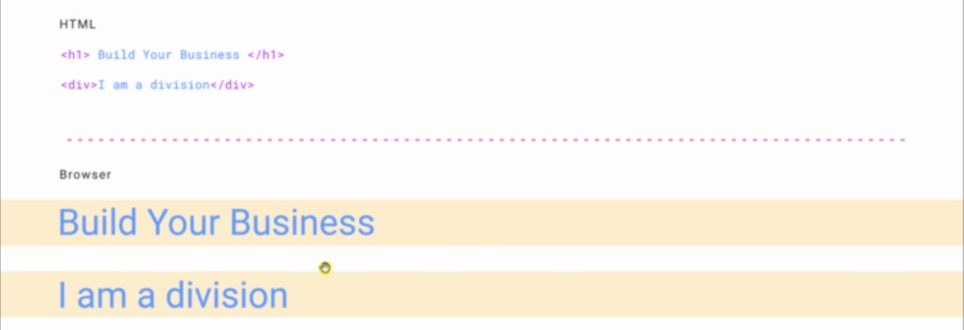
Block elements
Block level elements take the full width of the browser.
Inline elements
Inline level elements take the available space.
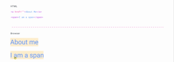
display: block
display: inline
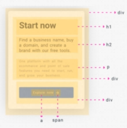
Box anatomy
Everything on webpages are boxes. Everything is a box nested inside a box.
CSS
Anatomy
Cascading Style Sheets used to make webpages look pretty by mainly targeting HTML elements

CSS selector: tag name, class, id
Classes
- 2nd specificity power
- can be assigned to multiple HTML elements
<h1 class="heading"></h1>
.heading {}
→ .heading has more power than h1
<h2 class="class1 class2">
→ Use dashes or camelCase for complex words. eg: sub-heading or subHeading
ID
- highest specificity
- can only be used once per page
<h1 id="world">Hello world</h1>
#world {}
Multiple selector
Use comma to select multiple elements from HTML.
p, #world, .name {}
Variables
Create variables for colors and assign it to elements.
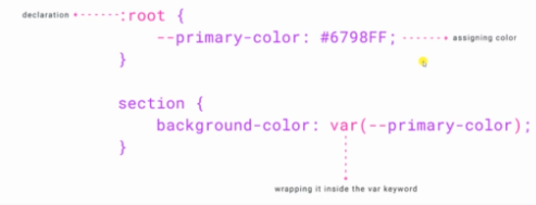
:root {
    --primary-color: #222222;
}

section {
    background-color: var(--primary-color);
}
Specificity
CSS specificity determines which style has the most power when applied.
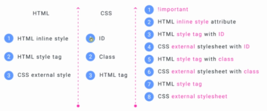
HTML: HTML inline style > HTML style tag > CSS external style
CSS: ID > class > HTML tag
!important > HTML inline style attribute > HTML style tag with ID > CSS external stylesheet with ID > HTML style tag with class > CSS external stylesheet with class > HTML style tag > CSS external stylesheet
Width & height
width, height
- 25%: 25% of the parent
- 25vw, 25wh: 25% of the viewport
Margin & padding
Clockwise direction: top left bottom right padding: 10px → all sides padding: 5px 10px → 5px top bottom, 10px left right padding: 5px 10px 15px 20px → 5top, 10right, 15bottom, 20left padding: 0 auto → 0 top bottom, center horizontally
Border radius
Rounded corners: border-radius
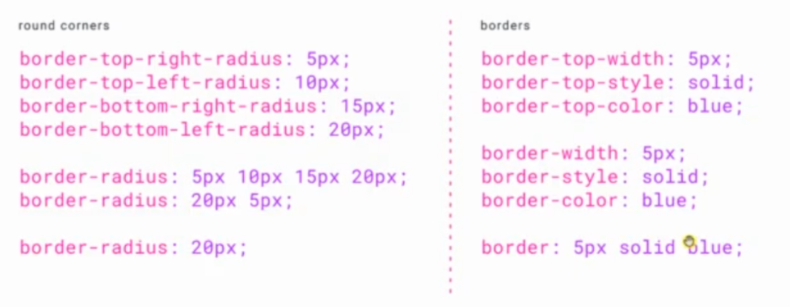
border: 10px solid #cdfeee
Box model
Every element on HTML has margin, padding, border, and content area.
The instructor recommends adding box-sizing: border-box to every element when starting a project.
Universal selector
Universal selector selects every element on the page.
basic reset, head start:
* {
    margin: 0;
    padding: 0;
    box-sizing: border-box;
}
Or selects all elements inside an element:
div * {
}
→ selects all elements within div
Descendant selector
Select nested children elements.
section p {
    color: red;
}
→ selects all p inside section
Direct child selector
Use > to select all direct children elements.
section > p {

}
General sibling selector
Selects all elements that come after an element, but not the direct children elements.
p ~ h2 {}
Adjacent selector
Selects all elements that come immediately after an element.
h1 + h2 {}
Attribute selector
<input type="emai">
input[type='email']
Focus pseudo class
Use the :focus pseudo class to style the focus state of element.
input:focus {}
First child
Use :first-child to select all the first children of an element.
<ul>
    <li>Item 1</li>
    <li>Item 2</li>
    <li>Item 3</li>
</ul>

ul li:first-child {
    color: red;
}
→ Selects Item 1
Last child
Use :last-child to select all the last children of an element.
ul li:last-childe {
    color: red;
}
→ Selects Item 3
Nth child
Use :nth-child() to select all the nth children of an element.
eg: :nth-child(2) → select the 2nd children of element.
Odd selector
Use :nth-child(2n-1) or odd to select all the odd children (1, 3, 5, 7…) of an element.
ul li:nth-child(2n-1) {
    color: red;
}

ul li:nth-child(odd) {
    color: red;
}
(4n-1) → select the 3rd→ children.
Even child selector
Use :nth-child(2n) or even to select even children (2, 4, 6…) of an element.
ul li:nth-child(2n) {

}

ul li:nth-child(even) {

}
Nth of type
Use :nth-of-type() to select elements that are the nth child, of the same type (tag name), of its parent.
n can be number, (even) or (odd), formula like (an+b)
p:nth-of-type(even) {
    background: blue;
}

li:nth-of-type(3n+1) {
    background: red;
}
→ 3 is the cycle size, n is a counter (starts at 0), 1 is offset value. Bg color for all p elements whose index is a multiple of 3. Select 3rd, 6th, 9th, etc.
Not selector
Use `:not() to select all items but not the specified one.
.list:not(.class1) {} → selects all lists but not the one with the class of class1
Link pseudo classes
Use :link, :visited, :hover, :active to style different states of links.
a:link {
    color: red;
}

a:visited {
    color: gray;
}

a:hover {
    color: yellow;
}

a:active {
    color: blue;
}
Pseudo elements
::
Insert content before an element:
section::before {
    content: 'hello';
}
Insert content after an element: ::after
CSS comments
Everything is rendered by the browser except comments.
/* */
Background
background-color
background-image: url(“image.png”)
SVG don’t get blurry or pixelated.
background-repeat: no-repeat
background-repeat: repeat-y → bg repeated on the Y axis (vertical)
background-repeat: center right; bottom left; 10px 5px; -6% -5%; → pushed 10px from the left, 5px from the top
background-size sets the size of bg img. values could be contain or cover


Gradient
linear-gradient(direction, color1, color2)
background-color: linear-gradient(to right, black, white)
to left, to bottom right, -120deg
Multiple backgrounds
background: linear-gradient, bg2;
background: solidcolor bg2; → no comma
background: linear-gradient(45deg, black, white), url(bg-img.svg) center / 50px;
Filters
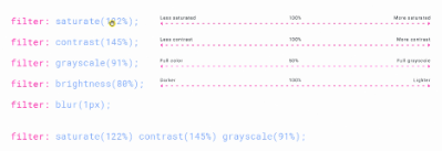
Opacity
Make elements transparent.
section {
    opacity: 0.2;
}
Clip path circle
To clip elements with circle shape.
clip-path: circle (circleRadius anchorPoint)
clip-path: circle (50% at top left)
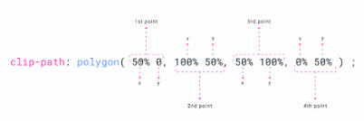
Clip path polygon
Display & visibility
display: none, block, inline-block, inline, flex, grid
visibility: hidden, visible
visibility: hidden → hidden but still in the document fold
Overflow
overflow: hidden → clip element
Text shadow
text-shadow: x y blur color;
Box shadow
box-shadow: x y blur spread color;
Blend mode
mix-blend-mode
Scale
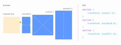
transform: scale(1.2) → scale 1.2 times
transform: scaleX(0.8)
transform: scaleY(0.5)
Skew
transform: skew(10deg, 5deg); transform: skewX(10deg); transform: skewY(5deg);
Translate
To move the position of the element.
transform: translate(-24px, 18px); translateX() translateY()
Matrix
transform: matrix(scaleX, skewX, skewY, scaleY, transformX, transformY)

Rotate
transform: rotate(45deg) rotateX rotateY
Transform origin
The anchor point of transform
transform-origin: center;
Multiple transform
transform: 1stproperty 2ndproperty;
eg: transform: scale(1.1) rotate(45deg);
transform: scale(1) skew(0) translate(0, 0) rotate(0); → doesn’t have to be in this order
Easing functions
Every element has a beginning and an end state for animation. Time and transform properties are the main points. With easing functions, we can make animations smoother.
Ease in: starts slowly & ends faster
Ease out: starts faster & ends slower
Ease in & out: starts slow, speeds up, ends slower
animation-timing-function: ease-in;
Cubic bezier
Create custom easing function with cubic-bezier(x1,y1,x2,y2)
cubic-bezier: (0.075, 0.82, 0.165, 1);

Open cubic bezier editor in Chrome inspector to custom the animation:

Transitions
Transitions should be triggered using hover effect, click events, scroll.
section {
    width: 100px;
    transition-property: width;
    transition-duration: 0.2s;
    transition-delay: 0.5s;
    transition-timing-function: ease;
}
Multiple transitions
Separate multiple transitions with a comma.
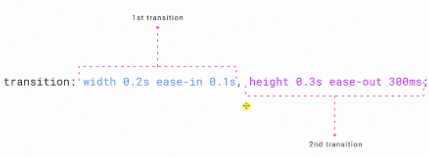
transition: width 0.2s ease-in 0.1s, height 0.3s ease-out 300ms;
Transitions shorthand
Transition anatomy: 4 properties to use for transition
transition: property duration easingfunction delay;
eg: transition: width 0.2s ease-in 0.1s;
Animations
We can animate multiple property and create a multi state animation.
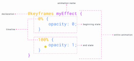
Declare @keyframes for CSS animation.
@keyframes animationName {
    animation
}
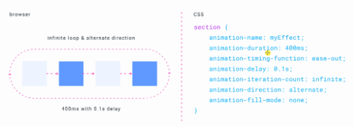
animation-name is case sensitive
animation-iteration-count: infinite → loop. If iteration count is 2, animation stops after playing 2 times.
animation-direction: alternate → point A to B and B to A
animation-fill-mode: forwards →
Position
relative, absolute, fixed
main {
    position: relative;
    top: 100px;
}
→ 100px from the top.
top, bottom, left, right
absolute is used when the parent element has position relative.

fixed brings the object out of the document flow. Often used for navigation bar, sticky banners.

Z-index
z-index is used to bring elements to front and back.
Responsiveness
Declare @media for CSS responsiveness. Set min-width and max-width to control the behavior of elements on different screen sizes.
@media (min-width: ) and (max-width: ) {
    element {
        property: ;
    }
}
CSS grid & flexbox
Flexbox is a CSS layout model designed to create layouts in one dimension (either as a row or a column). You can lay out, align, and distribute space among items in a container, even when their size is unknown or dynamic.

Key concepts of Flexbox:
- Flex Container: The parent element that has
display: flexordisplay: inline-flexapplied to it. - Flex Items: The direct children of the flex container.
- Main Axis: The primary axis along which flex items are laid out. It can be horizontal or vertical.
- Cross Axis: The axis perpendicular to the main axis.
Flexbox properties:
- For the flex container:
flex-direction: Sets the main axis (row, column, row-reverse, column-reverse)justify-content: Aligns items along the main axisflex-start: Items are pushed towards the start of the flex-direction.flex-end: Items are pushed towards the end of the flex-direction.space-evenly: Evenly distributes the remaining space in the flex container around the flex items. Space between each item is twice the size of the space at the ends.space-between: Evenly distributes the flex items within the container, with the first item at the start and the last item at the end.
align-items: Aligns items along the cross axis.baseline: Aligns based on text baseline.
- For the flex items
flex-grow: Determines how much an item can grow relative to other items.flex-shrink: Determines how much an item can shrink relative to other items.flex-basis: Sets the initial main size of an item.align-self: Allows individual items to have different alignment.order: Change the visual order of flex items without changing their order in the HTML structure.