Notes from the book Refactoring UI, written by Adam Wathan & Steve Schoger.
Starting from scratch
-
Start with the feature, not the layout: Think about what you’ll need to put on the interface before where to put the navigation bar.
-
Details come later:
-
In the earliest stages, don’t get hung up making low-level decisions about typefaces, shadows, icons, etc. One tip to ignore the details is to design on paper using Sharpie.
-
Design in grayscale so spacing, contrast, and size can do the heavy lifting.
-
Don’t over-invest: Low-fidelity design is to move fast and start building the real thing asap. Leave sketches & wireframes behind when you’ve made a decision.
-
-
Don’t design too much:
-
It’s hard to figure out every interaction in a feature and every edge case. Instead of designing everything up front, work in short cycles, build a simple version first, make it real, and iterate as you go.
-
Expect features to be hard to build, and design the smallest useful version you can ship. Nice-to-have parts of a feature can be designed later.
-
-
Choose a personality: Personality is reflected through multiple factors.
-
Font choice: serif - elegant or classic, rounded sans serif - playful, neutral sans serif - plainer, etc.
-
Color: How different colors feel to you? Why you think a color is the right fit? Eg. Blue - safe and familiar, gold - expensive & sophisticated, pink - fun & not so serious, etc.
-
Border radius: Small is pretty neutral, larger feels more playful, none can feel more serious or formal. Stay consistent.
-
Language: is just as important as the color or typeface.
-
Look at other sites & businesses, but don’t borrow too much. You don’t want to look like a second-rate version of something else.
-
-
Limit choices:
-
Define systems in advance: Pick 8-10 shades per color, define a type scale. More work up front, but once, instead of every time you design.
-
Eliminate bad choices
-
Systematize everything:
• Font size
• Font weight
• Line height
• Color
• Margin
• Padding
• Width
• Height
• Box shadows
• Border radius
• Border width
• Opacity
You don’t have to define all of this stuff ahead of time, just make sure you’re approaching design with a system-focused mindset. Look for opportunities to introduce new systems as you make new decisions, and try to avoid having to make the same minor decision twice.
-
Hierarchy is everything
-
Size isn’t everything. Try using font weight or color too. Eg. Bolder primary text at reasonable font size, softer color for supporting text instead of tiny font size. Stick to 2-3 colors: dark for primary, grey for secondary, lighter grey for tertiary. 2 font weights are usually enough for UI work: normal (400-500) for most text, heavier (600-700) for emphasis.
-
Don’t use grey text on colored backgrounds. Grey on white is reduced contrast. Instead, make the text closer to the background color to create hierarchy. Hand-pick a color with the same hue, adjust saturation and lightness until it looks right.
-
When the main element isn’t standing out enough and you can’t add anything to it to emphasize it, try de-emphasizing other elements that are competing with it. Eg. give other items softer color.
-
Don’t add labels to info that is clear withut a label, eg.
Jane Doeinstead ofName: Jane Doe. Combine labels & values into a single unit for meaningful styling, eg.12 left in stockinstead ofIn stock: 12. Sometimes, when the data is the main info and the label is just there for clarity, treat the label as supporting content and de-emphasize it by making it smaller, reducing contrast, using lighter font weight, eg. Heart rate 82 BPM. Users often look for the labels on info-dense pages like technical specifications of a product, eg. they scan forBatteryinstead of8 hours, emphasize the labels but don’t de-emphasize the data too much by using a darker color for labels and lighter color for values. -
Separate visual hierarchy from document hierarchy: Although in articles or documentation,
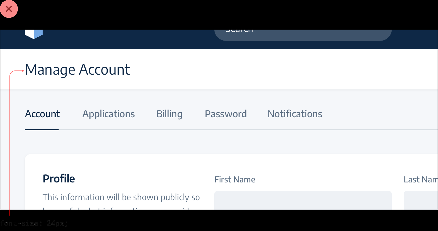
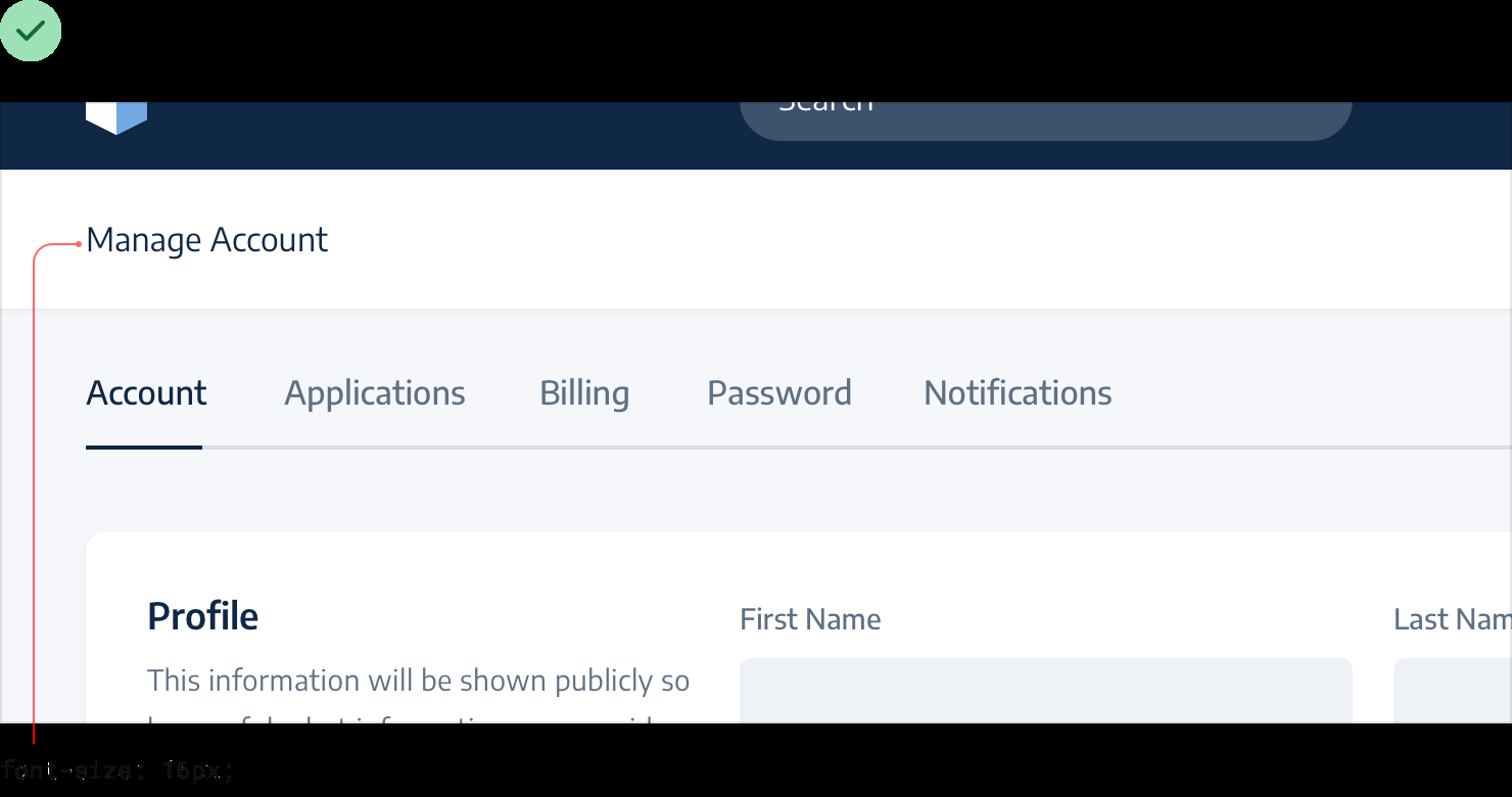
h1h2h3get bigger font sizes, it might be different in apps UI. Eg. it makes sense to useh1for the titleManage Account, but the title doesn’t need to be big because it acts more like labels than headings and the content in that section should be the focus, not the title. You can even include section titles in markup for accessibility, but hide them visually if the content speaks for itself.
-
Balance weight and contrast:
-
Use contrast to compensate for weight: Eg. when putting solid icons next to text, icons tend to feel emphasized. To de-emphasize them, lower contrast by giving them a softer color.
-
Use weight to compensate for contrast: Eg. if a thin 1px border is either too subtle using a soft color or too harsh using a darker color, try increasing the width to 2px.
-
-
Action buttons: hierarchy first, semantics secondary.
- Primary actions: obvious, solid, high contrast background colors.
- Secondary actions: clear but not prominent, outline or lower contrast background.
- Tertiary actions: discoverable but unobtrusive, link-style.
- Destructive actions: doesn’t mean automatically big, red, and bold; can be secondary or tertiary if not the main action on the page.
Layout and spacing
-
Start with too much white space, then remove when needed.
-
Dense UIs have their place: Eg. packing lots info to fit in one screen for a Dashboard might make the UI busy, but worth it.
-
Establish a spacing and sizing system:
-
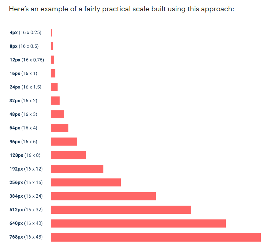
A linear scale won’t work: A useful system considers the relative difference between adjacent values. Eg. 12px vs 16px is a big difference, but 500px vs 520px won’t make a big difference. Make sure no two values in your scale are ever closer than about 25%.
-
Start with a sensible base value, then build a scale using factors and multiples of that value. 16px is great to start with because it divides nicely and is the default font size in major web browsers.
-
-
You don’t have to fill the whole screen: Spreading things out or making things unnecessarily wide makes an interface harder to interpret. Try designing for the mobile layout first and bring it to a bigger screen to adjust. Split into columns.
-
Grids are overrated: There are situations where it makes more sense to give an element a fixed width instead of relative width. For example, a 12-grid traditional sidebar layout with 25% sidebar & 75% main content, the sidebar takes up too much space if the screen is wider and shrinks too much if the screen is narrower, so it makes more sense to give it a reasonable fixed width.
-
Don’t use percentages to size something unless you actually want it to scale.
-
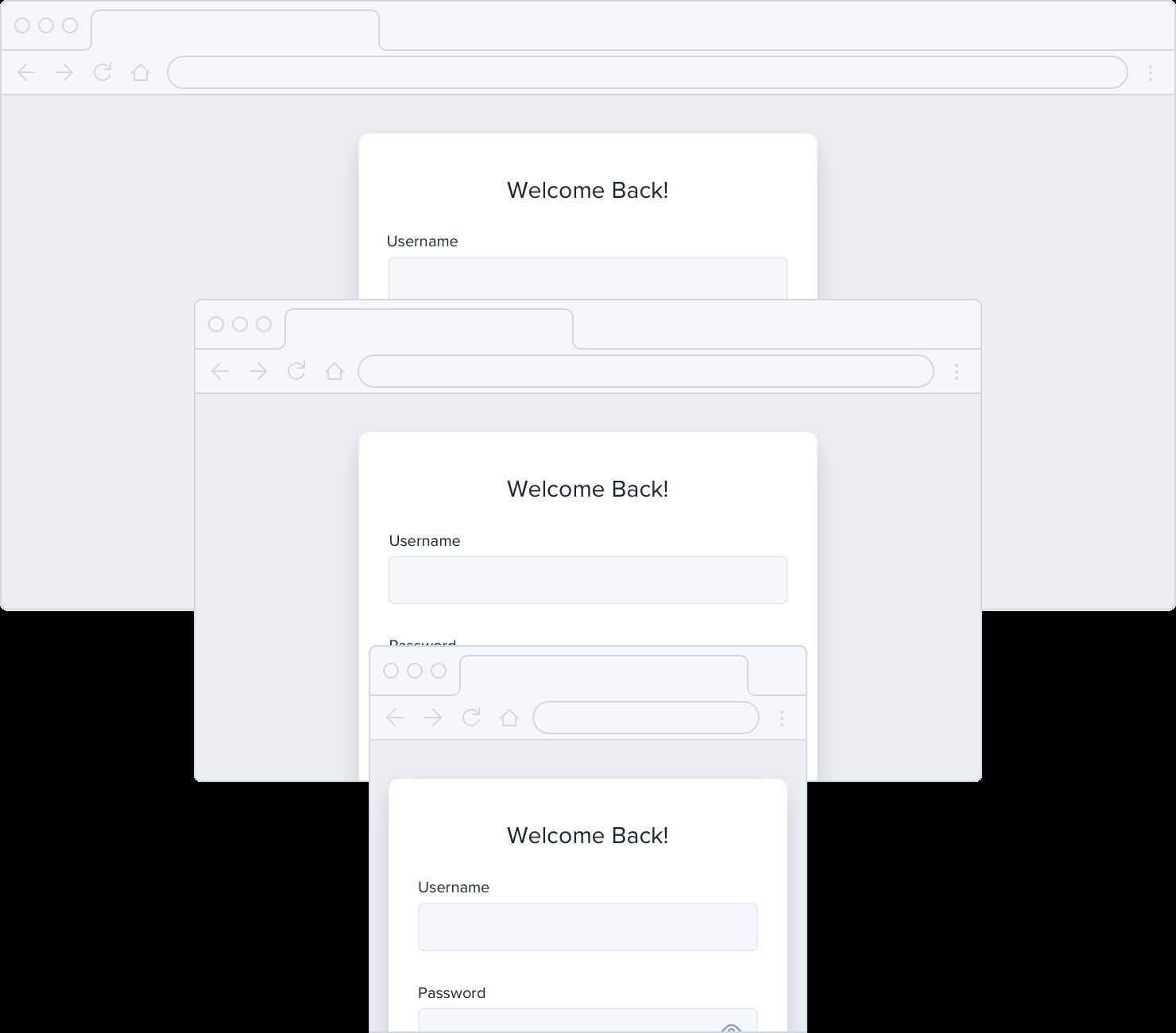
Elements like a login card maybe too big or narrow on different screen sizes. Instead of sizing them based on a grid, give them a max-width so they don’t get too large, and only force them to shrink when the screen gets smaller than that max-width. Give your components the space they need and don’t make any compromises until it’s actually necessary.
-
-
Relative sizing doesn’t scale: Things should scale independently applies to sizing elements at different screen sizes and the properties of a single component.
-
Screen sizes: Elements that are large on large screens need to shrink faster than elements that are already fairly small — the difference between small elements and large elements should be less extreme at small screen sizes. Eg. headlines & body copy can be 45px-18px on desktop, but looks best 24px-14px on mobile; defining headline size relative to body copy size may make headline too big on mobile.
-
Component properties: Eg. if button paddings are based on font size, buttons won’t look good.
Let go of the idea that everything needs to scale proportionately — giving yourself the freedom to fine-tune things independently makes it a hell of a lot easier to design for multiple contexts.
-
-
Avoid ambiguous spacing: Whenever you’re relying on spacing to connect a group of elements, always make sure there’s more space around the group than there is within it.
Designing text
-
Establish a type scale:
-
A linear scale won’t work: Smaller jumps at bigger font sizes make you waste time deciding, eg. between 46px and 48px.
-
Modular scales using ratio like 4:5, 2:3, or golden ratio: May create fractional values like 31.25px, 48.828px and browsers handle pixel rounding differently → round the values if you want to use this approach. Also, you’ll often need more sizes, eg. a value between 12px and 16px, and modular scales are often limiting.
-
Handcrafted scales: Constrained just enough to speed up your decision making, but isn’t so limited as to make you feel like you’re missing a useful size.
-
-
Avoid
emunits: Becauseemunits are relative to their parent, the sameemvalue can result in different absolute sizes in different parts of the document. Stick topxorrem. -
Use good fonts:
-
Safe options: Neutral sans-serif, eg. Helvetica. Or the system font stack
-apple-system, Segoe UI, Roboto, Noto Sans, Ubuntu, Cantarell, Helvetica Neue; -
Ignore typefaces with less than 5 weights: Isn’t always true, but typefaces with lots of different weights are often more carefully crafted. A tip to find fonts on directories is to filter by number of styles.
-
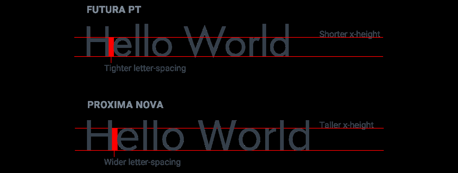
Legibility: Fonts meant for headlines usually have tighter letterspacing and shorter lowercase letters (a shorter x-height), while fonts meant for smaller sizes have wider letter-spacing and taller lowercase letters. Avoid using condensed typefaces with short x-heights for main UI text.
-
If a font is popular, it’s probably a good font.
-
Steal from people who care: Inspect some of your favorite sites and see what typefaces they are using.
-
-
Keep line length in check: Long lines make text harder to read. For the best reading experience, make your paragraphs wide enough to fit between 45 and 75 characters per line. The easiest way to do this on the web is using em units, which are relative to the current font size. A width of 20-35em will get you in the right ballpark.
-
Baseline, not center: When using multiple font sizes on a single line, align by baseline.

-
Line height is proportional:
- Accounting for line length: Line-height and paragraph width should be proportional — narrow content can use a shorter line-height like 1.5, but wide content might need a line-height as tall as 2. Tight line height might make readers go back to the left edge unsure which line is next.

- Accounting for font size: Line-height and font size are inversely proportional — use a taller line-height for small text and a shorter line-height for large text.
-
Not every link needs a color: When you’re designing an interface where almost everything is a link, colors can be overwhelming. Try just using a heavier font weight or darker color. If you’ve got links that are really ancillary and not part of the main path a user takes through the application, consider adding an underline or changing the color only on hover.


-
Align with readability in mind:
-
Don’t center long form text: Center-alignment can look great for headlines or short, independent blocks of text. But if something is longer than two or three lines, it will almost always look better left-aligned. If you’ve got a few blocks of text you want to center but one of them is a bit too long, the easiest fix is to rewrite the content and make it shorter.
-
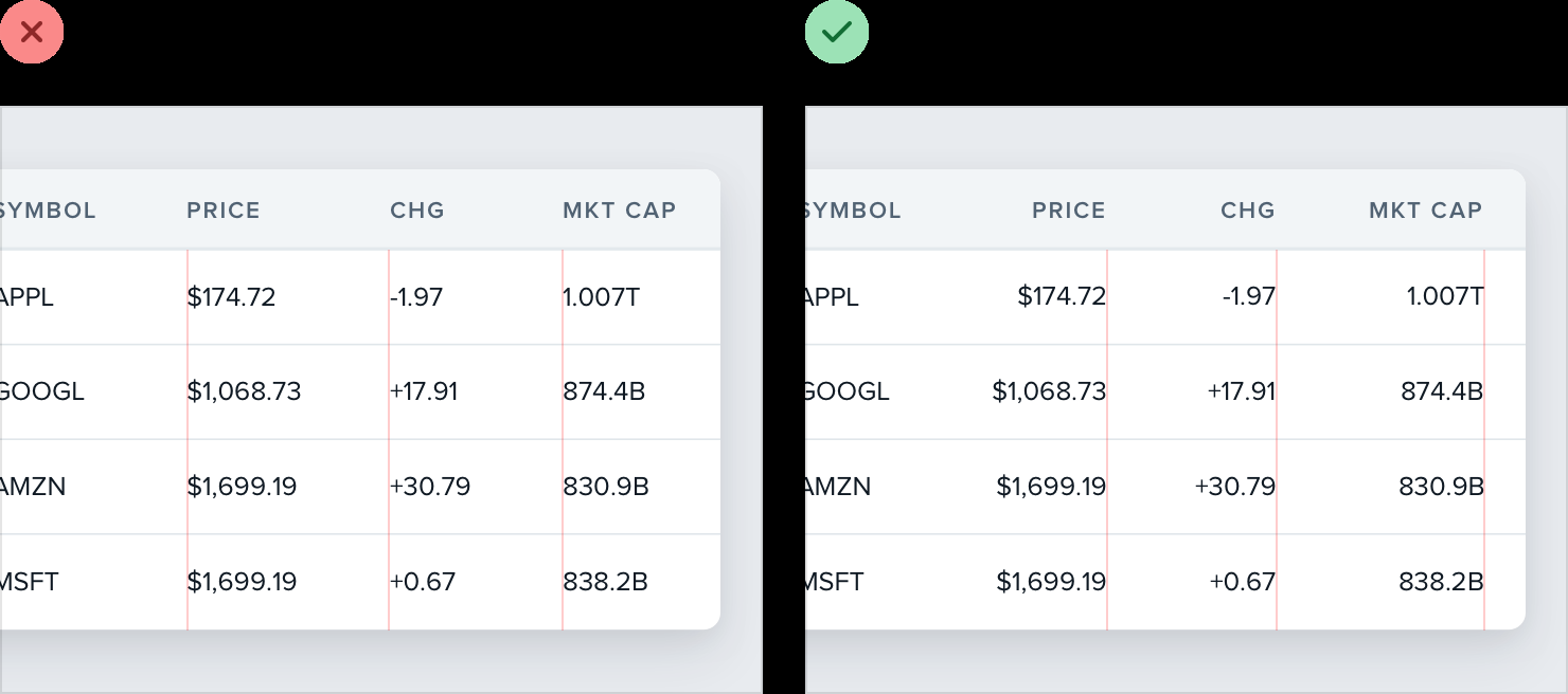
Right-align numbers: If you’re designing a table that includes numbers, right-align them. Easier to compare decimal numbers.
-
Hyphenate justified text: To avoid awkward gaps between words. Justified text works best in situations where you’re trying to mimic a print look, perhaps for an online magazine or newspaper. Even then, left aligned text works great too, so it’s really just a matter of preference.
-
Use letter-spacing effectively: If you want to use a family with wider letter-spacing for headlines or titles, it can often make sense to decrease the letter-spacing to mimic the condensed look of a purpose-built headline family. Avoid trying to make this work the other way around though — headline fonts rarely work well at small sizes even if you increase the letter spacing. For allcaps text, it often makes sense to increase letter-spacing to improve readability.

-
Working with color
-
Ditch hex for HSL
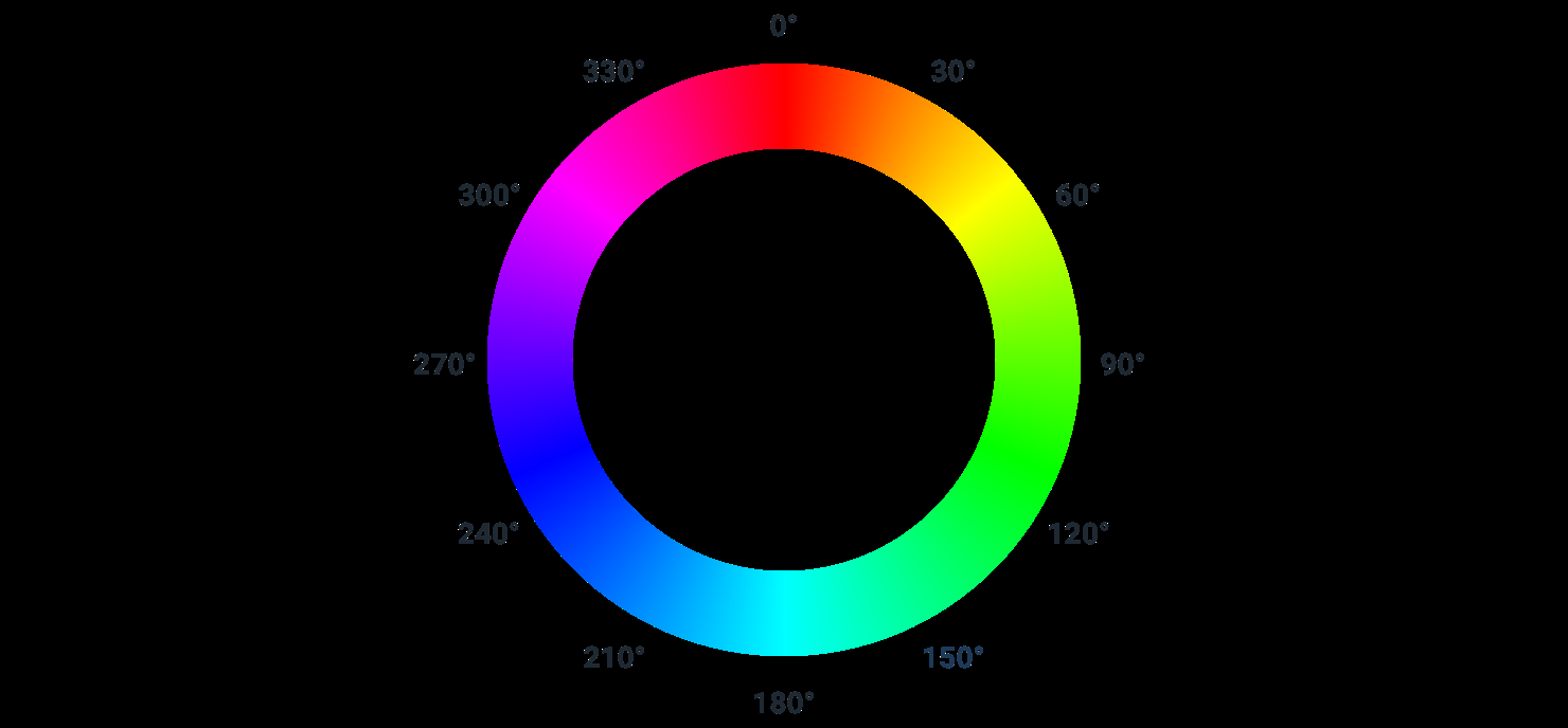
- Hue is a color’s position on the color wheel — it’s the attribute of a color that lets us identify two colors as “blue” even if they aren’t identical. Hue is measured in degrees, where 0° is red, 120° is green, and 240° is blue.

- Saturation is how colorful or vivid a color looks. 0% saturation is grey (no color), and 100% saturation is vibrant and intense.

- Lightness is just what it sounds like — it measures how close a color is to black or to white. 0% lightness is pure black, 100% lightness is pure white, and 50% lightness is a pure color at the given hue.

- HSL vs. HSB: Lightness is not the same as Brightness. HSB is more common than HSL in design software, but browsers only understand HSL, so if you’re designing for the web, HSL should be your weapon of choice.
-
You need more colors than you think: You can’t build anything with five hex codes. To build something real, you need a much more comprehensive set of colors to choose from. It’s not uncommon to need as many as ten different colors with 5-10 shades each for a complex UI. You can break a good color palette down into three categories:
-
Greys: Text, backgrounds, panels, form controls — almost everything in an interface. In practice, you want 8-10 shades to choose from. True black tends to look pretty unnatural, so start with a really dark grey and work your way up to white in steady increments.
-
Primary color(s): Primary actions, active navigation elements, etc.
-
Accent colors: Eye-grabbing color like yellow, pink, or teal to highlight a new feature; different semantic states, like red for confirming a destructive action, yellow for warnings, green for positive trends.
-
-
Define your shades up front:
-
Choose the base color first: A good rule of thumb is to pick a shade that would work well as a button background.
-
Finding the edges: The darkest shade of a color is usually reserved for text, while the lightest shade might be used to tint the background of an element. A simple alert component is a good example that combines both of these use cases, so it can be a great place to pick these colors.

- Filling in the gaps: Nine shades is a great number because it’s easy to divide and makes filling in the gaps a little more straightforward. Let’s call our darkest shade 900, our base shade 500, and our lightest shade 100. Start by picking shades 700 and 300, the ones right in the middle of the gaps. You want these shades to feel like the perfect compromise between the shades on either side. This creates four more holes in the scale (800, 600, 400, and 200), which you can fill using the same approach.

- It’s not a science: Once you actually start using your colors in your designs, it’s almost inevitable that you’ll want to tweak the saturation on a shade, or make a couple of shades lighter or darker. Trust your eyes, not the numbers.
-
-
Don’t let lightness kill your saturation: In HSL, as a color gets closer to 0 or 100% lightness, saturation is weakened. You need to increase saturation as the lightness gets further away from 50% if you don’t want the lighter and darker shades to look washed out.
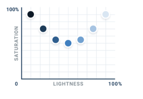
- This part includes lots of details about how to adjust brightness and lightness without affecting intensity to create a color palette. Useful if I want to create color palette from scratch.
-
Greys don’t have to be grey:
-
True grey has 0% saturation. But in practice, a lot of greys are actually saturated and this saturation makes some greys feel cool and other feel warm.
-
Color temperature: Saturate greys with blue to make them feel cool, and with yellow or orange to make them feel warm. Increase the saturation for the lighter and darker shades so those shades won’t look washed out.
-
-
Accessible doesn’t have to mean ugly:
-
The Web Content Accessibility Guidelines (WCAG) recommend that normal text (under ~18px) has a contrast ratio of at least 4.5:1, and that larger text has a contrast ratio of at least 3:1.
-
Flipping the contrast: Dark colored backgrounds really grab attention, so instead of using light text on a dark colored bg, use dark colored text on light colored bg so the color is still there to support the text but doesn’t interfere as much with other actions on the page.
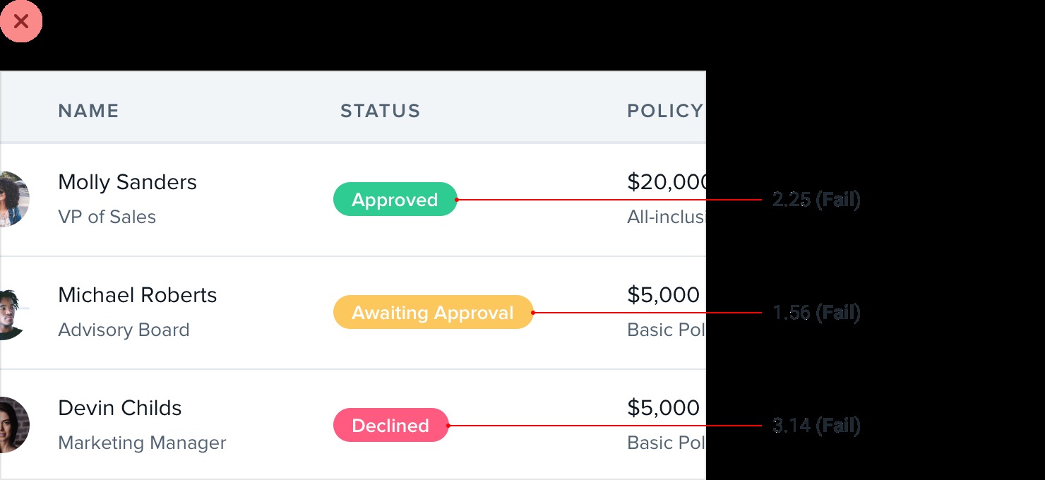
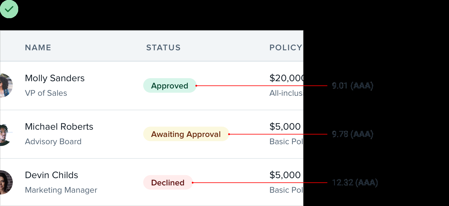
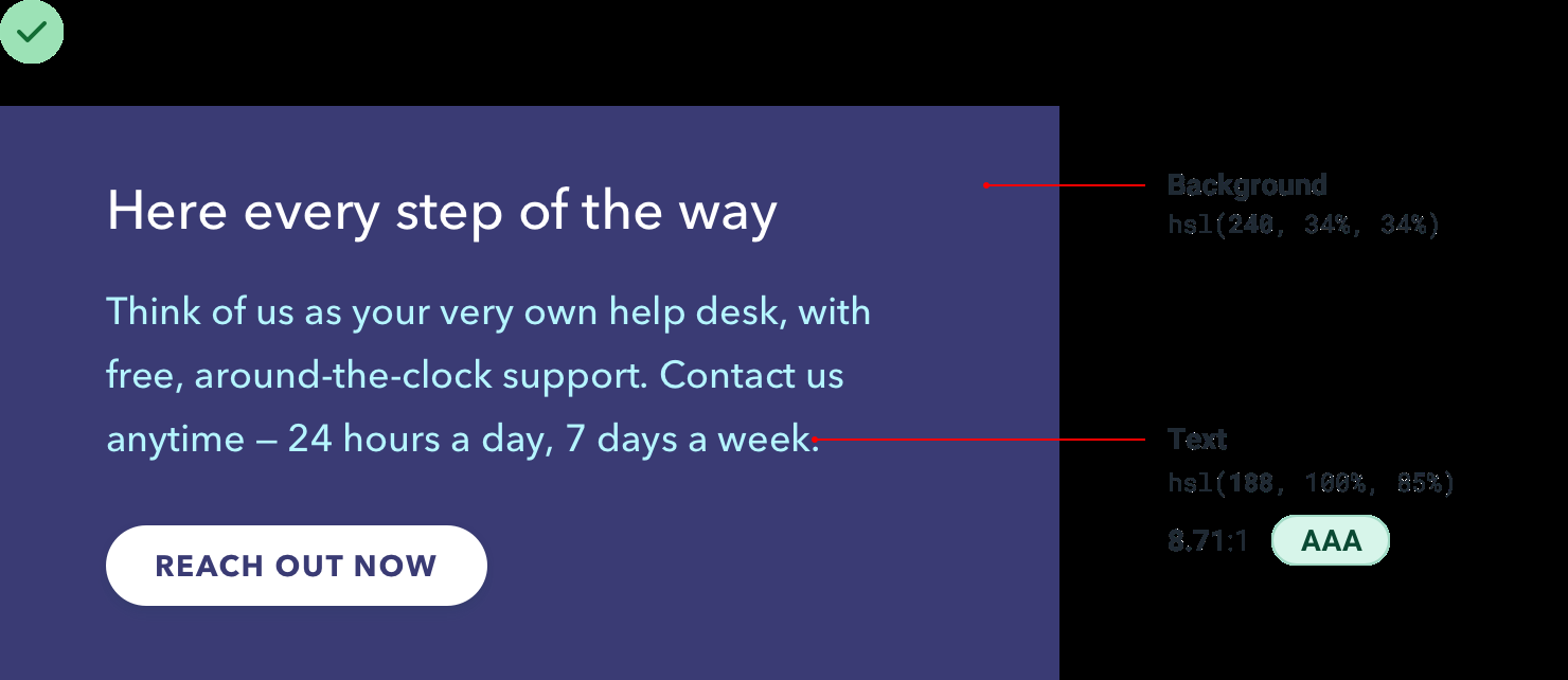
- Rotating the hue: When picking color for secondary text on a colored background, it’s hard to meet the recommended contrast ratio without getting very close to pure white. But primary text is already white, so one way is to rotate the hue towards a brighter color, like cyan, magenta, or yellow.
-
-
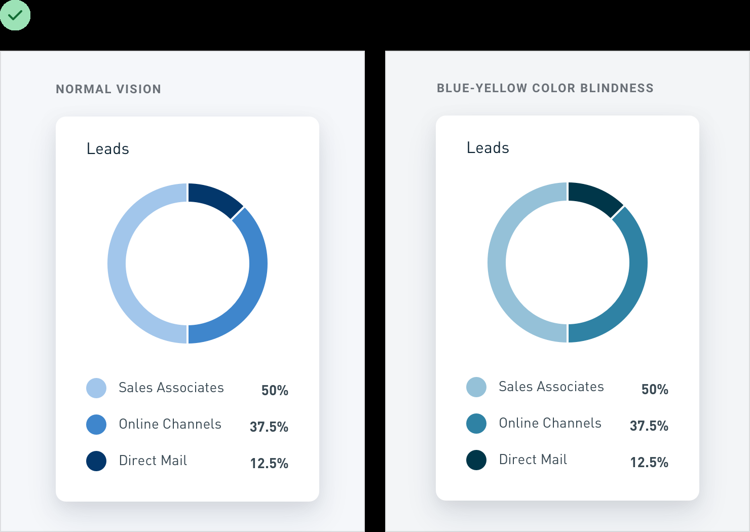
Don’t rely on color alone: Users with color blindness will have a hard time interpreting your UI. An easy fix is to communicate info in some other way, like by adding icons or relying on contrast instead of using different colors.

Creating depth
-
Emulate a light source:
-
Light comes from above
-
Simulate light in a UI:
People generally look slightly downward towards their screens, so for the most natural look, reveal a bit of the top edge and hide the bottom edge. Since the top edge is facing upward, make it slightly lighter than the face of the button, usually using a top border or an inset box shadow with a slight vertical offset. Choose the lighter color by hand instead of using a semi-transparent white for best results — simply overlaying white can suck the saturation out of the underlying color.

A raised element will block some of the light from reaching the area below the element. → Add small dark box shadow with a slight vertical offset.

-
Inset elements:
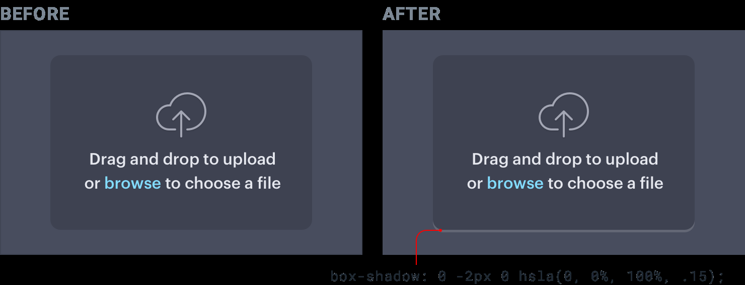
Looking slightly downward, only the bottom lip is visible → Slightly litghter color using bottom border or inset shadow with negative vertical offset:
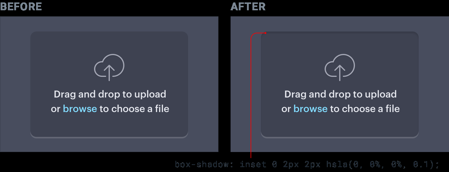
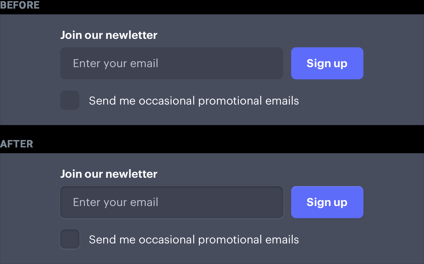
The area above blocks some of the light from reaching the very top → Add a small dark inset box shadow with a slight positive vertical offset:
-
Don’t get carried away: In practice it can lead to interfaces that are busy and unclear. Borrowing some visual cues from the real world is a great way to add a bit of depth, but there’s no need to try and make things look photo-realistic.
-
-
Use shadows to convey elevation:
-
Larger shadows with higher blur radius make element feel much closer to the user. The closer, the more it will attract user’s focus. Great for modal dialogs.
-
Use smaller shadow for sth like a button, you want user to notice but don’t want it to dominate the page.
-
Medium shadows are useful for things like dropdowns, elements that need to sit a bit further above the rest of the UI.
-
Establish an elevation system: 5 options is usually enough.
-
Combining shadows with interaction: Shadows provide visual cues to users when they interact with elements. Eg. Add shadow to an item to make it pop forward above other items and make it clear that user can click and drag it. Or make a smaller shadow or remove the shadow when user clicks a button.
-
-
Shadows can have 2 parts: To make large shadow nice and subtle while still making the shadow closer the element’s edges nice and defined.
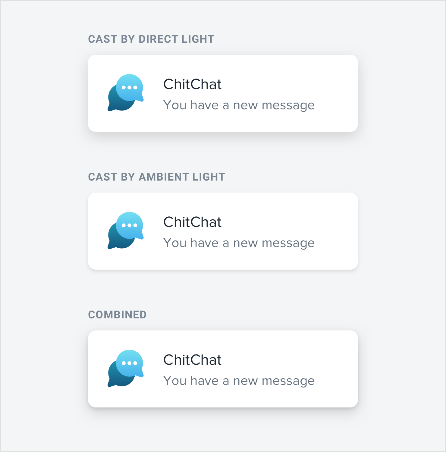
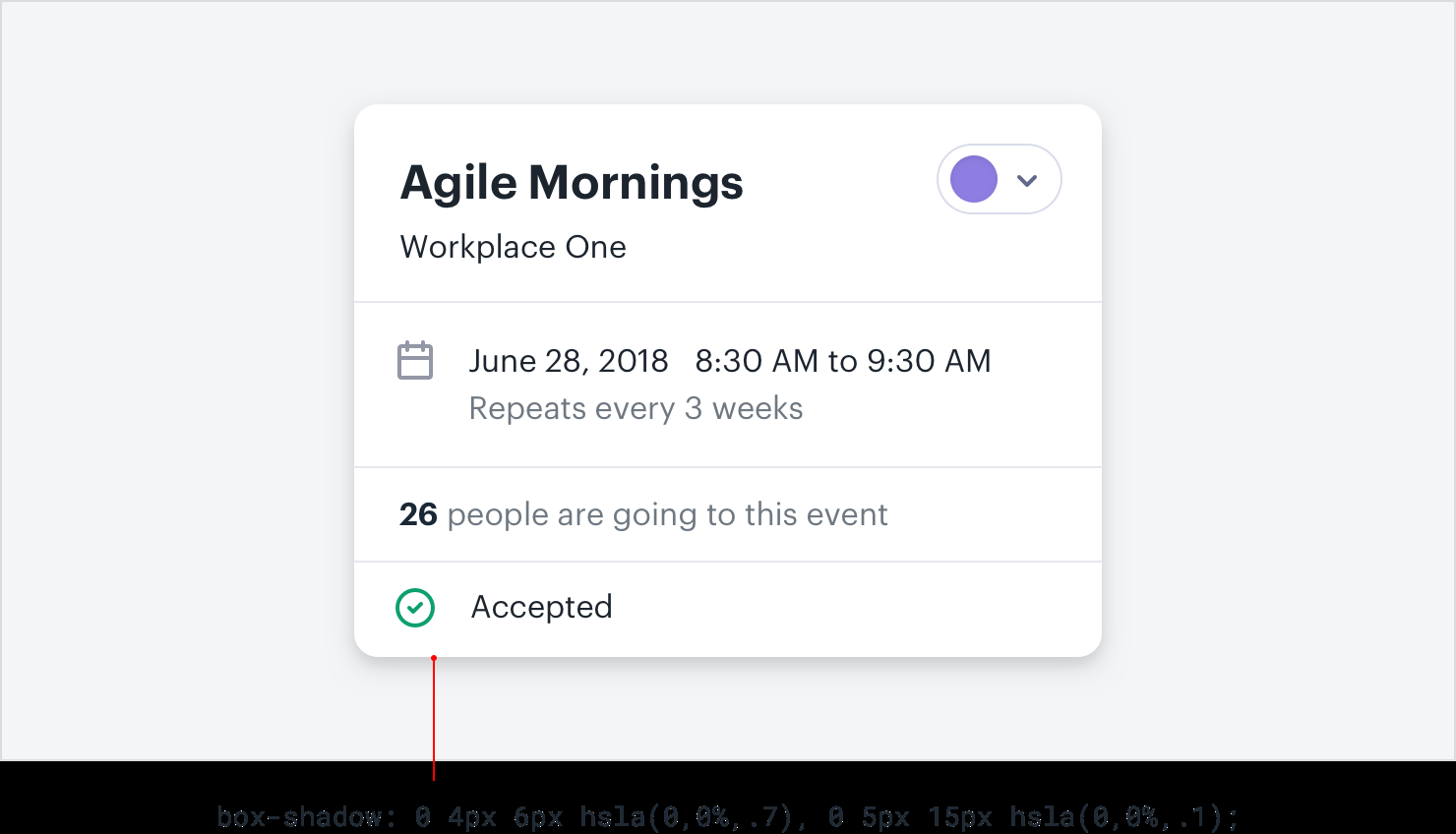
- Accounting for elevation: As an object gets further away from a surface, the small, dark shadow created by a lack of ambient light slowly disappears. Make that shadow more subtle for shadows that represent a higher elevation. Distinct at lowest elevation, almost (or completely) invisible at highest elevation.
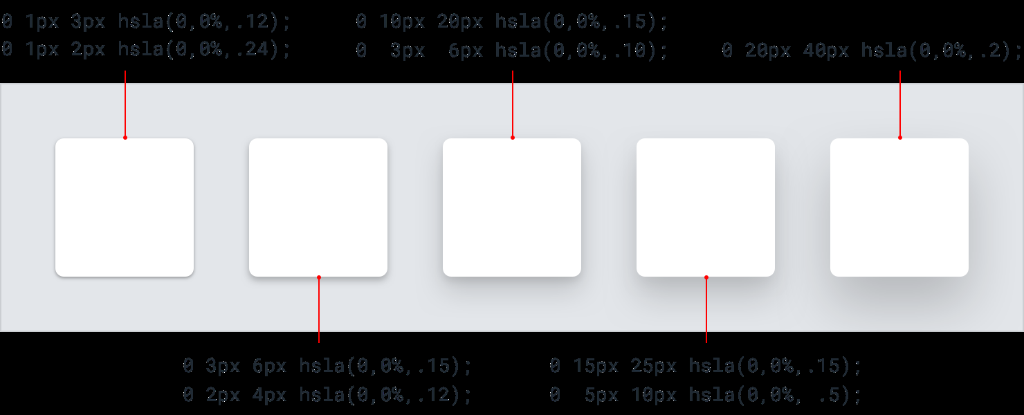
-
Flat designs can have depth:
-
Create depth with color: In general, lighter objects feel closer to us and darker objects feel further away. Make an element lighter than the background color to make it feel like it’s raised off of the page, or darker than the background color if you want it to feel inset.
-
Use solid short, vertically offset shadows with no blur radius.
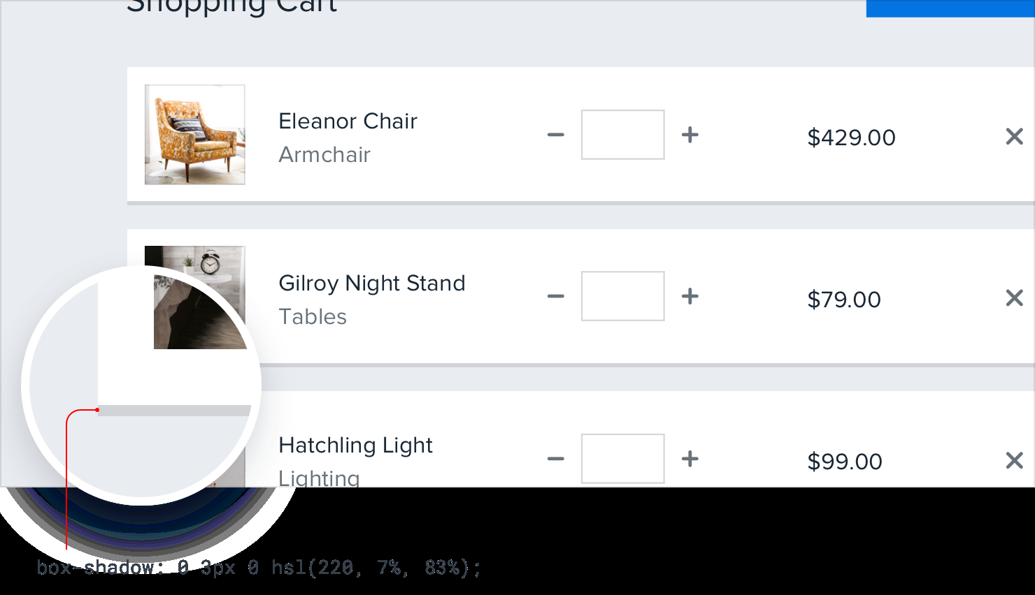
-
-
Overlap elements to create layers
- For example, instead of containing a card entirely within another element, offset it so it crosses the transition between two different backgrounds:
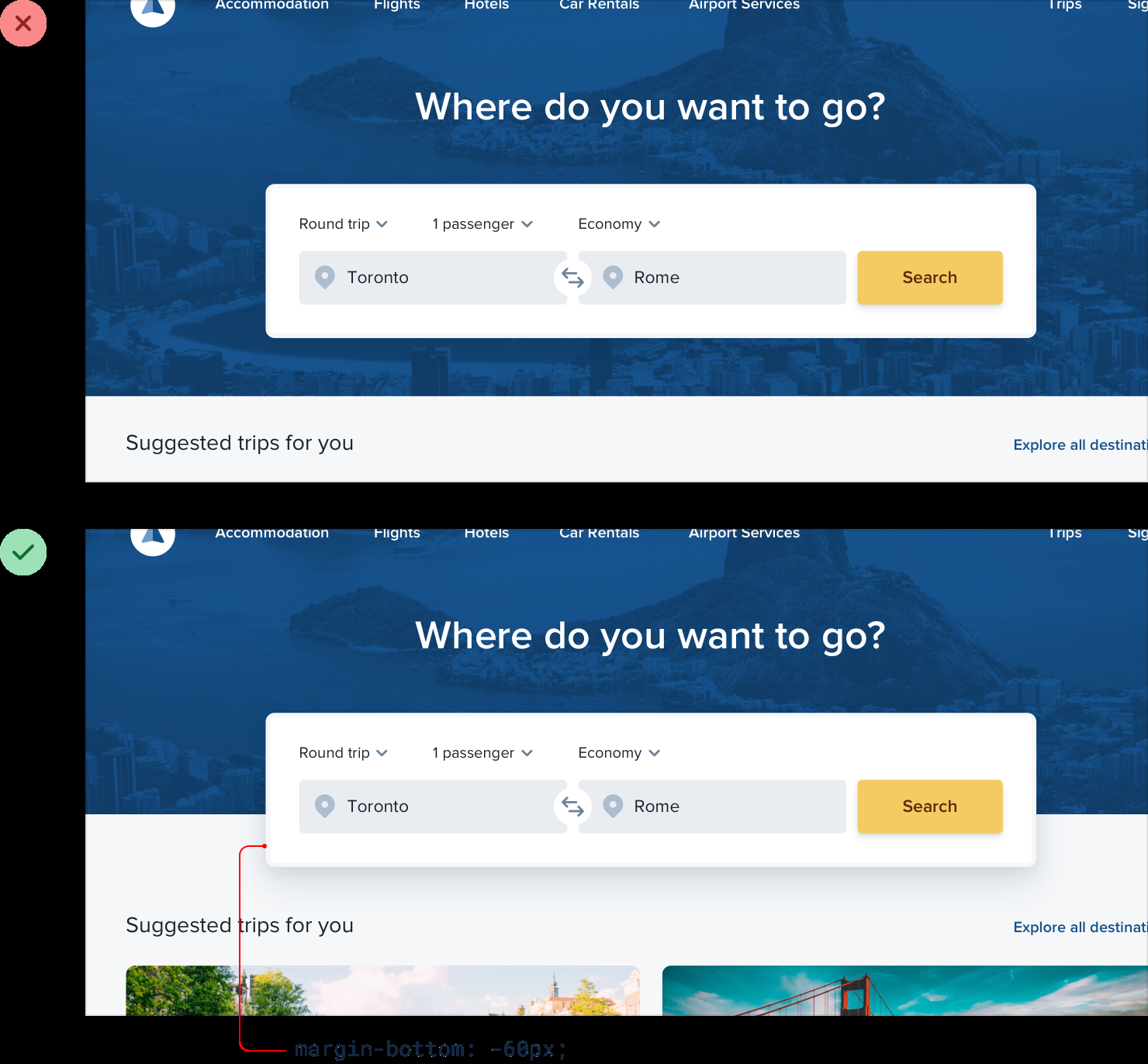
- Make an element taller than its parent, so it overlaps on both sides:
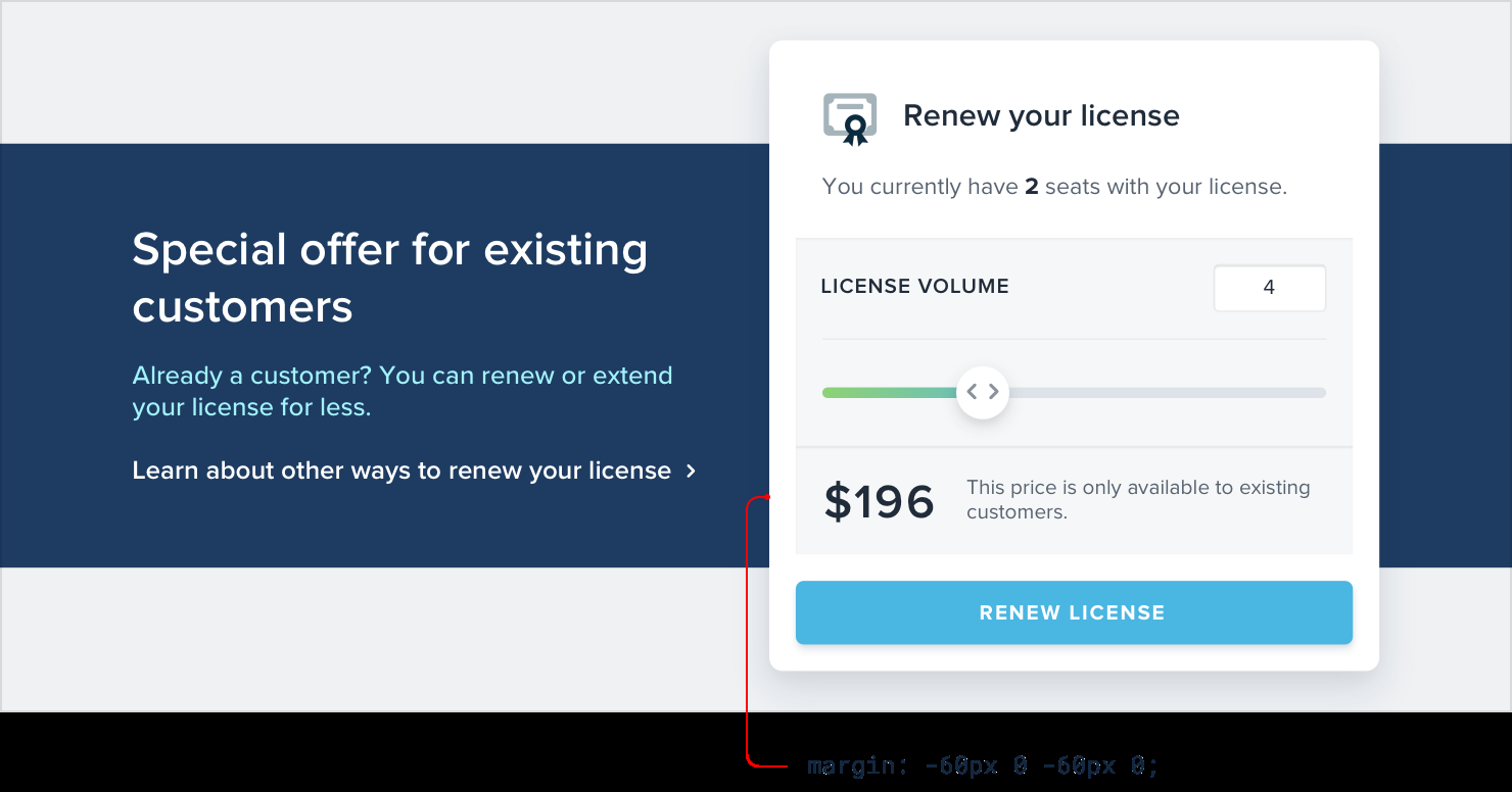
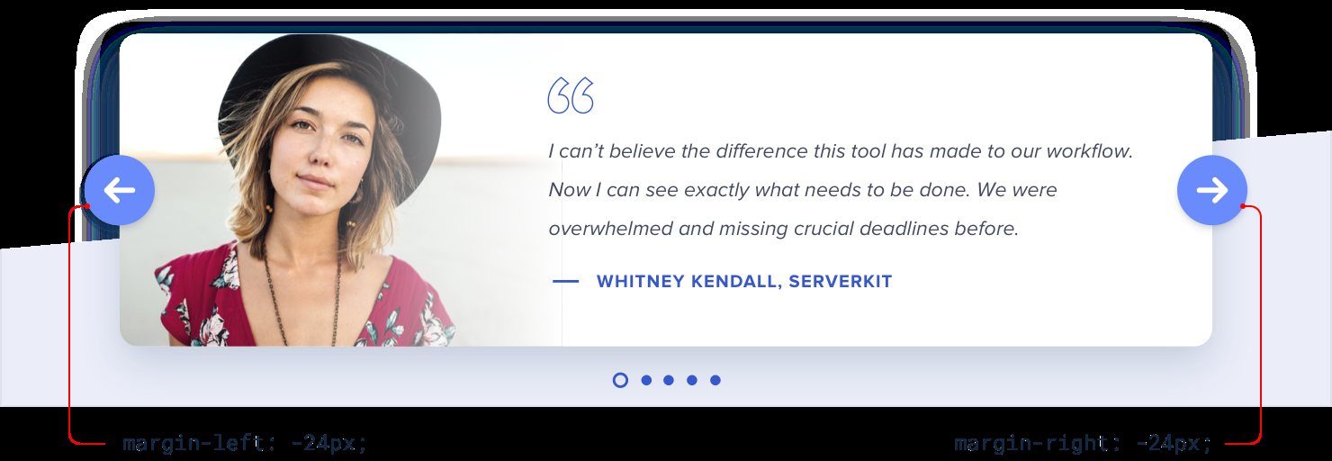
- Overlapping elements can add depth to smaller components too, for example the controls on this carousel:
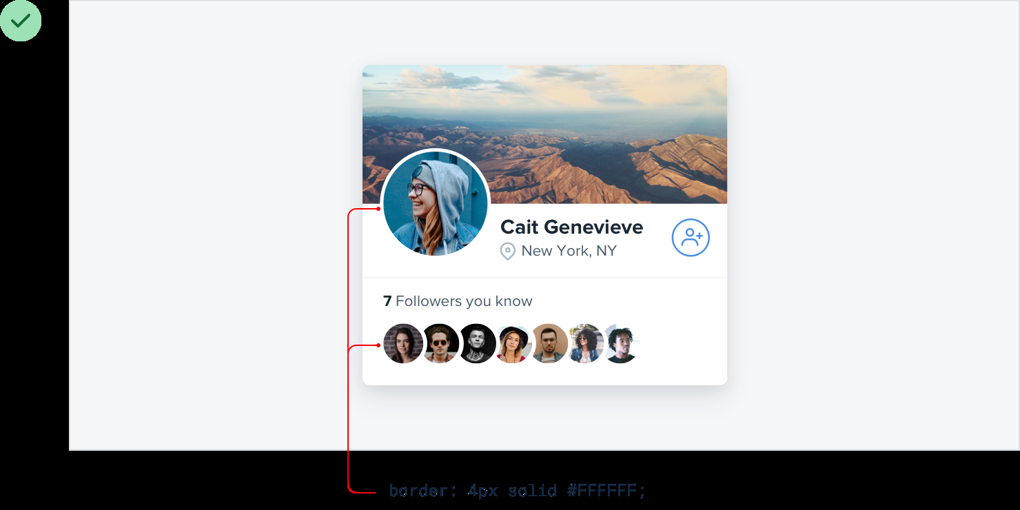
- Overlapping images: Give images an “invisible border” — one that matches the background color.
Working with images
-
Use good photos: Hire a professional photographer or use high quality stock photos.
-
Text needs consistent contrast: Photos can be very dynamic with lots of light and dark areas, so text on image can get lost. You can:
-
Add a semi-transparent overlay to the bg img.
-
Lower the img contrast.
-
Colorize the image with a single color: Lower the img contrast → Desaturate the img → Add a solid fill using “multiply” blend mode.
-
Add text shadow: Use large blur radius & don’t add offset.
-
-
Everything has an intended size:
- Don’t scale up icons: Icons that were drawn at smaller sizes may not look good when enlarging them because they often lack detail and feel disproportionately chunky. If you have to use the small icons, try enclosing them inside another shape and giving the shape a background color.


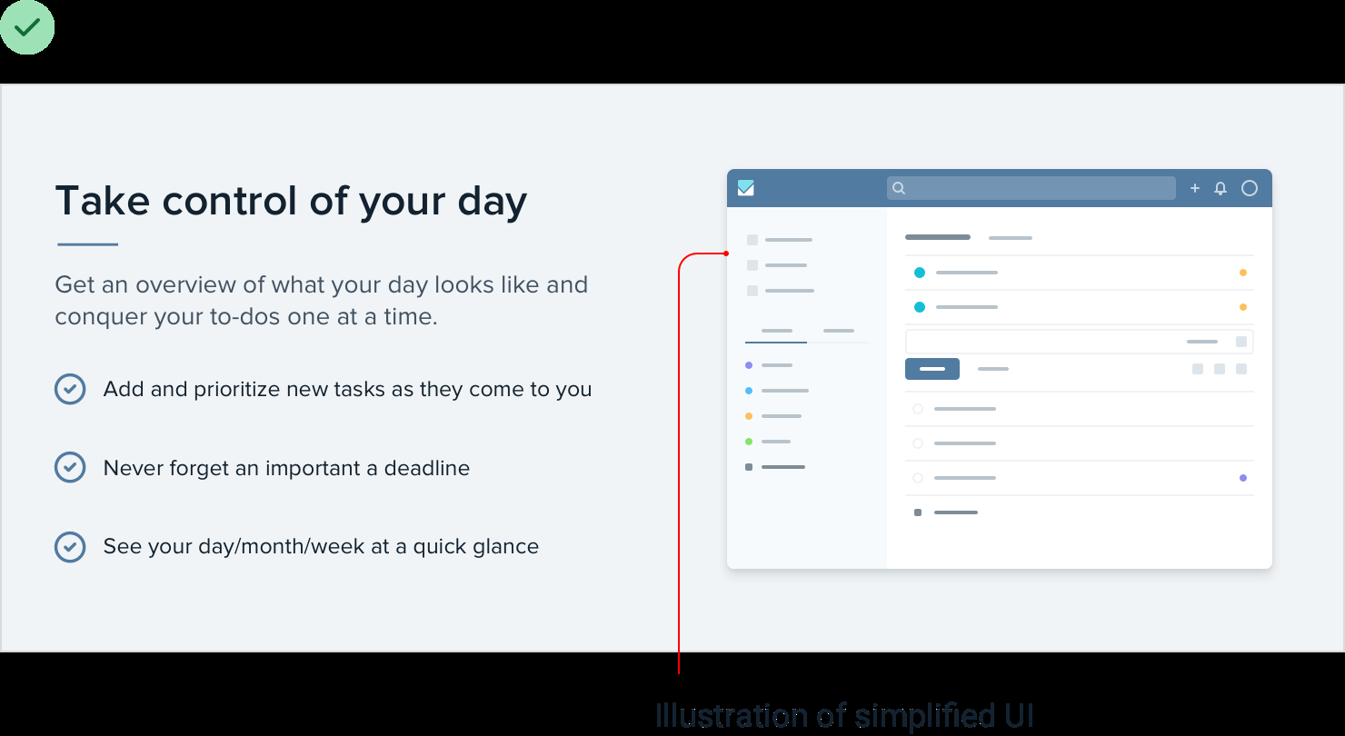
- Don’t scale down screenshots: If you take a full-size screenshot and shrink it by 70% to make it fit, you’ll end up with an image that’s trying to cram way too much detail into far too little space. Users have to squint to see what the text is about. If you want to include a detailed screenshot in your design, take the screenshot at a smaller screen size (like maybe your tablet layout). Or consider taking just a partial screenshot.
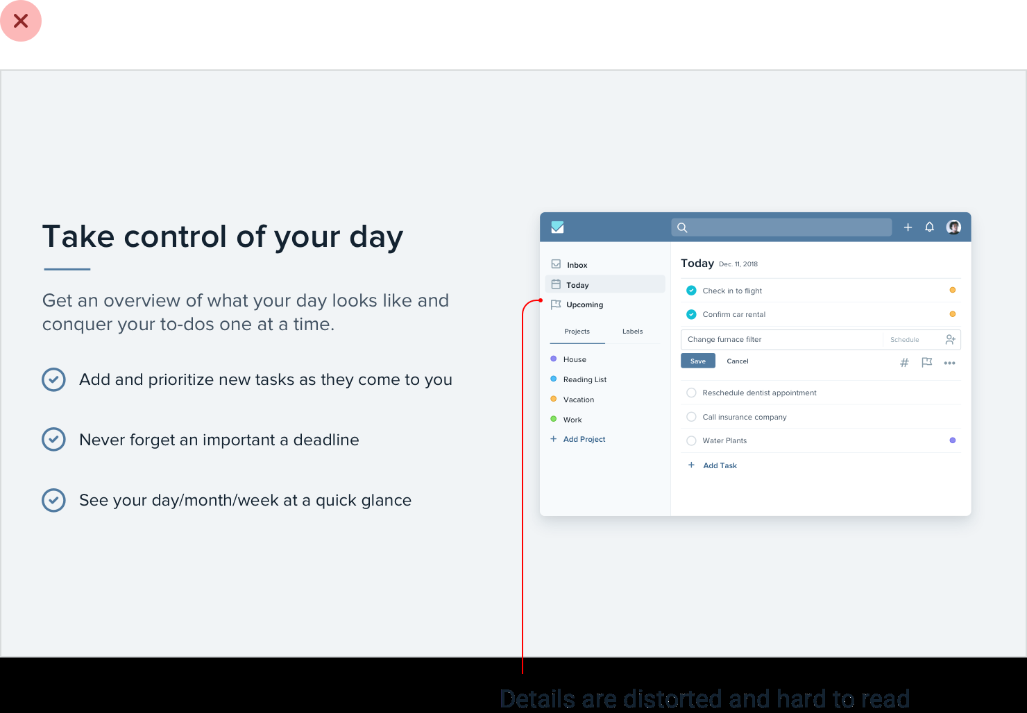
If you really need to fit a whole-app screenshot in a tight space, try drawing a simplified version of the UI with details removed and small text replaced with simple lines:
-
Don’t scale down icons: Icons intended to be used at larger sizes look choppy and fuzzy when you scale them down. Eg. favicons. Redraw a super simplified version of the logo/icon at the target size, so you control the compromises instead of leaving it up to the browser.
-
Beware user-uploaded content:
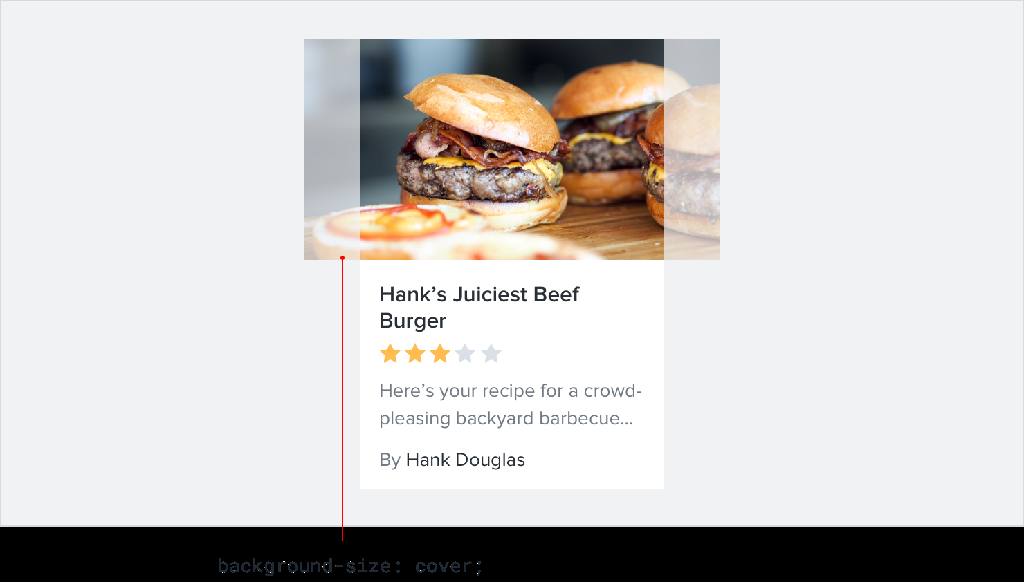
- Control the shape and size: Instead of letting users wreak havoc on your page structure, center their images inside fixed containers, cropping out anything that doesn’t fit. Easy to do with CSS by making the image a background image, and setting the
background-sizeproperty tocover.
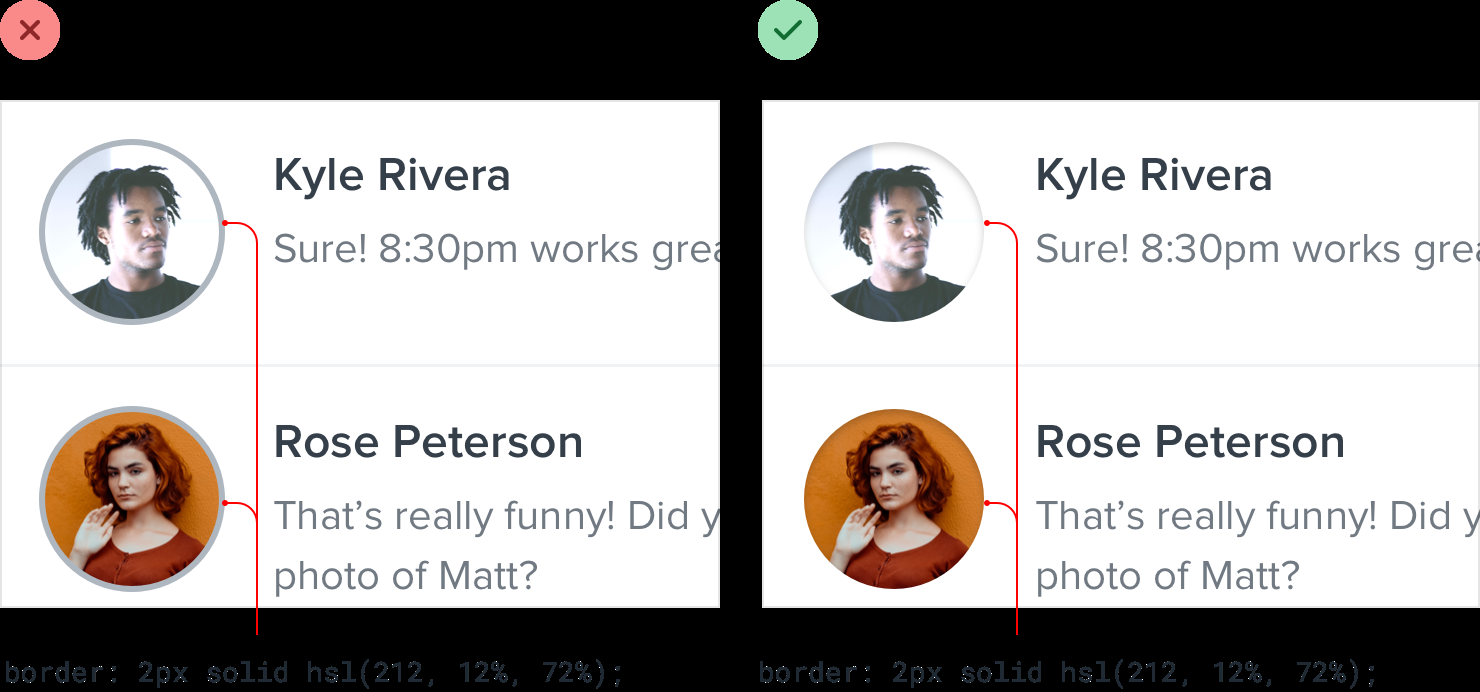
- Prevent background bleed: When a user provides an image with a background color that’s similar to the background in your UI, the image and the background can bleed together, causing the image to lose its shape. Instead of trying to solve this with a border, try using a subtle inner box shadow:
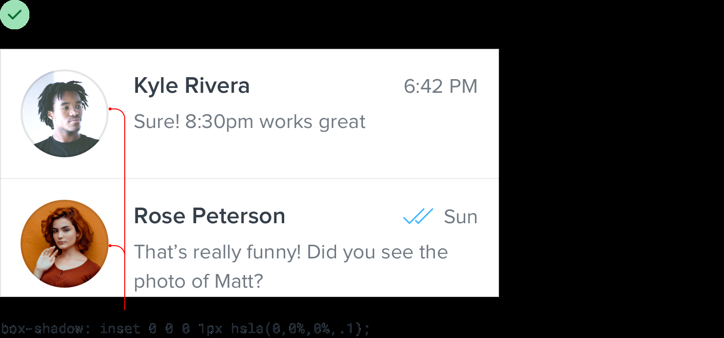
If you don’t like the slight “inset” look you get from using a box shadow, a semi-transparent inner border works great, too.
- Control the shape and size: Instead of letting users wreak havoc on your page structure, center their images inside fixed containers, cropping out anything that doesn’t fit. Easy to do with CSS by making the image a background image, and setting the
Finishing touches
-
Supercharge the defaults: Improve what’s already there.
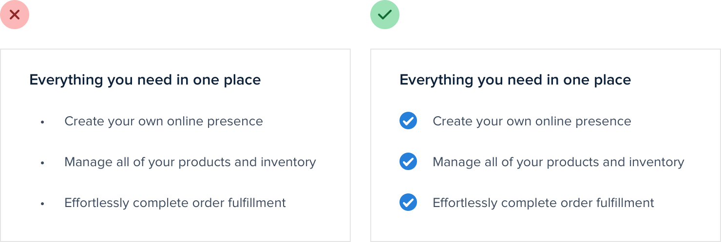
- Bulleted list: Replace bullets with icons.
-
Use icons related to content, e.g. a padlock for a list of security-related features.
-
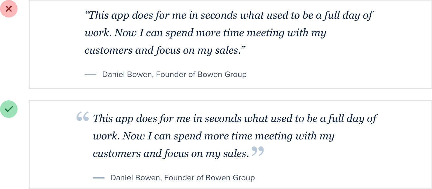
Testimonial: Increase the size & change the color.
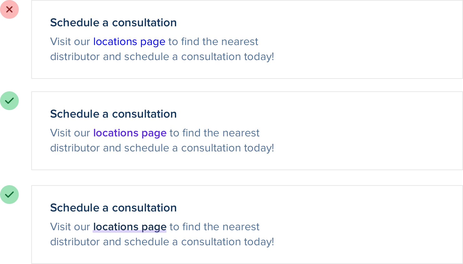
- Links: change color & font weight, thick & colorful custom underline that partially overlaps the text:
- Custom checkboxes & radio buttons using brand colors
-
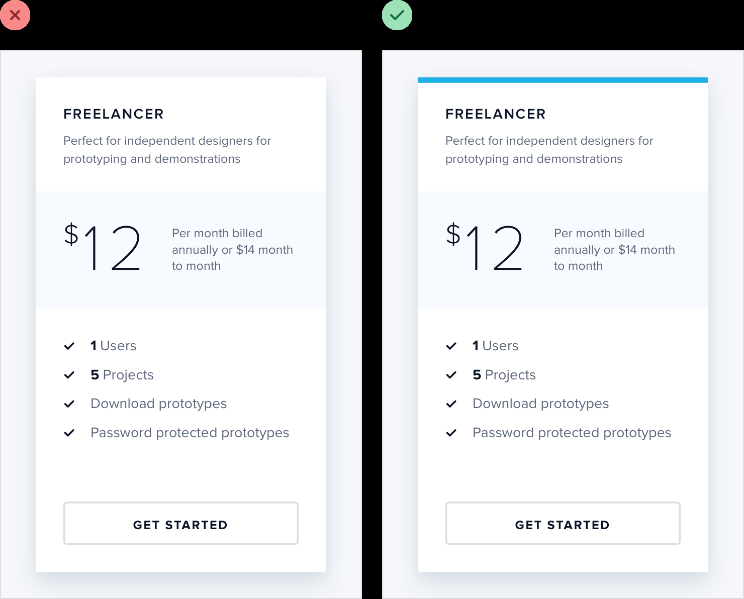
Add color with accent borders
For example, across the top of a card:
…navigation items:

…alert message:

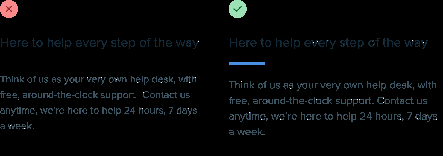
…short accent underneath a headline:
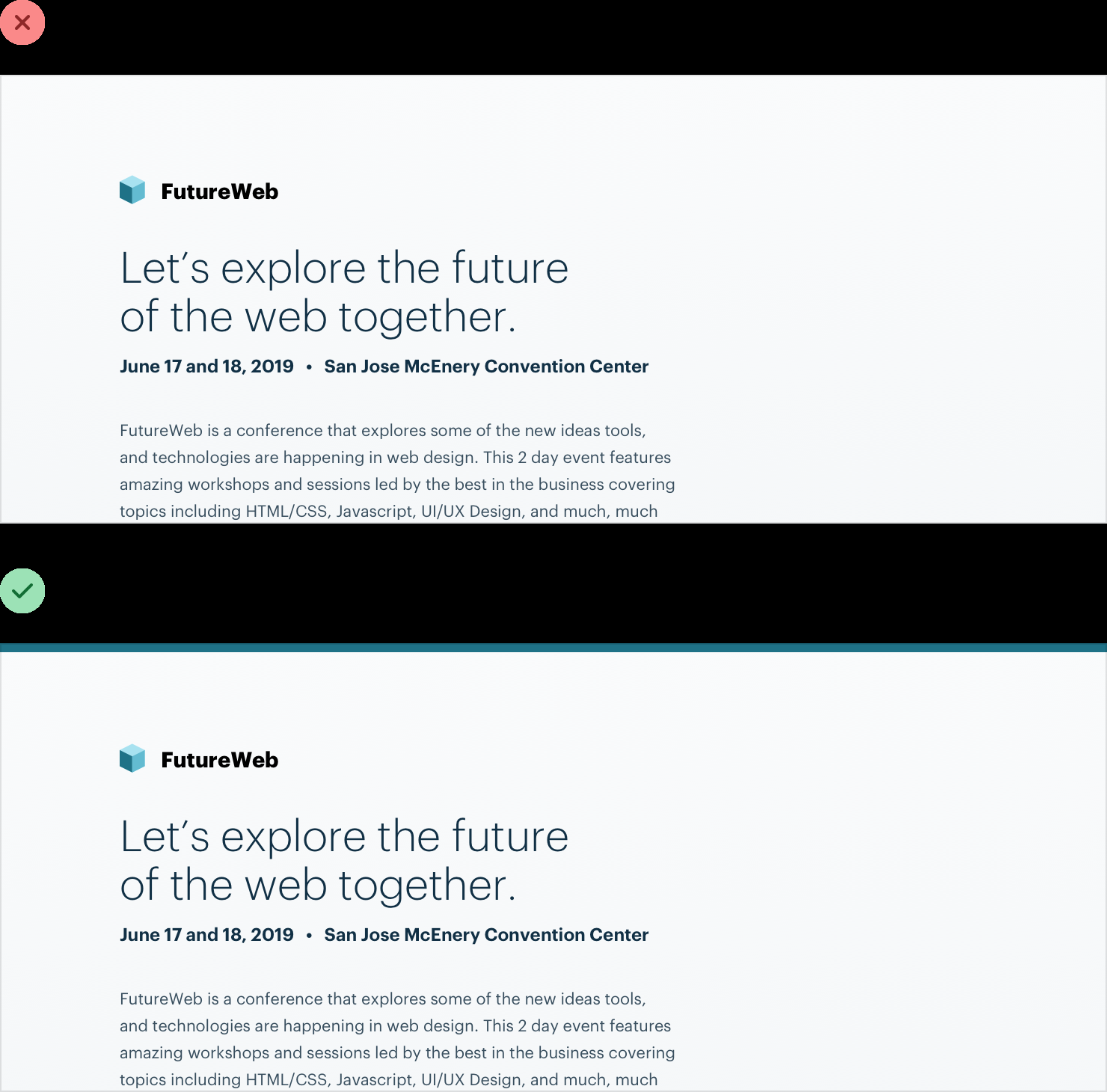
…across the top of your entire layout:
-
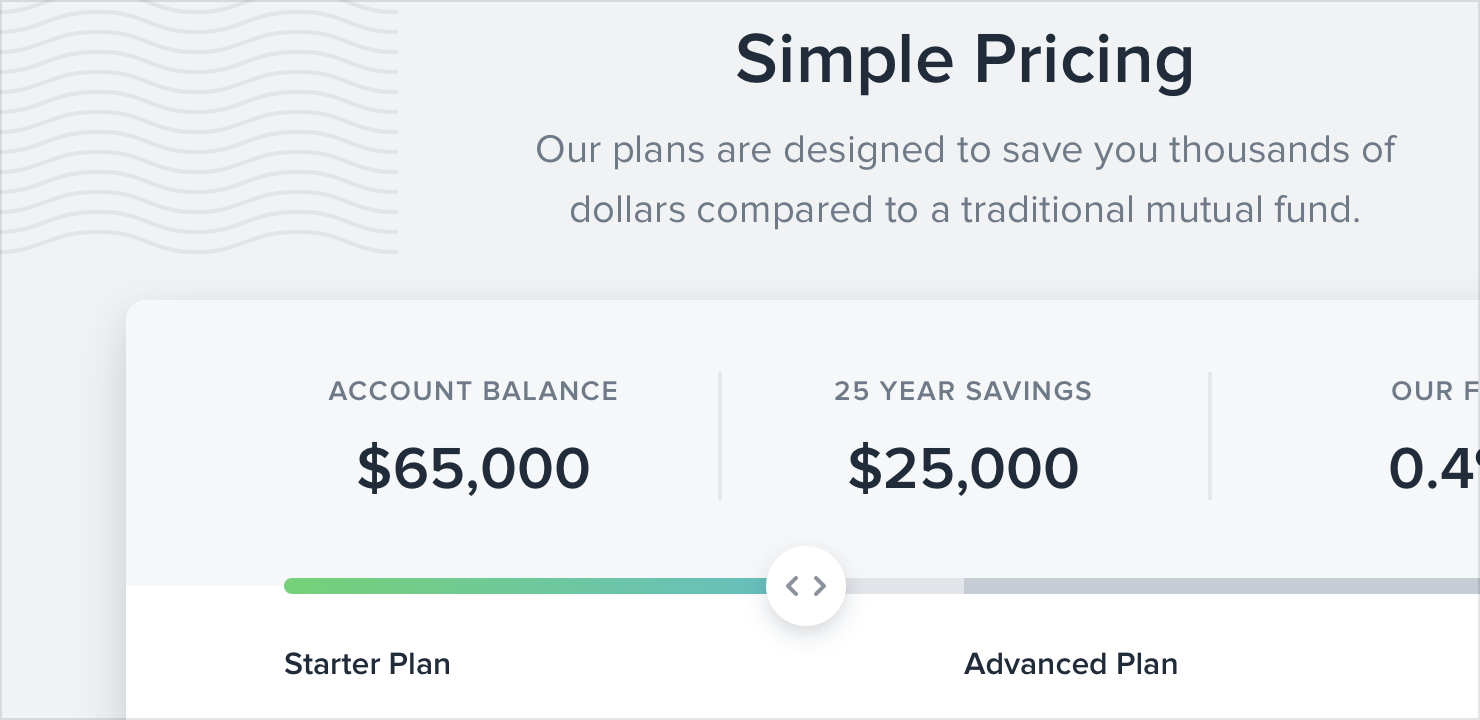
Decorate backgrounds:
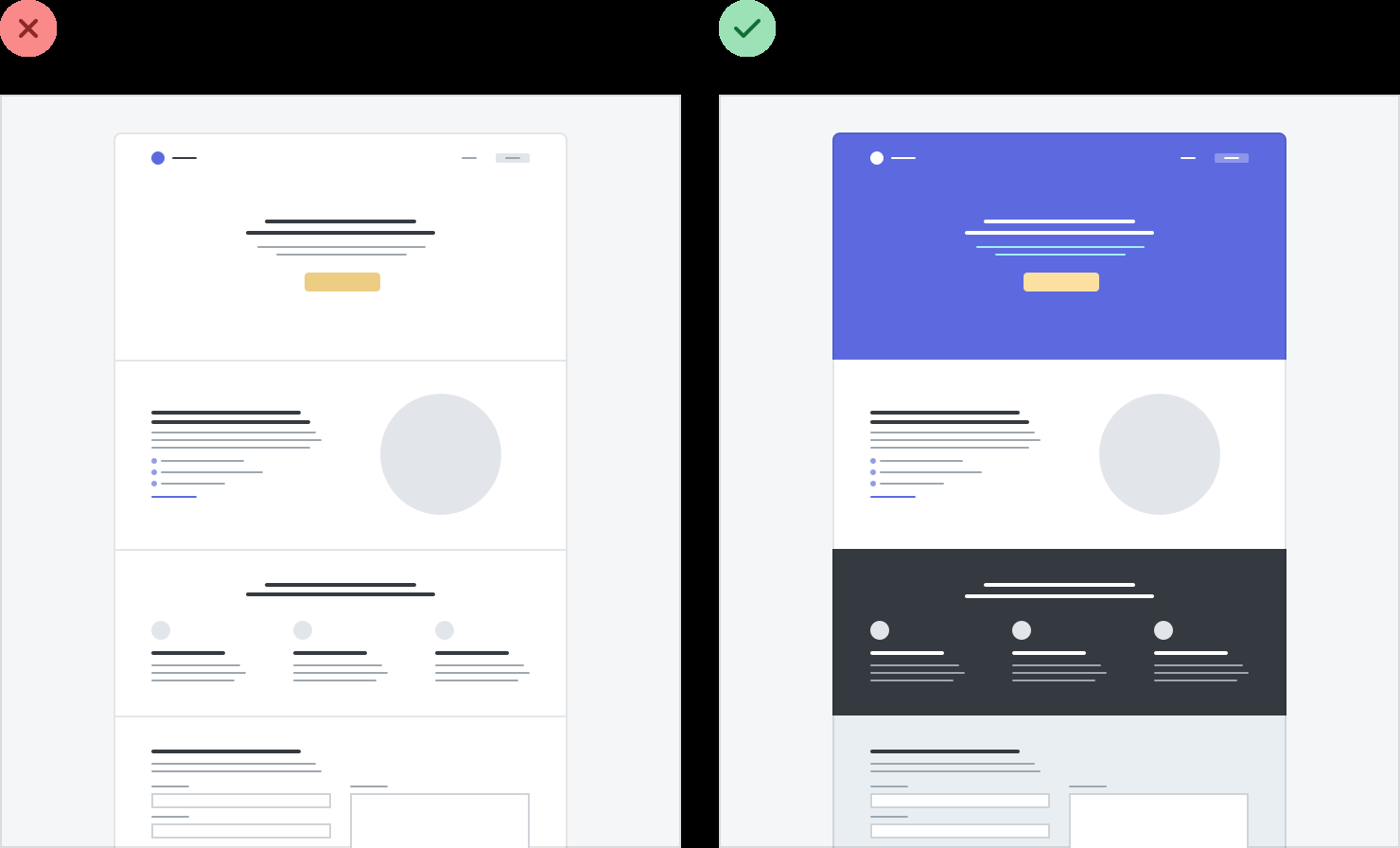
- Change bg color: Great for emphasizing an individual panel, as well as for adding some distinction between entire page sections.
-
Gradient bg color: For best results, use 2 hues that are no more than about 30deg apart.
-
Use a repeating pattern
-
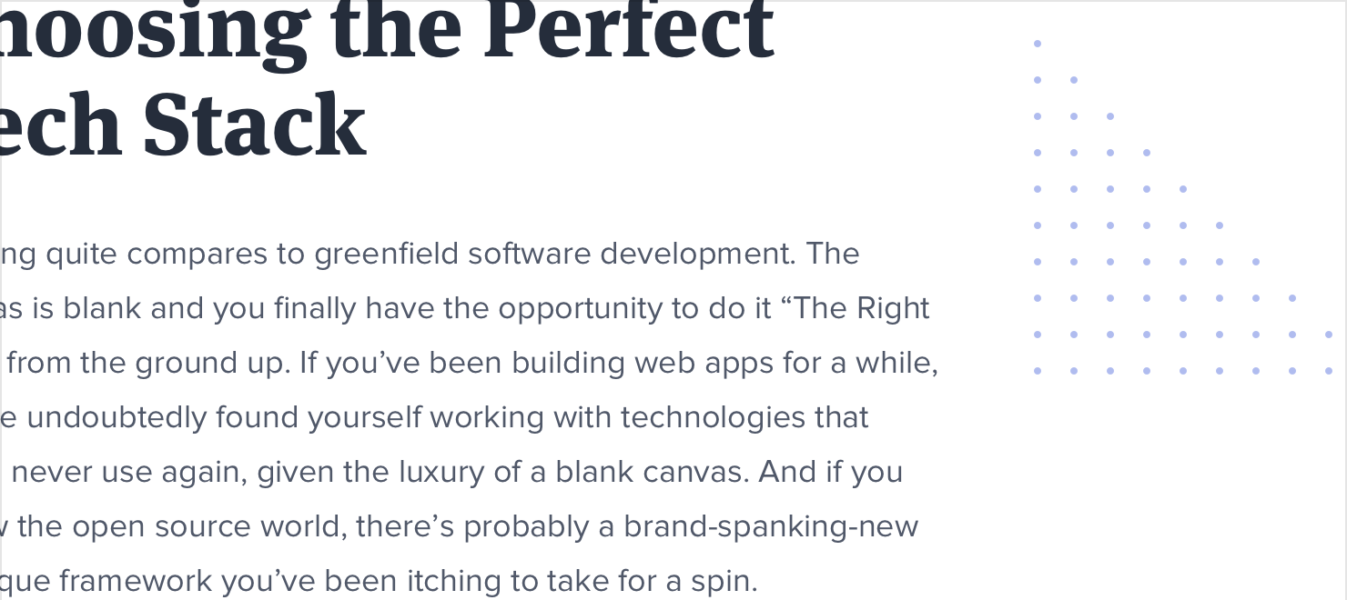
Add a simple shape or illustration
-
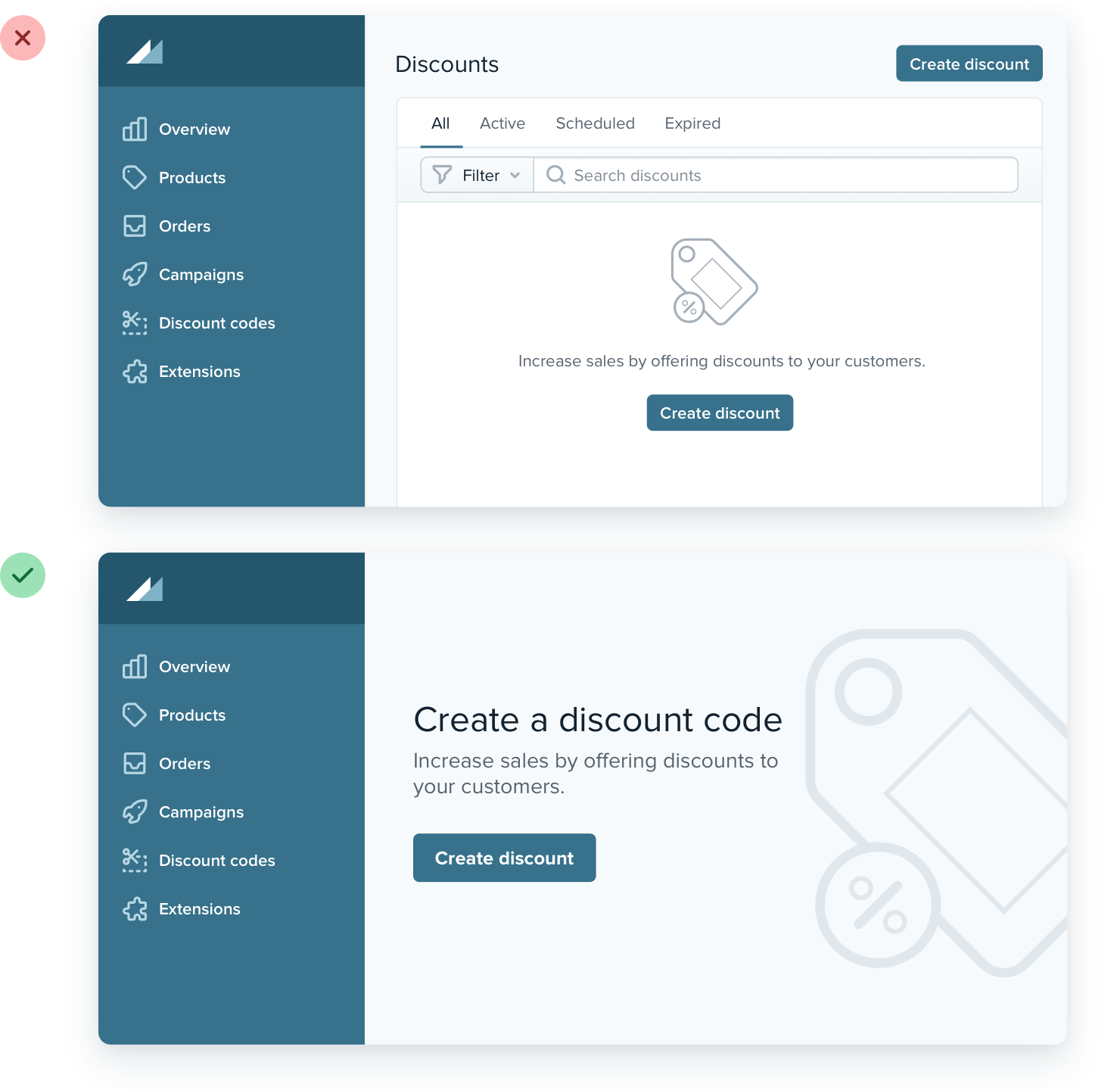
Don’t overlook empty states: If you’re designing something that depends on user-generated content, the empty state should be a priority, not an afterthought. Try incorporating an image or illustration to grab the user’s attention, and emphasizing the call-to-action to encourage them to take the next step:

- Hide supporting UI like tabs or filters. There’s no point in presenting a bunch of actions when there’s no content.
-
Use fewer borders: Too many make your design busy & cluttered.
-
Use a box shadow: Works best when the element you are applying the box shadow to is not the same color as the background. Eg. modal.
-
Use 2 slightly different bg colors for adjacent elements
-
Add extra spacing
-
-
Think outside the box:
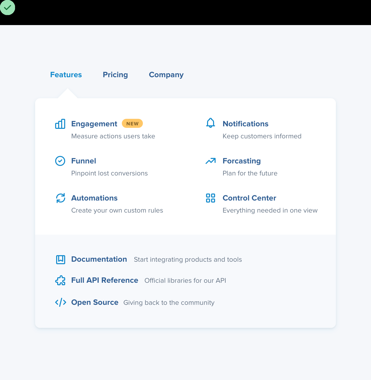
- Instead of a plain dropdown list, try breaking it into sections, using multiple columns, adding supporting text or colorful icons.
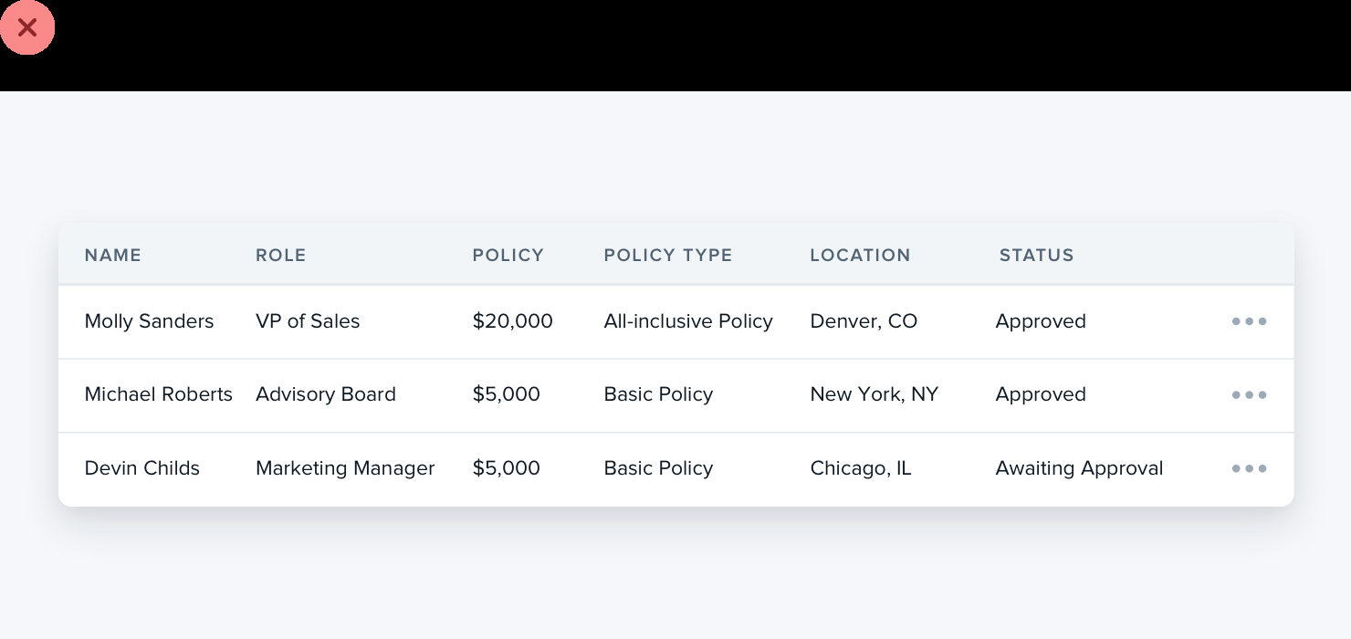
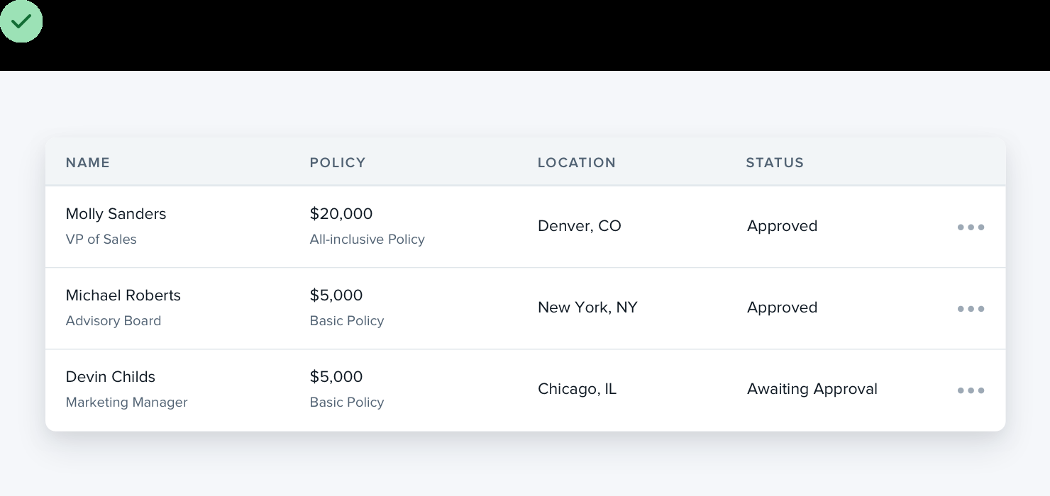
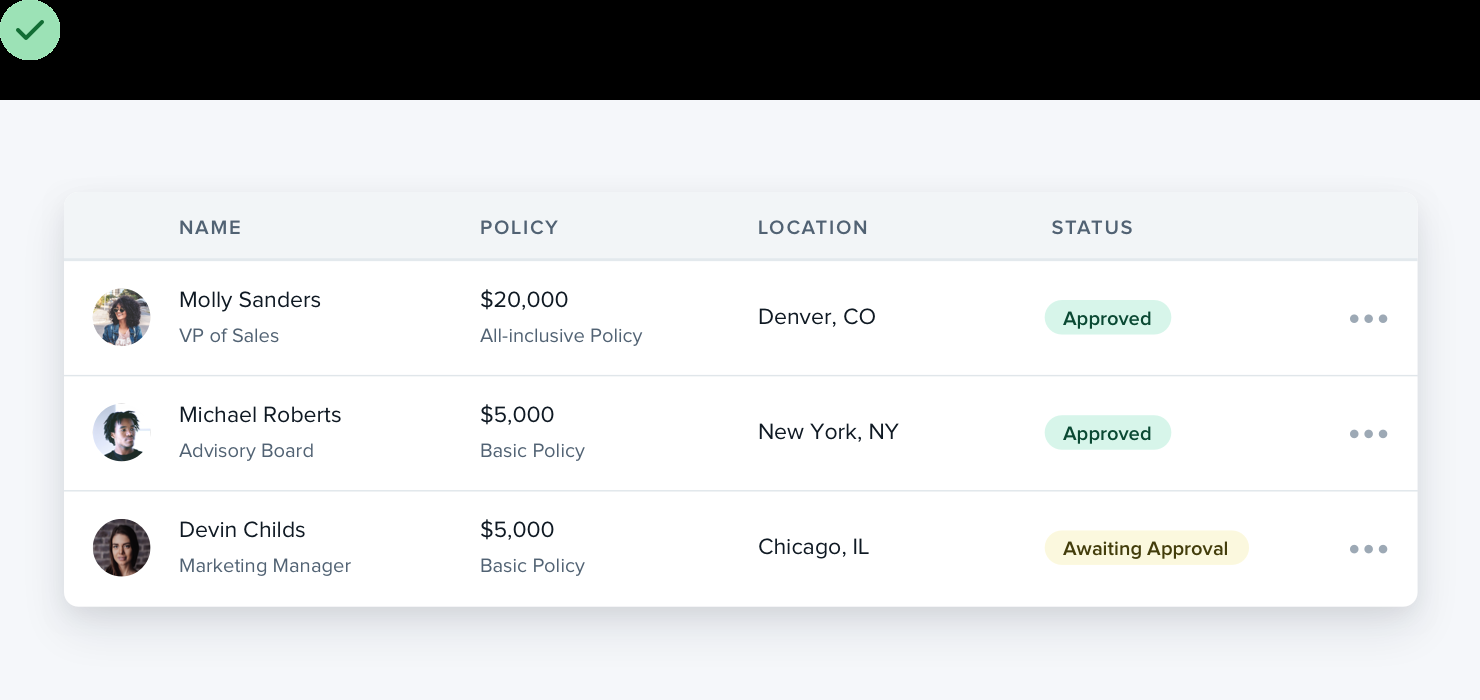
- Tables: Instead of each data for each column, try combining data. And not just plain text, you can also add images, colors.
- Radio buttons: Instead of a stack of labels with little circles, try selectable cards.
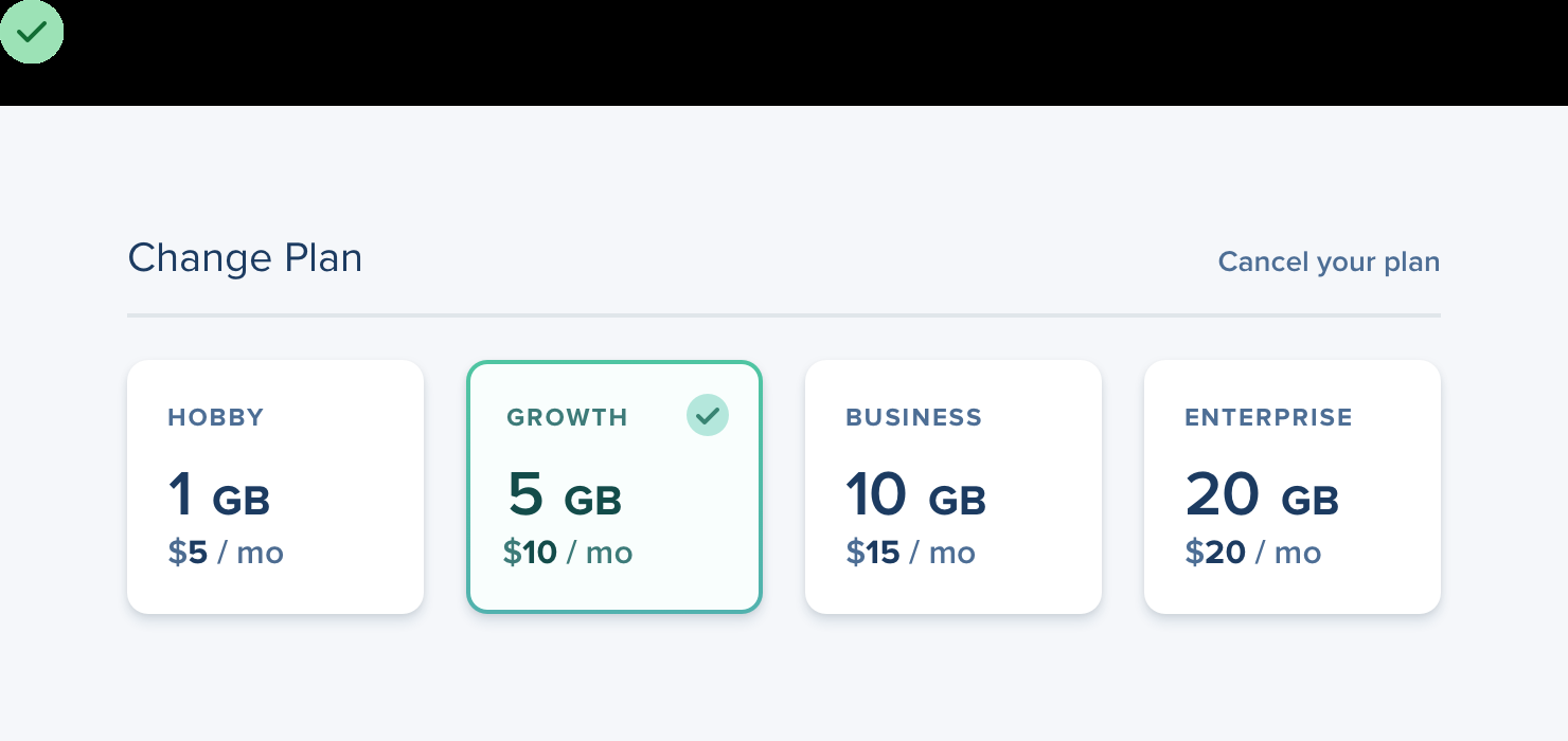
Don’t let your existing beliefs hold back your designs — constraints are powerful but sometimes a bit of freedom is just what you need to take an interface to the next level.
Leveling up
Here are two of the best ways you can continue to hone your skills, and add new tools to your toolbelt.
-
Look for decisions you wouldn’t have made: Ask yourself “Did the designer do anything here that I never would have thought to do?” when looking at a design you like.
-
Rebuild your favorite interfaces: Recreate the design from scratch, without peeking at the developer tools.
By continually studying the work that inspires you with a careful eye, you’ll be picking up design tricks for years to come.