My review
Good
- It’s very easy and straightforward to read. Knowledge is practical. Lots of examples.
Can be improved
- The examples and some of the knowledge are outdated. I remember there’s a part where the author expressed doubts about flat designs, which has become so popular these days. And the screenshots of webs and apps look ancient.
Book notes
The author’s definition of usability:
A person of average (or even below average) ability and experience can figure out how to use the thing to accomplish something without it being more trouble than it’s worth.
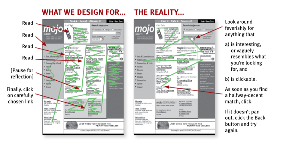
What most users do is glance at each new page, scan some of the text, and click on the first link that catches their interest or resembles the thing they’re looking for.

3 facts about real-world Web use
-
We don’t read pages. We scan them.
-
We don’t make optimal choices. We satisfice. (accept an available option as satisfactory)
-
We don’t figure out how things work. We muddle through.
Not just beginners, even tech-savvy users muddle through. Because it doesn’t matter whether we understand how things work as long as we can use them; if we find something that works, we stick to it.
Does it really matter if users “get it”? Yes, a great deal because there’s a higher chance users can find what they’re looking for, understand what you offer, you can steer them to other parts of your site, and users feel smarter and more in control, which will bring them back.
Some important things you can do to make users see and understand:
- Follow existing conventions: Where things will be located on a page, how things work and look. If you don't use conventions, make sure you replace them with something so clear and self-explanatory that there's no learning curve, of worth a small learning curve.

> The rule of thumb is that you can--and should--be as creative and innovative as you want, and add as much aesthetic appeal as you can, as long as you make sure it's still usable.

> CLARITY TRUMPS CONSISTENCY

- Create effective visual hierarchies:

	- More important - more prominent

	- Related logically - related visually

	- Nest things visually to show what's part of what

- Break pages up into clearly defined areas

- Make it obvious what's clickable

- Eliminate distractions aka Keep the noise down to a dull roar

	- Noise: Shouting (invitation to buy, exclamation points, different typefaces, bright colors, automated slideshows, animation, pop-ups, ads), Disorganization, Clutter

- Format content to support scanning: well-written & thoughtful headings, short paragraphs, bulleted lists, highlight key term.
Why users like mindless choices
Users don’t mind a lot of clicks as long as each click is painless and they’re confident they’re on the right track.
Three mindless, unambiguous clicks equal one click that requires thought.
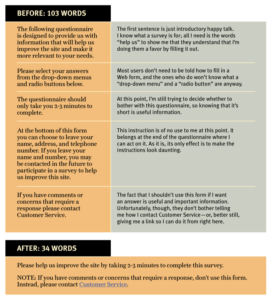
Omit needless words
E. B. White’s seventeenth rule in The Elements of Style:
- Omit needless words
Vigorous writing is concise. A sentence should contain no unnecessary words, a paragraph no unnecessary sentences, for the same reason that a drawing should have no unnecessary lines and a machine no unnecessary parts.
Getting rid of words no one is going to read helps reduce the noise level of the page, make useful content more prominent, make the page shorter so users see more at a glance without scrolling.
-
Happy talk must die: The introductory text that’s suppose to welcome us to the site and tell us how great it is or tell us what we’re about to see in the section we’ve just entered. Conveys no useful info. Most Web users don’t have time for small talk, they want to get right to the point.
-
Instructions must die: No one is going to read them, at least not until they’ve repeatedly failed to muddle through. Make everything self-explanatory. When instructions are necessary, cut them back to the bare minimum.

Persistent navigation
Persistent navigation should include:
-
Site ID
-
Utilities: Sign in, Contact, Shopping cart, Register
-
Search
-
Sections: Products/News, Support, About, etc.
The Big Bang Theory of Web Design
The first few seconds you spend on a new Web site or Web page are critical.
Homepage
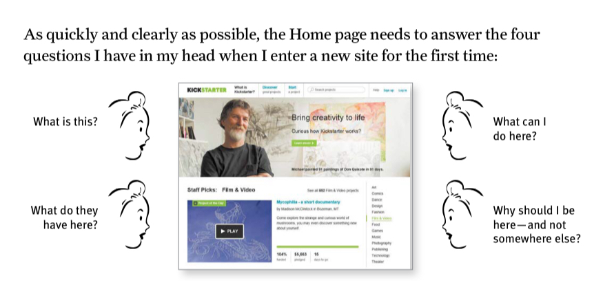
The Homepage needs to include:
- Site identity and mission: what this site is, what it’s for, why I should be here.
- Site hierarchy: site overview, features, how it’s organized→ persistent navigation
- Search
- Teases: hints of the good stuff
- Content promos: newest, best, most popular content
- Feature promo:
- Timely content: shows that your site is not dead
- Deals: ads, cross-promotions, co-branding deals
- Shortcuts: most sought after content
- Registration
Homepage objectives:
- Show how to get what people want to look for
- Show wonderful things people don’t actively look for
- Show where to start
- Establish credibility and trust
Usual constraints:
- Stakeholders all want a piece of them on the front page.
- Everyone has opinions on the homepage.
- One size fits all (visitors).

People can click on any page within your site, not just the homepage. That’s why every page should orient people properly: give the right idea about who you are, what you do, and what your site has to offer. Also, very often, people will visit homepage to find out about you.
3 important places to find out what the site is about: tagline, Welcome blurb (terse description of site), Learn more (Short explanatory video). Not everyone will use these 3.
Keep it (the message) short, but long enough to get the point across, and no longer.
Don’t use a mission statement as a Welcome blurb. Many sites fill their Home page with their corporate mission statement that sounds like it was written by a Miss America finalist. “XYZCorp offers world-class solutions in the burgeoning field of blah blah blah blah blah…” Nobody reads them.
Show the Home page to people outside your organization to tell whether the design is getting this job done.
Tagline
Explain exactly what your site or your organization does.
Just long enough, 6-8 words.
Convey differentiation (value proposition) and clear benefit.
Example: Save time. Save money. Here for you. We bring good things. You’re in good hands. → They’re generic motto, not tagline.
Personable, lively, sometimes clever.
Is tagline necessary? Probably not, but unless you’re well-knowned, a tagline is a chance to tell people why they’re better off at your site.
Where to start
Be clear about where to start if people want to search/browse/sample stuff. Label clearly: Search, Browse by category, Sign in, Start here.
The tendency to promote everything might clutter the Home page and affect the effectiveness of all other sections.
8. Arguments about usability
All Web users are unique and all Web use is basically idiosyncratic.
While designers want to create good-looking web/app and engineers want to create great features, there’s no average user. The clash of personal and professional opinions, finding outside expert, research, or focus groups.
There are no simple “right” answers for most Web design questions. What works is good, integrated design that fills a need—carefully thought out, well executed, and tested.
X: “Do most people like this pull-down menu?”
Y: “Does this pull-down, with these items and this wording in this context on this page create a good experience for most people who are likely to use this site?”
There’s really only on way to answer this kind of question: testing.
9. Usability testing
Focus groups are good for getting a sampling of users’ feelings and opinions, determining wants, needs, and likes, but not for learning whether your site works. → The planning stages, before designing and building
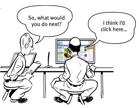
Usability tests (You observe people actually use things) help you detect and fix the things that confuse or frustrate users. → Entire process
-
Testing 1 user is better than none.
-
Testing 1 early is better than 50 near the end.
One way to test more often and simple, and less expensive is to test only 3 users, recruit them loosely, one morning a month, in an office or conference room, debrief with the team over lunch, and decide what to fix.
→ This kind of testing isn’t to prove anything. It’s to improve. Actionable insights, not proof.
Unless your site requires specific domain knowledge and you have lots of time and money to recruit, you don’t need to be too precise about participants. You can find them in user groups, trade shows, Craigslist, Fb, Tw, customer forums, pop-up on your site, friends, neighbors.
Resource: How to Recruit Participants for Usability Studies - NNGroup report.
Tools:
- Computer with Internet, mouse, keyboard, microphone
- Screen sharing software to observe from another room
- Screen recording software
- The facilitator who leads users through the test should be patient, calm and a good listener.

Observationroom with snacks to lure as many observers in as possible. Computer, large screen monitor, speakers. Observers write down 3 most serious usability problems they noticed during the session to share in the debriefing.
The book has detailed info about what to test, when, how to choose tasks, script to say during test, what to do during and after the test. There’s also a sample record of a test session (transcript, behavior description, video, along with analysis from the facilitator).
Typical problems
-
Users don’t get it.
-
Words users look for aren’t there.
-
Too much. → Reduce overall noise or make things they need to see pop out more.
Alternatives can be users doing it at their own home or services like UserTesting.com.
10. Mobile
It’s all about constraints and trade-offs.
-
Leave things out. Which one to leave out? One approach is to build on mobile first and include features/content that are most important to users.
-
It’s ok to tap or scroll more, as long as it’s clear where to tap that user can get what they want.
Responsive design can be a lot of work, so allow zooming, provide correct links, and provide a link to the full Web site (esp if it has info that isn’t available on mobile site).
Affordance is visual clue in an object’s design that suggest how we can use it.
Eg: a box with border -> can click and type sth
On mobile, there’s no cursor and hover.
Keep in mind that the Internet speed might vary depending on where people are, so page speed and performance also needs to be fast.
The author’s definition of usability:
A person of average (or even below average) ability and experience can figure out how to use the thing [i.e., it’s learnable] to accomplish something [effective] without it being more trouble than it’s worth [efficient].
Apps need to be delightful, learnable, and memorable. Can you complete tasks using the app? Will you remember how to use it the next time you try?
When testing users for mobile, can set up a camera pointed at the screen (not the user’s face).

11. Usability as common coutersy
Each user has a reservoir of good will, and each problem they encounter on the site lowers the level of reservoir. If you treat users badly enough and exhaust it there’s a good chance that they’ll leave, not eager to use your site, think less of your org, savage you on social media.
That reservoir is idiosyncratic (some people have a large one, some have a small one), situational (people may be in a bad mood even when they have a large reservoir). You can refill it. A single mistake can empty it.
Things that diminish goodwill
- Hide info: support phone number, shipping rates, prices
- Punish users for not doing things your way: force them to put dashes, spaces when they enter data, etc.
- Ask unnecessary info, esp personal info
- Shucking and jiving: faux sincerity, disingenuous attempts to convince user that you care are annoying
- Put sizzle in my way: I’m in a hurry
- Amateurish-looking site
There may be times you choose to do something that users don’t really want, like uninvited pop-ups. But statistics show it’s worth annoying users, you can do it. Just be sure to make business decision in an informed way.
Things that increase goodwill
- Make main things people want to do on your site obvious and easy.
- Be upfront about costs, fees, outages, etc.
- Reduce steps wherever you can.
- Put effort into it: info to solve problems, make it accurate n useful, present clearly, organize so peeps can find.
- Know questions and answer them: FAQs, keep them up to date.
- Create printer-friendly pages (and drop the ads).
- Make it easy to recover from errors.
- When in doubt, apologize: sometimes you don’t have ability or resources to do what user wants.