Source: Dark mode UI design article
UI designers should also have a basic understanding of coding. With proper color naming and structure, it’s easy to switch between light and dark modes using CSS variables.
Avoid naming colors as “gray-100”, “white”, “black”
You might use the lightest gray as background in light mode, but for dark mode, you use the darkest gray. Naming gray-100 would be confusing. Main bg might be white in light mode, but black in dark mode.
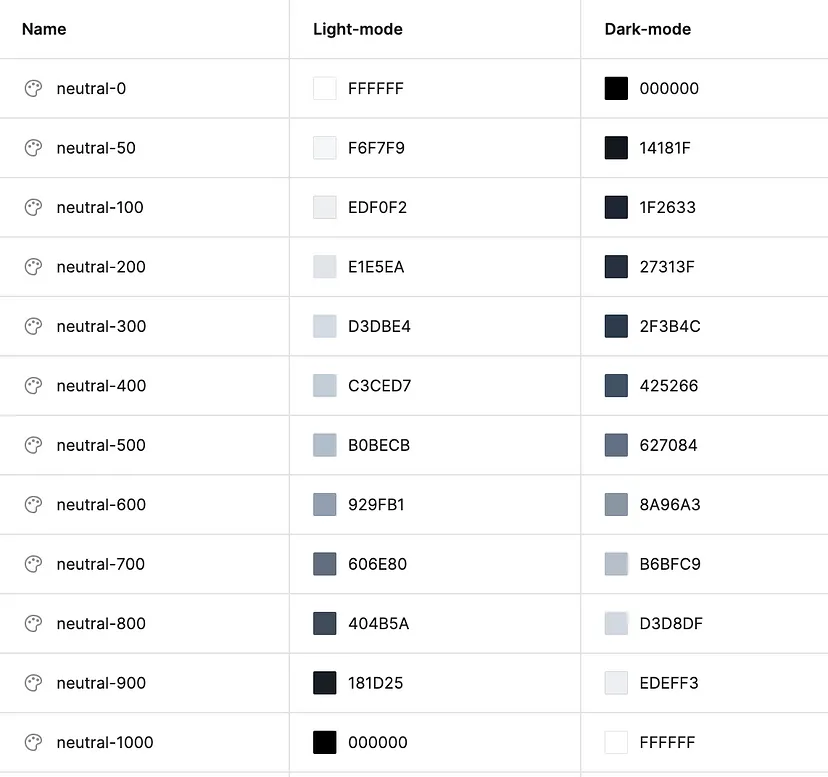
Solution: Use names like “neutral”.
Eg:
- neutral-0: no color or default color → absolute white in light, absolute black in dark

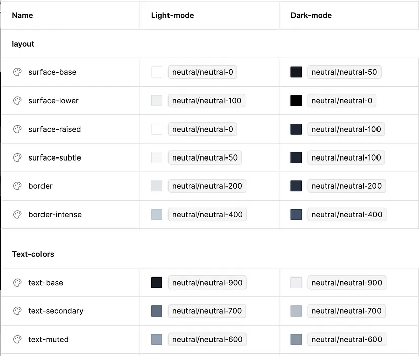
What if your UI has multiple bg gray colors? Or you have different popover elements, dropdowns, and cards? → Not recommended to apply colors from “neutral” library.
Solution: Create another color group for backgrounds.
Advice:
- Keep colors minimal.
- Use generic names like “surface-base” for cards or bg behind main content. For dropdowns, modal dialogs or popovers, use “surface-raised” or “surface-elevate”.
Light mode:
- Use more shadows for dropdowns, less or no for cards.
Dark mode:
- Use lighter dark color for dropdowns.

Other colors (primary, accent, warning, etc.) in dark mode
Create dark versions of all primary colors for both texts and backgrounds.
Create two groups of primary colors:
- Primary colors for surfaces — button backgrounds or other backgrounds. Colorful backgrounds should be adjusted for dark mode.
- Primary colors for texts. Colorful texts should be more lighter in light mode.
Icons? Use the colors of text for icons.
Adjust according to accessibility standards. Check accessibility here.
Constant colors
Colors that remain consistent across any mode. Eg the dark sidebar of an admin panel.
Create colors like “const-white”, “const-primary”, “const-gray-800”/