Here are some notes from the book Atomic Design by Brad Frost. I think this book gives a good overview of how to create and maintain a design system. The author mentions some tools and main steps that can be useful. For more practical, hands-on product design best practices, we’ll need to find elsewhere.
1. Designing systems
Front-end frameworks
Pros:
- Help speed up development
Cons:
- Designs start to look the same
- May add unnecessary CSS & JS, making page slower
- May not be enough and you need to add custom codes, spending more time modifying and fixing codes
- You subscribe to someone else’s structure, naming & style conventions
Design system
- Brand identity
- Design language: Design language style guides articulate a general design direction, philosophy, and approach to specific projects or products. E.g. Google’s material design.
- Voice and tone
- Writing
- Code style guide
- Pattern libraries
This Is Responsive: a showcase of responsive patterns that demonstrate the various ways a particular component could be executed in a responsive environment.
Style guides
The cornerstones of good design systems are style guides, which document and organize design materials while providing guidelines, usage, and guardrails.
Style guides establish a consistent, shared vocabulary between everyone involved in a project, encouraging collaboration between disciplines and reducing communication breakdowns.
Style guides should be attractive, inviting, visible, clear, easy to use, and as useful for many people as possible.
2. Atomic design methodology
Atomic design is not a linear process.
5 stages of atomic design
-
Atoms: UI elements that can’t be broken down any further and serve as the elemental building blocks of an interface.
-
Molecules: Collections of atoms that form relatively simple UI components. E.g. a search form.
-
Organisms: Relatively complex components that form discrete sections of an interface. E.g. a website header.
-
Templates: Place components within a layout and demonstrate the design’s underlying content structure. (Wireframe)
-
Pages: Apply real content to templates and articulate variations to demonstrate the final UI and test the resilience of the design system.
3. Tools
When choosing tools to create your pattern library, look for these qualities and features of effective pattern libraries:
- Providing pattern descriptions and annotations.
- Showcasing the relevant pattern HTML, templating, CSS, and/or JavaScript code.
- Viewing patterns across the entire resolution spectrum.
- The ability to showcase pattern variations, such as active or disabled tabs.
- The ability to dynamically add real representative content into the patterns’ structures.
- Providing contextual information, like which patterns make up a particular component, as well as where that component is used.
Recommended tools: Pattern Lab, ish.
4. The atomic workflow
To create effective design systems, people need to truly collaborate and communicate with one another.
Pitching and convincing
Pitching patterns: Explain how design systems promote consistency and cohesion, speed up your team’s productivity, establish a more collaborative workflow, establish a shared vocabulary, provide helpful documentation, make testing easier, and serve as a future-friendly foundation.
-
Design systems speed up your team’s workflow. Rather than reinventing the wheel every time, teams can reuse already established UI puzzle pieces to roll out new pages and features faster.
-
Centralizing UI components in a pattern library establishes a shared vocabulary for everyone in the organization, and creates a more collaborative workflow across all disciplines. With everyone speaking the same language, more time is spent getting work done and less time is spent dealing with superfluous back-and- forth communications and meetings.
-
Design systems make cross-browser/device, performance, and accessibility testing easier, vastly speeding up production time and allowing teams to launch higher-quality work faster. Also, baking things like accessibility into a living design system scales those best practices, allowing your interfaces to reach more users while reducing the risk of you getting sued!
-
Once a design system (with accompanying pattern library) is established, it serves as a future-friendly foundation for the organization to modify, tweak, extend, and improve on over time. Doing some A/B testing? Roll the lessons from those tests into the living design system. Made some big performance optimizations? Roll them into the living design system! The living part of living design systems means they can always adapt to meet the future needs of the organization, saving time and money all the while.
It’s much more effective to simply ask, “Do you like saving time and money? Yes or no?”
Design systems lead to cohesive, consistent experiences. That means users master your UI faster, leading to more conversions and more money based on the metrics your stakeholders care about.
Create an interface inventory
An interface inventory is a comprehensive collection of the bits and pieces that make up your user interface.
To create an interface inventory, screenshot and loosely categorize all the components.
Step 1: Representatives from all disciplines of the site should be in a room together for the exercise. UX designers, visual designers, front-end developers, back- end developers, copywriters, content strategists, project managers, business owners, QA, and any other stakeholders.
Step 2: Screenshot n display
- PowerPoint or Keynote
- Photoshop or Sketch
- Evernote Web Clipper
- Google Docs or Microsoft Word
- Google Slides
Everyone should agree on a single tool to make it easier to combine.
Step 3: Screenshot n categorize UI patterns (capture 1 instance only).
Step 4: Present findings & name things.
What patterns to capture
-
Global elements: components like headers, footers, and other global elements that are shared across the entire experience.
-
Navigation: primary navigation, footer navigation, pagination, breadcrumbs, interactive component controls, and essentially anything that’s used to navigate around a user interface.
-
Image types: logos, hero images, avatars, thumbnails, backgrounds, and any other type of image pattern that shows up in the UI.
-
Icons: icons are a special type of image worthy of their own category. Capture magnifying glasses, social icons, arrows, hamburgers, spinners, favicons, and every other interface icon.
-
Forms: inputs, text areas, select menus, checkboxes, switches, radio buttons, sliders, and other forms of user input.
-
Buttons: primary, secondary, big, small, disabled, active, loading, and even buttons that look like text links.
-
Headings: h1, h2, h3, h4, h5, h6 and variations of typographic headings.
-
Blocks: also known as touts, callouts, summaries, ads, or hero units, blocks are collections of typographic headings and/or images and/or summary text.
-
Lists: unordered, ordered, definition, bulleted, numbered, lined, striped, or any group of elements presented in a list-type format.
-
Interactive components: accordions, tabs, carousels, and other functional modules with moving parts.
-
Media: video players, audio players and other rich media elements.
-
Third-party components: widgets, iframes, stock tickers, social buttons, invisible tracking scripts, and anything else that isn’t hosted on your domain.
-
Advertising: all ad formats and dimensions.
-
Messaging: alerts, success, errors, warnings, validation, loaders, popups, tooltips, and so on. This can be a challenging category to capture as messaging often requires user action to expose.
-
Colors: capture all unique colors presented in the interface. This category can be aided by fantastic style guide bootstrapping tools like CSS Stats and Stylify Me.
-
Animation: animation is an elemental aspect of user interfaces, and should therefore be documented. This requires using screen recording software such as QuickTime to capture any UI element that moves, fades, shakes, transitions, or shimmies across the screen.
Organizations tend to favor certain parts of the experience (cough homepage cough) over others. For example, people working on an e-commerce website tend to focus on the core shopping experience, even though areas like customer support, FAQs, sizing charts, 404 pages, and legal terms are also extremely important to the user experience.
Remember, users perceive your brand as a singular entity and don’t care about your organizational structure, tech stack, or anything else that might cause disparities in the UI.
Once the gaps in the interface inventory have been filled, the working group can have some important conversations about next steps for the design system project:
- Which patterns should stay, which should go, and which can be merged together?
- What pattern names should we settle on?
- What are the next steps to translate the interface inventory into a living pattern library?
Establishing direction
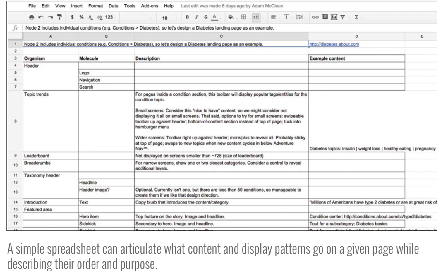
Content & display patterns
Start with lo-fi sketches that establish what appears on a particular screen and in what general order.
Make lo-fi wireframes mobile-first.
You can even use a simple spreadsheet.
“What content and display patterns go on this page? And in what general order?” are crucial questions to ask, and the techniques we just described can help designers discuss them effectively without making any layout or technical assumptions.
Establishing visual direction
- UX designers can create lo-fi sketches to establish basic information architecture and some anticipated UI patterns.
- Visual designers can gather the teams’ aesthetic values by conducting a 20-second gut test exercise, then create style tiles and element collages to explore initial design directions.
- Front-end developers can set up project dependencies, stub out basic templates, and write structural markup for patterns the team anticipates using in the project.
The 20-second gut test
View a blend of industry-specific websites & visually interesting sites from other industries. Score from 1 to 10. Instruct participants to consider visual properties they find interesting, such as typography, color, density, layout, illustration style, and general vibe. Vote & discuss low-score & high-score sites.
Comps, like any other design artifact, are used to facilitate a conversation with the project stakeholders. If their feedback is, “This feels all wrong,” then it’s back to the drawing board to create a new comp. But if their feedback suggests, “Can we move this from here to here? Can we add a gray border around the article text? Can we increase the size of this image?” that’s a sign the overall direction is in good shape and those relatively minor issues can be addressed in the browser.
Working in the browser allows teams to address layout issues across the entire resolution spectrum, design around dynamic data (such as variable character lengths, image sizes, and other dynamic content), demonstrate interaction and animation, gauge performance, factor in ergonomics, and confront technical considerations (such as pixel density, text rendering, scrolling performance, and browser quirks).
5. Maintaining design systems
You should:
-
Make it official by allocating real time, money, and resources to your design system. Make & show that it’s useful to convince higher-ups. Makers and users of the design system should work together to maintain it.
-
Make it adaptable by counting on change and establishing a clear governance plan. Schedule regular discussions to communicate & review the system. For removing patterns, through some clever use of Sass variable flags and styling, the maker team can give a heads-up to users that a particular pattern is being deprecated, and recommend an alternative pattern instead.
-
Make it maintainable by seeking the holy grail and making it easy to deploy and communicate changes to the design system.
- Make the update process as frictionless as possible.
- The design system holy grail involves creating an environment where the pattern library and live applications are perfectly in sync. An example is the Rizzo design system of Lonely Planet.
- The templating language can serve as the bridge between your pattern library and production environments. Example: The team at Phase2 Technology achieved the holy grail by using Pattern Lab as their pattern library development tool and Drupal as their content management system. Because both Pattern Lab and Drupal support the popular Twig templating engine, Phase2 is able to easily share patterns between the two environments, ensuring their clients’ pattern libraries and production builds are always in step with each other.
-
Make it cross-disciplinary by making your pattern library a watering hole the entire organization can gather around.
-
Make it approachable by making an attractive, easy-to-use style guide with helpful accompanying documentation.
-
Make it visible by communicating change, evangelizing the design system, and making it public.
- Communicate change through change logs, roadmap, success stories, tips and tricks.
- Change logs: “Here’s what’s changed in the pattern library this month.”
- Roadmap: “Here’s what’s coming up over the next few months.”
- Success stories: “Team X launched this great new application using the design system; read more about how they did it.”
- Tips and tricks: “Here are a few best practices and considerations for using our system’s buttons throughout your application.”
- Train & support people to use it: Pair sessions, workshops, webinars, tutorials, onboarding.
- Support: Issue trackers, office hours for questions and solutions, chat tools, forums, reach out to peeps asking if they need help.
- Communicate change through change logs, roadmap, success stories, tips and tricks.
-
Make it bigger by including brand, voice and tone, code, design principles, and writing guidelines. Add best practices, guidelines for native platform patterns alongside web-based patterns (web, iOS, Android).
-
Make it agnostic by naming patterns according to their structure rather than their context or content. The more agnostic pattern names are, the more versatile and reusable they become. Eg. naming a component “carousel” instead of “homepage carousel”, now it can be used everywhere, not just the homepage. “Card” instead of “product card” so you can put all sorts of info into the card, not just only the product.
-
Make it contextual by demonstrating what patterns make up a particular pattern and showing where each pattern is used.
-
Make it last by laying a solid foundation with which to build on for years to come.